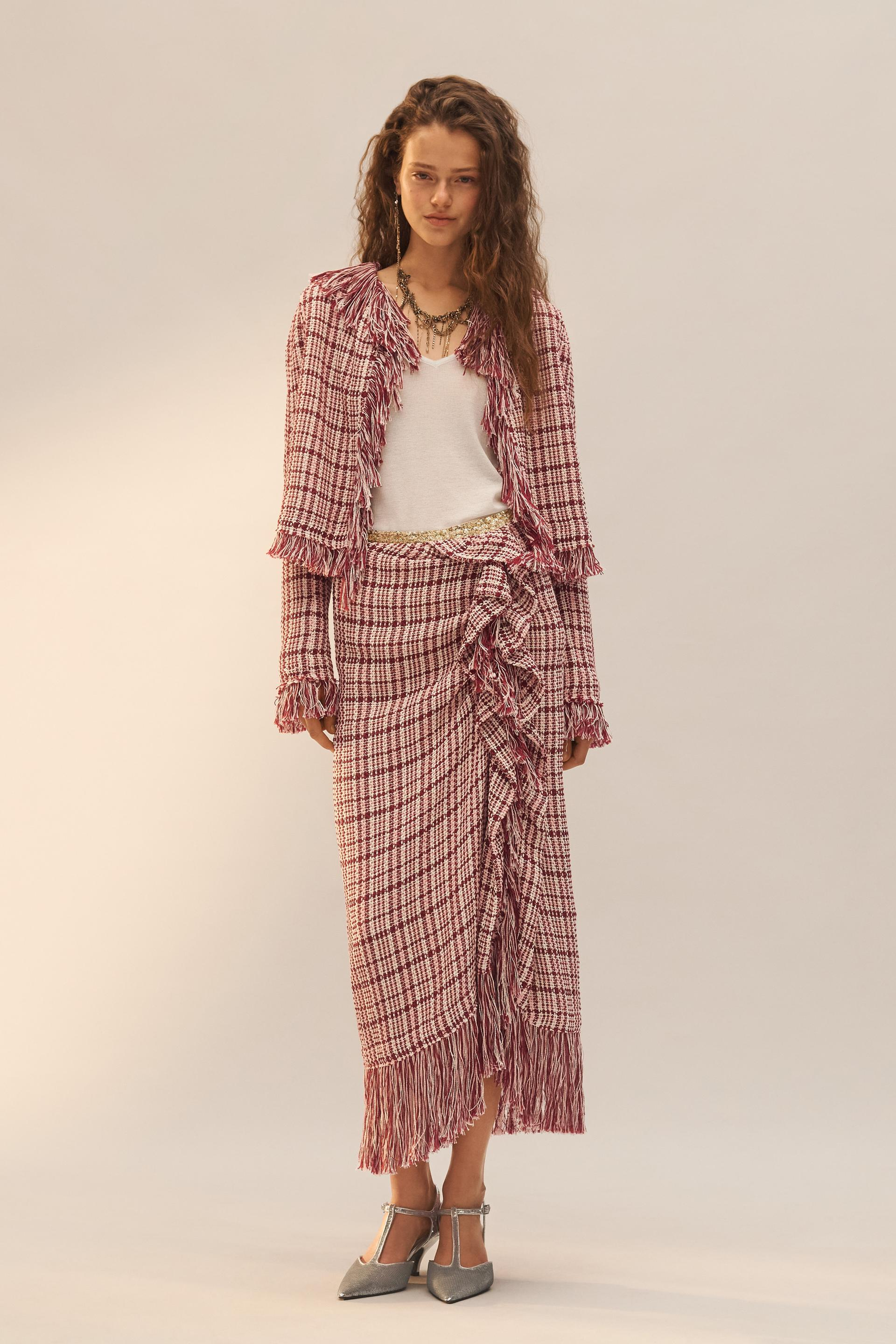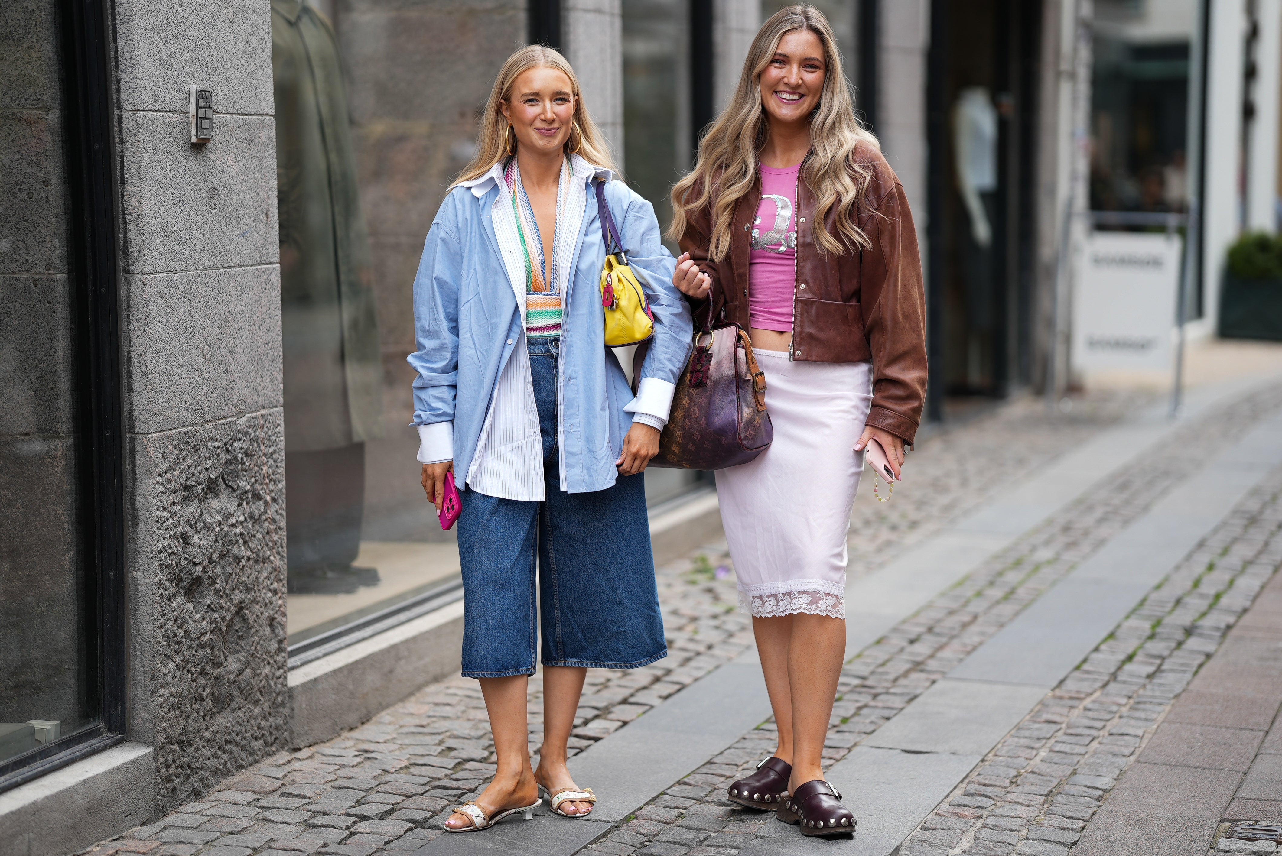
I blame the early 2010s street style boom for my obsession with colorblocking. Back in 2011, when the trend emerged in the pictures of bloggers from The Sartorialist to Garance Doré, I was instantly sold on their bold minimalism. On a tight budget, this trend was easy to replicate. After all, it only took two contrasting color pieces. And so, I convinced my mom to take me to the local mall’s Zara in search of cheaper dupes of the pieces whose saturated colors beckoned to me online.
My favorite colorblocking combo at the time was bright blue and a heavily-saturated orange, in the form of a knitted sweater and miniskirt I paired all through college, until the items no longer fit me.
Back in July, I was reminded of my past love for colorblocking when Valentino unveiled its fall 2021 couture collection, filled with gorgeously juxtaposed bright hues, from a purple gown paired with orange opera gloves to a neon yellow mini dress mixed with a purple feather hat. Other designers, like Bottega Veneta and Brandon Maxwell, also recently unearthed the 2010s trend, which was originally championed by creatives like Raf Simons, Prabal Gurung, and Phillip Lim.
As designers look back to the 2010s, I also find myself reminiscing over the one trend from the Tumblr era I can get behind. For someone who’s most comfortable wearing all black (and has been compared to Morticia on more than one occasion) wearing color on top of color on top of color can be a difficult step to take. But somehow, colorblocking turns my Wednesday Addams soul into a color wheel happily spinning from shade to shade.
While it was hard to imagine I’d have pieces in my closet fit for this trend, I was surprised to find a few colorful items lurking around. But first I needed some inspiration.
Meet Carmen, one of the lead characters in the Netflix Spanish series Valeria. An advertising creative, Carmen is the global champion of colorblocking, with outfits that blur the line between professional and playful, often composed of more than three clashing shades that somehow cohere into a single work-ready look. Her bubbly personality is completely different from mine, yet we both have an adoration for monochrome pieces — blazers, button-down-shirts, boots, you name it — that made me decide to imitate her on-screen style at home. After binge-watching the second season of Valeria to gather some inspiration (and enjoy some major eye candy), I got right to work.
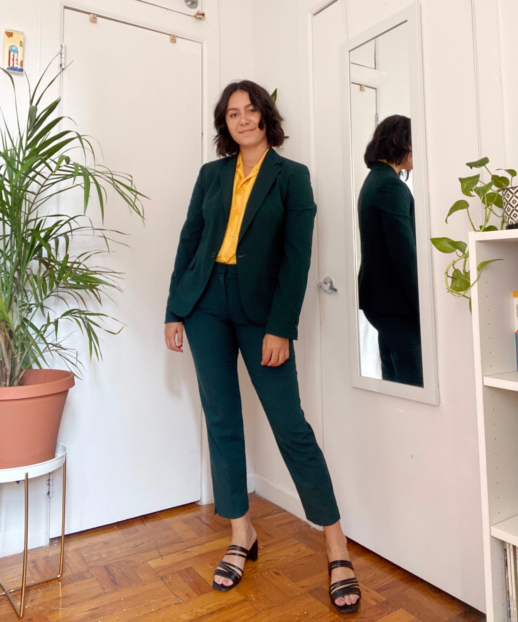
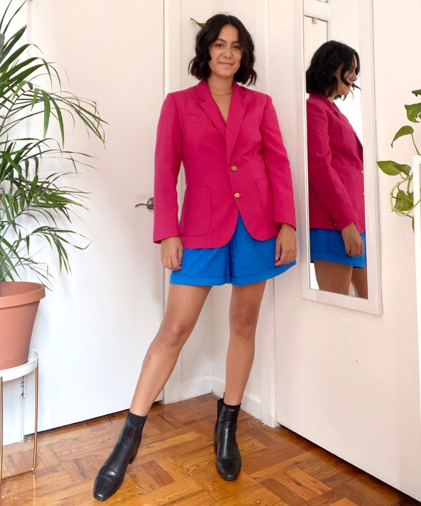
My first look is heavily influenced by Carmen, whose preferred styling method for two-piece suits is to wear a monochrome set with a contrasting shirt underneath. My version includes a green Zara suit, paired with a vintage Christie & Jill golden yellow button down shirt. I topped off the look with black Halston sandals and a Saint Laurent bag. While it was definitely more color than I wear in a single week, it was still inside my comfort zone, using a somewhat neutral green shade and black accessories to distract myself from the fact that my chest was shining brighter than Twilight’s Cullen family on a sunny day. For the second look, I went full in, wearing a bright pink blazer with electric blue high-waisted shorts. While there were no neutral shades to hide in, I still felt comfortable with the idea that the pieces were classic enough to handle that much color together. After all, my favorite colorblocking combinations always carry minimal silhouettes and simple textiles. Best to let the colors do the talking, I’ve found.
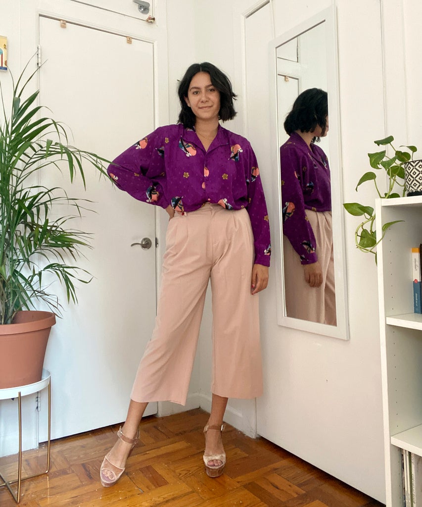
But when I happened upon an abstract-print vintage Diane von Fürstenberg shirt I’d recently purchased, I decided it was time to try a colorblocked look in uncharted territory. I paired the shirt with light pink culottes from Asos and velvet pink (and, for the record, impossible-to-walk-in) platforms from Zara. Mixing not only prints but textures is risky business, a risk that I’ll happily pass on next time around.
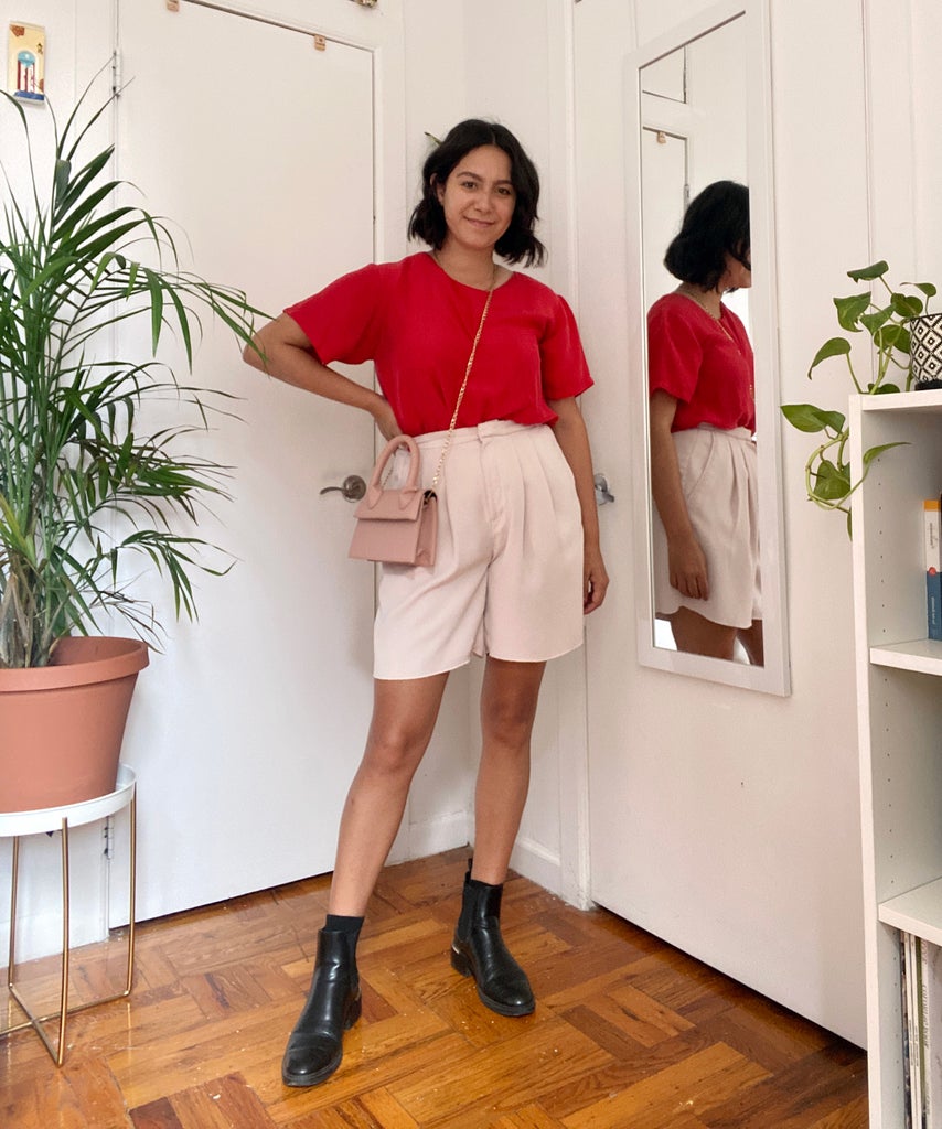
For the fourth look, I wanted to embrace a new colorblocking formula, one I’d seen on the runways and lookbooks of some of this year’s collections. It involves colorblocking different shades of the same color family in one outfit. Think: bright yellow with pastel yellow with gold yellow. My version included a red shirt with light pink shorts and a pastel pink crossbody bag. While you may assume that I’d be more comfortable with this kind of colorblocking, which plays it safer than out-there patterns, think again. Something about wearing that much pink made me realize it should be reserved for Glossier showrooms or Valentine’s Day, not my wardrobe.
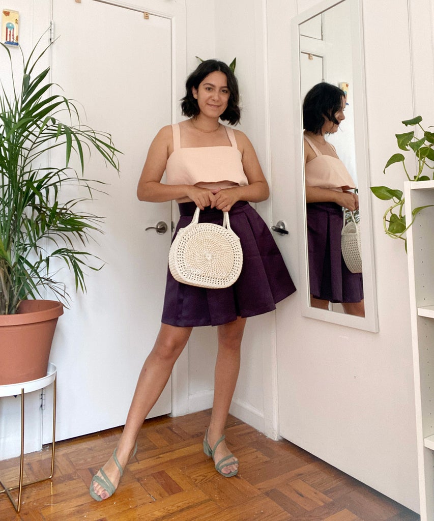
As I reached the end of this challenge, it was key for me to try one last colorblocking iteration outside of my comfort zone. While the past looks pushed my color limits, all of them largely remained neutral on footwear. Until now. I chose to pair a light pink bralette top with a purple high-waisted skirt (made by my mom!) with pastel green heels from H&M. I realized as I wore it on the final day of my self-imposed challenge that I was donning the colors of Barney, the dinosaur. But since the ‘90s are having a comeback, I’m good with channeling Barney’s “I Love You.”
I did return to my all-black wardrobe at the end of this bright week. but I can confidently say that, as we brace for the return of 2010s fashion, I’ll stick with cartwheel-inducing colorblocking and leave you all with the Jeffrey Campbell platforms and cross T-shirts.
Like what you see? How about some more R29 goodness, right here?
Valentino’s Latest Show Featured Colorblocking


