
/* Roboto */
@import url(‘https://fonts.googleapis.com/css2?family=Roboto:ital,wght@0,100..900;1,100..900&display=swap’);
/* Roboto Mono */
@import url(‘https://fonts.googleapis.com/css2?family=Roboto+Mono:ital,wght@0,100..700;1,100..700&display=swap’);
:root {
/* //////////////////////////////////////////////////////////////////// */
/* System colors */
–color-cream: #DCE0E2;
–color-black: #3A3C42;
–color-white: #FFFFFF;
–color-light-gray: #EAE0D4;
–color-medium-gray: #555555; /* Hovers */
–color-dark-gray: #4B4D56;
/* Primary colors, use white or black text */
–color-pink: #F300CE;
–color-blue: #1F69FF;
/* Secondary colors, use black text only*/
–color-orange: #4B4D56;
–color-yellow: #FBF5E7;
–color-green: #4B4D56;
–color-teal: #4B4D56;
–color-purple: #4B4D56;
/* //////////////////////////////////////////////////////////////////// */
/* Fonts */
–Brown-Regular: Brown Regular, Gill Sans, Arial, Helvetica, Roboto, Segoe UI Light, Ubuntu Light, DroidSans, sans-serif;
–Brown-Bold: Brown Bold, Gill Sans, Arial, Helvetica, Roboto, Segoe UI Light, Ubuntu Light, DroidSans, sans-serif;
–Roboto: ‘Roboto’, Arial, Helvetica, Segoe UI Light, Ubuntu Light, DroidSans, sans-serif;
–Roboto-Mono: ‘Roboto Mono’, Monaco, monospace;
–Owners-Narrow: ‘owners-narrow’, sans-serif;
–Playfair: Playfair Display, Times New Roman Bold, TimesNewRomanPSMT-Bold, Times Bold, Noto Serif Bold, NotoSerif-Bold, Georgia, serif;
–Ivy-Presto: “ivypresto-headline”, Playfair Display, Times New Roman Bold, TimesNewRomanPSMT-Bold, Times Bold, Noto Serif Bold, NotoSerif-Bold, Georgia, serif;
/* Font Letterspacing < DO NOT ALTER */
–Tight: -0.01em;
–Normal: 0em;
–Loose: 0.02em;
–Spread: 0.1em;
/* Intro column div{font-family:var(–Roboto-Mono);font-weight:var(–Weight-Roboto-Mono-Regular);font-size:.8rem;text-transform:uppercase;text-decoration:none;letter-spacing:.02em;color:var(–subnav-text-color);border-bottom:1px solid transparent}.subnav__container a:hover,.subnav__container-mobile button:hover,.subnav__container>div:hover{color:var(–subnav-text-hover-color);border-bottom:1px solid var(–subnav-text-hover-color)}.subnav__read-more{pointer-events: none;color:var(–subnav-read-more-color);border:0!important;text-decoration:none}.subnav__container-mobile{display:none}#subnav__marker{height:1px;margin-top:-1px}@media only screen and (max-width:1100px){.subnav__container{display:none}.subnav__container-mobile{display:flex}}@media only screen and (max-width:1024px){.subnav__container{width:100%;height:50px;display:flex!important;flex-direction:row;justify-content:start;align-items:center;gap:30px;overflow-x:auto;scroll-behavior:smooth;padding:0 20px}.subnav__container a,.subnav__container-mobile button,.subnav__container>div{white-space:nowrap}.subnav__container::-webkit-scrollbar{height:1px;pointer-events:auto;cursor:pointer}.subnav__container::-webkit-scrollbar-thumb{background:rgba(255,255,255,0);border-radius:6px;border:0}.subnav__container::-webkit-scrollbar-track{background:rgba(0,0,0,0);padding:0}}@media only screen and (max-width:760.98px){.subnav__container a,.subnav__container-mobile button,.subnav__container>div{font-size:.7rem;border-bottom:1px solid var(–subnav-text-color)}.subnav__container,.subnav__container-mobile{gap:20px}}
#subnav, .subnav {
transition: translateY 0.5s ease-in-out;
-webkit-transition: translateY 0.5s ease-in-out;
z-index: 99;
}
/* //////////////////////////////////////////////////////////////////// */
/* Anchors */
.caro__marker{position:relative}.caro__anchor{position:absolute;top:-40px;left:0;width:100%;height:1px}.caro__marker .caro__anchor{top:-140px}
.marker_set{position:relative}.marker{position:absolute;top:-40px;left:0;width:100%;height:1px}.marker_set .marker{top:-140px}
.section-html, .module {position: relative;}
/* //////////////////////////////////////////////////////////////////// */
/* Carousel Basics */
.caro,.caro__scroller{display:block;width:100%}.caro{clear:both;margin:0;padding:0;overflow:hidden}.caro__scroller{position:relative}.caro__scroller-wrapper{width:100%;display:flex;flex-direction:column;position:relative}.caro__count{display:none}.caro__arrows{position:absolute;top:0;left:0;right:0;width:100%;pointer-events:none;display:flex;flex-direction:row;justify-content:center;align-items:center;height:100%}.caro__arrow,.caro__arrow-left,.caro__arrow-right{padding:0;pointer-events:auto}.caro__arrow-left{top:auto;bottom:auto;left:40px;width:auto;margin:0;display:none;opacity:0}.caro__arrow-right{top:auto;right:40px;width:100px;margin:0;display:block;opacity:1;animation-name:moveArrow;animation-timing-function:ease-in-out;animation-duration:1.5s;animation-iteration-count:infinite}.caro__arrow{position:absolute;width:60px;height:60px;cursor:pointer;margin:-20px 0 0}.caro__arrow-file svg{width:100%;height:100%}.caro__arrow-file svg path{fill: var(–carousel-arrow-shape-color)}.caro__arrow-file:hover path{fill:var(–carousel-arrow-shape-color-hover)}.caro__arrow-file svg circle{fill:var(–carousel-arrow-bgcolor);stroke:var(–carousel-arrow-bordercolor)}.caro__arrow-file:hover svg circle{fill:var(–carousel-arrow-bgcolor-hover);stroke:var(–carousel-arrow-bordercolor-hover)}.caro__arrow-right:hover{animation-play-state:paused;-webkit-animation-play-state:paused}@keyframes moveArrow{0%,100%{transform:translateX(0)}50%{transform:translateX(30px)}}@-moz-keyframes moveArrow{0%,100%{transform:translateX(0)}50%{transform:translateX(30px)}}@-webkit-keyframes moveArrow{0%,100%{transform:translateX(0)}50%{transform:translateX(30px)}}@-o-keyframes moveArrow{0%,100%{transform:translateX(0)}50%{transform:translateX(30px)}}.caro__scroller-list{width:100%;height:fit-content;white-space:nowrap;overflow-x:auto;overflow-y:hidden;scroll-behavior:smooth;scroll-snap-type:x mandatory;scroll-padding:0 20px;padding:0 0 20px;-webkit-transform:translateZ(0);-moz-transform:translateZ(0);-ms-transform:translateZ(0);-o-transform:translateZ(0);transform:translateZ(0);-webkit-backface-visibility:hidden;-moz-backface-visibility:hidden;-ms-backface-visibility:hidden;backface-visibility:hidden;-webkit-perspective:1000;-moz-perspective:1000;-ms-perspective:1000;perspective:1000;-webkit-overflow-scrolling:touch;grid-template-columns:repeat(100,340px);font-size:0;display:flex;justify-content:start;align-items:start;gap:20px;flex-wrap:nowrap}.is-promos .caro__scroller-list,.is-wide .caro__scroller-list,.is-youtube .caro__scroller-list{grid-template-columns:repeat(100,500px)}.is-social .caro__scroller-list,.is-tall .caro__scroller-list{grid-template-columns:repeat(100,340px)}.caro__card{overflow:hidden;width:340px;min-width:340px;max-width:340px;background-color:transparent;height:fit-content;scroll-snap-align:start;position:relative;display:inline-block;float:none;box-sizing:content-box;padding:0;margin:0}.caro__card img{width:100%}.caro__card>div{box-sizing:border-box;width:inherit}.caro__card:first-of-type{padding-left:20px}.caro__card:last-of-type{margin-right:20px}.is-promos .caro__card,.is-wide .caro__card,.is-youtube .caro__card{width:500px;min-width:500px;max-width:500px}.is-youtube .caro__card iframe{width:500px!important;height:281px!important}.is-social .caro__card iframe.instagram-media{max-width:unset!important;width:100%!important;border-radius:0!important;margin:-54px 0 0!important;border:0!important}@media only screen and (max-width:760.98px){.caro__arrow-left{left:15px}.caro__arrow-right{right:15px;pointer-events:none}.caro__arrow-right .caro__arrow-file{transform:rotate(180deg)}.caro__arrow-file{width:85px;height:85px}.caro__arrow-file img,.caro__arrow-file svg{padding:11px}@keyframes moveArrow{0%,100%{transform:translateX(0)}50%{transform:translateX(20px)}}@-moz-keyframes moveArrow{0%,100%{transform:translateX(0)}50%{transform:translateX(20px)}}@-webkit-keyframes moveArrow{0%,100%{transform:translateX(0)}50%{transform:translateX(20px)}}@-o-keyframes moveArrow{0%,100%{transform:translateX(0)}50%{transform:translateX(20px)}}.caro__scroller-list,.is-people .caro__scroller-list,.is-promos .caro__scroller-list,.is-social .caro__scroller-list,.is-tall .caro__scroller-list,.is-wide .caro__scroller-list,.is-youtube .caro__scroller-list{grid-template-columns:repeat(100,335px)}.caro__card,.is-people .caro__card,.is-promos .caro__card,.is-social .caro__card,.is-tall .caro__card,.is-wide .caro__card,.is-youtube .caro__card{width:335px;min-width:335px;max-width:335px}.is-youtube .caro__card iframe{width:335px!important;height:188px!important}.caro__arrows{display:none!important}}.caro__scroller-list::-webkit-scrollbar{height:4px;pointer-events:auto;cursor:pointer;background:0 0!important}.caro__scroller-list::-webkit-scrollbar-track{background:0 0!important;padding:2px 0}.caro__scroller-list::-webkit-scrollbar-thumb{background:0 0!important;border-radius:6px;border:0}.caro__scroller-list::-webkit-scrollbar-thumb:hover{background:0 0!important}
/* /////////////////////////////////////////////////////////////////////////////// */
/* Editors */
.editors {
margin: 40px auto 0;
padding: 0;
}
.editors__wrapper {
}
.editors__list {
display: flex;
flex-direction: row;
justify-content: center;
align-items: flex-start;
flex-wrap: wrap;
width: 100%;
gap: 15px;
}
.editors__card {
width: 100%;
max-width: 250px;
display: block;
margin: 0;
padding: 0 20px;
}
.editors__card-image {
width: 100%;
max-width: 250px;
margin: 0 auto 10px;
}
.editors__card-image img {
width: 100%;
border-radius: 500px;
border: var(–editor-border-size) solid var(–editor-border-color);
}
.editors__card-details {
width: 100%;
display: flex;
flex-direction: column;
font-family: var(–editor-details-font);
font-weight: var(–editor-details-weight);
color: var(–editor-details-color);
font-size: 0.7rem;
line-height: 1.45;
text-align: center;
}
.editors__card-details a:hover {
color: var(–editor-name-hover-color);
}
.editors__card-name {
font-size: 1.2rem;
color: var(–editor-name-color);
font-family: var(–editor-name-font);
font-weight: var(–editor-name-weight);
}
.editors__card-role {
color: var(–editor-role-color);
text-transform: uppercase;
letter-spacing: 0.05em;
}
.editors__card-social {
display: flex;
flex-direction: row;
justify-content: center;
align-items: center;
gap: 0;
}
.editors__card-social-icon svg {
width: 50px;
height: 50px;
}
.editors__card-social-icon svg path {
fill: var(–editor-social-color);
}
.editors__card-social-icon:hover svg path {
fill: var(–editor-social-hover-color);
}
@media only screen and (max-width: 760px) {
.editors {
padding: 0 0 40px;
}
.editors__list {
gap: 20px;
}
.editors__card {
margin-bottom: 20px;
}
}
/* //////////////////////////////////////////////////////////////////// */
/* Products */
.product__card {
width: 100%;
height: 100%;
display: flex;
flex-direction: column;
gap: 0;
align-items: stretch;
justify-content: center;
}
.product__image {
width: 100%;
overflow: hidden;
display: flex;
flex-direction: column;
justify-content: start;
align-items: center;
position: static;
padding-bottom: 0;
height: fit-content;
top: 0;
max-height: 440px;
}
/* new */
.product__image {
width: 100%;
overflow: hidden;
display: flex;
flex-direction: column;
justify-content: center;
align-items: center;
position: relative;
padding-bottom: 0;
height: 440px; /* 420px; */
}
.product_image-container {
width: 100%;
overflow: hidden;
position: relative;
padding-bottom: 0;
height: auto;
border: 0; /* var(–product-img-border-size) solid var(–product-img-border-color); */
border-radius: 0; /* var(–product-img-border-radius); */
display: flex;
flex-direction: column;
justify-content: center;
align-items: center;
}
.product__image img {
width: 100%;
position: static;
top: unset;
-ms-transform: unset;
transform: unset;
top: 0;
left: 0;
}
.product__eyebrow {
width: 100%;
font-family: var(–product-brand-font);
font-weight: var(–product-brand-weight);
font-size: 0.7rem;
text-transform: uppercase;
letter-spacing: 0.05em;
color: var(–product-brand-color);
text-decoration: none;
padding: 15px 10px 5px;
overflow: hidden;
height: 35px;
}
.product__name {
width: 100%;
font-family: var(–product-name-font);
font-weight: var(–product-name-weight);
font-size: 1.1rem;
text-transform: none;
letter-spacing: 0em;
color: var(–product-name-color);
text-decoration: none;
padding: 0 10px 15px;
white-space: normal;
overflow: hidden;
height: 60px;
}
.product__name span {
border-bottom: 1px solid transparent;
}
.product__name:hover span {
border-bottom: 1px solid var(–product-name-color);
}
.product__buy {
width: 100%;
display: flex;
flex-direction: row;
justify-content: center;
align-items: stretch;
padding: 0 10px 10px;
gap: 20px;
}
.product__buy-button {
width: fit-content;
padding: 8px 20px;
font-family: Brown Bold, sans-serif;
font-weight: 400;
font-size: 0.7rem;
text-transform: uppercase;
letter-spacing: 0.05em;
color: var(–product-buy-text-color);
background-color: var(–product-buy-bg-color);
border: var(–product-buy-border-size) solid var(–product-buy-border-color);
border-radius: 100px;
text-align: center;
text-decoration: none;
}
.product__buy-button:hover {
background-color: var(–product-buy-bg-hover-color);
color: var(–product-buy-text-hover-color);
}
.product__buy-details {
display: flex;
flex-direction: column;
gap: 5px;
width: 100%;
}
.product__prices {
font-family: Brown Bold, sans-serif;
font-weight: 400;
font-size: 0.7rem;
color: var(–product-brand-color);
text-decoration: none;
}
.product__retailer {
font-family: Brown Regular, sans-serif;
font-weight: 400;
font-size: 0.7rem;
text-transform: uppercase;
letter-spacing: 0.05em;
color: var(–product-brand-color);
text-decoration: none;
}
.product__card {
text-align: left;
}
.caro.is-products .caro__card {
width: 220px !important;
min-width: 220px !important;
max-width: 220px !important;
}
.product__name {
font-size: 1.1rem !important;
}
.product__image {
height: 320px !important;
}
.product__buy {
padding: 0 0 10px !important;
gap: 15px !important;
}
.product__name,
.product__eyebrow {
padding-left: 0 !important;
padding-right: 0 !important;
}
.caro__card:first-of-type {
padding-left: 0 !important;
}
.caro__card:last-of-type {
margin-right: 0 !important;
}
.caro__scroller-list {
scroll-padding: 0 20px;
padding: 0 20px 20px !important;
}
h2.caro__header {
font-family: var(–Ivy-Presto);
font-weight: 400;
font-size: 2.5rem;
margin: 0 auto 40px;
text-transform: uppercase;
}
h2.caro__header img {
height: 120px;
}
@media only screen and (max-width: 768px) {
h2.caro__header img {
height: auto;
width: 100%;
max-width: 400px;
padding: 0 20px;
}
}
@media only screen and (max-width: 500px) {
h2.caro__header img {
max-width: 375px;
}
}
@media only screen and (max-width: 420px) {
h2.caro__header img {
max-width: 335px;
}
}
.caro__eyebrow {
margin-bottom: 10px;
padding-top: 20px;
font-family: var(–Ivy-Presto);
font-weight: 400;
}
.subnav {
/* background-color: #FFEEEE; */
}
.header__container {
width: 100%;
display: flex;
flex-direction: row;
justify-content: start;
align-items: center;
gap: 0;
}
.header__column {
width: 33.333%;
}
.header__column.is-two-column {
width: 66.6666%;
}
.header__column img {
width: 100%;
}
.intro__break {
display: block;
}
.tmp-hero-overlay {
position: absolute;
top: 0;
left: 0;
width: 100%;
right: 0;
margin: 0 auto;
}
.tmp-hero-overlay img {
width: 100%;
}
@media only screen and (max-width: 968px) {
.header__container {
flex-direction: column;
}
.header__column {
width: 100%;
}
.header__column.is-two-column {
width: 100%;
}
.intro__break {
display: none;
}
}
.overlay__deaktop {
display: block;
}
.overlay__mobile {
display: none;
}
@media only screen and (max-width: 768px) {
.overlay__deaktop {
display: none;
}
.overlay__mobile {
display: block;
}
.tmp-hero-overlay {
top: 0;
left: 0;
width: 100%;
}
h2.caro__header {
font-size: 2.0rem;
}
}
/* Hide broken ad */
.goku,
.bxc {
display: none !important;
}
/* LOOKBOOK */
.gallery {
width: 100%;
margin-top: -20px;
font-size: 0;
}
.gallery__container {
width: 100%;
display: flex;
flex-direction: row;
flex-wrap: wrap;
gap: 0;
}
.gallery__item {
width: 25%;
}
.gallery__image {
width: 100%;
height: 100%;
z-index: 98;
position: relative;
}
.gallery__image img {
width: auto;
position: relative;
height: 80vh;
}
.gallery__details {
padding: 15px 0 0;
z-index: 99;
position: relative;
}
.gallery__item-title {
font-family: ‘Brown Regular’, sans-serif;
font-size: 1.2rem;
color: var(–color-black);
text-align: left;
margin: 5px auto;
display: flex;
flex-direction: row;
justify-content: start;
align-items: center;
gap: 12px;
max-width: 720px;
padding: 0 20px 40px;
}
.gallery__item-credit {
font-family: var(–Roboto-Mono);
font-size: 0.7rem;
text-transform: uppercase;
text-align: left;
display: flex;
flex-direction: row;
justify-content: start;
align-items: center;
gap: 12px;
padding-top: 0;
}
.caro__subheader .gallery__item-credit {
font-size: 0.9rem;
font-family: ‘Brown Regular’, sans-serif;
padding-top: 7px;
}
.gallery__item-credit a:hover {
background-color: var(–color-black);
color: var(–color-cream);
}
.footnote {
font-family: ‘Brown Regular’, sans-serif;
font-size: 0.65rem;
color: var(–color-black);
}
.person__overlay-set {
font-family: ‘Brown Regular’, sans-serif;
font-size: 1rem;
line-height: 1.65;
}
.person__image-container {
font-size: 0;
}
.is-double {
width: 50%;
}
.caro.is-gallery
.caro__card {
width: fit-content;
min-width: fit-content;
max-width: fit-content;
height: fit-content;
height: fit-content;
}
.gallery__credit-notes {
font-family: var(–Roboto-Mono);
font-size: 0.6rem;
text-transform: uppercase;
text-align: center;
width: 100%;
max-width: 1100px;
margin: 0 auto;
padding: 0 20px 50px;
white-space: normal;
}
/* Images */
.gallery__image.gallery__image-group {
display: flex;
flex-direction: column;
gap: 20px;
height: 80vh;
}
.gallery__image.gallery__image-group img {
height: 50%;
}
.gallery__image {
overflow: hidden;
}
.gallery__image a img {
transform: scale(1.0);
transition: all 0.5s ease-in;
-webkit-transition: all 0.5s ease-in;
}
.gallery__image a:hover img {
transform: scale(1.1);
transition: all 0.5s ease-in;
-webkit-transition: all 0.5s ease-in;
}
@media only screen and (max-width: 1400px) {
.gallery__image img,
.gallery__image.gallery__image-group {
height: 70vh;
}
}
@media only screen and (max-width: 1200px) {
.gallery__image img,
.gallery__image.gallery__image-group {
height: 60vh;
}
}
.is-quote-bg {
background: #f7e5ba;
background: -webkit-linear-gradient(180deg, rgba(247, 229, 186, 1) 0%, rgba(247, 231, 244, 0.85) 100%);
background: -moz-linear-gradient(180deg, rgba(247, 229, 186, 1) 0%, rgba(247, 231, 244, 0.85) 100%);
background: linear-gradient(180deg, rgba(247, 229, 186, 1) 0%, rgba(247, 231, 244, 0.85) 100%);
filter: progid:DXImageTransform.Microsoft.gradient(startColorstr=”#F7E5BA”, endColorstr=”#F7E7F4″, GradientType=0);
}
.caro__subheader {
font-family: var(–Ivy-Presto);
font-size: 1.35rem;
color: var(–color-black);
text-align: center;
display: flex;
flex-direction: column;
align-items: center;
gap: 12px;
max-width: 860px;
margin: 0 auto 20px;
padding: 0 20px 20px;
}
@media only screen and (max-width: 600px) {
.gallery__image img, .gallery__image.gallery__image-group {
height: auto;
width: 100%;
max-width: 87vw;
}
}
.caro__overlay {
pointer-events: none;
position: absolute;
top: 0;
left: 0;
display: flex;
flex-direction: column;
justify-content: center;
align-items: center;
background-color: #C0D6FA;
width: 100%;
height: 100%;
opacity: 0.0;
z-index: 99;
transition: all 0.3s ease-in-out;
-webkit-transition: all 0.3s ease-in-out;
}
.caro__overlay-set {
padding: 40px;
}
.gallery__image a:hover .caro__overlay {
opacity: 1.0;
transition: all 0.3s ease-in-out;
-webkit-transition: all 0.3s ease-in-out;
}
.caro__overlay-close {
position: absolute;
top: 10px;
right: 10px;
font-family: ‘Brown Regular’, sans-serif;
font-size: 0.8rem;
line-height: 1.5;
color: #000;
pointer-events: auto;
cursor: pointer;
}
.caro__overlay-info {
position: absolute;
top: 5px;
right: 5px;
padding: 0;
width: 44px;
height: 44px;
display: none;
flex-direction: column;
justify-content: center;
align-items: center;
pointer-events: auto;
cursor: pointer;
}
.caro__overlay-info-set {
display: flex;
flex-direction: column;
justify-content: center;
align-items: center;
background-color: rgba(0,0,0,0.25);
border-radius: 3px;
width: 26px;
height: 26px;
padding: 4px;
font-family: ‘Brown Regular’, sans-serif;
font-style: italic;
font-size: 0.8rem;
line-height: 1;
color: #fff;
border: 0 solid #fff;
}
.icon__info {
display: flex;
flex-direction: column;
justify-content: center;
align-items: start;
gap: 2px;
}
.icon__info-bar {
width: 15px;
height: 1px;
background-color: #fff;
}
.icon__info-bar-md {
width: 13px;
height: 1px;
background-color: #fff;
}
.icon__info-bar-sm {
width: 10px;
height: 1px;
background-color: #fff;
}
.caro__overlay.is-mobile-overlay {
display: none;
opacity: 1.0;
position: fixed;
top: 0;
left: 0;
width: 100%;
height: 100vh;
z-index: 9999999999;
}
.caro__overlay.is-mobile-overlay {
justify-content: start;
}
.caro__overlay.is-mobile-overlay
.caro__overlay-set {
overflow-y: auto;
justify-content: start;
max-width: 720px;
}
.caro__overlay-set>p {
font-family: ‘Brown Regular’, sans-serif;
font-size: 1.4rem;
line-height: 1.5;
color: #000;
white-space: normal;
width: 100%;
}
@media only screen and (max-width: 1400px) {
.caro__overlay-set>p {
font-size: 1.25rem;
}
}
@media only screen and (max-width: 1200px) {
.caro__overlay-set>p {
font-size: 1.0rem;
}
}
.mobile__overlays {
display: none;
}
@media only screen and (max-width: 1024px) {
.mobile__overlays {
display: block;
}
.caro__overlay-info {
display: flex;
}
.caro__overlay.is-desktop {
display: none;
}
}
.gallery__item.is-quote {
width: 100%;
}
.is-quote
.gallery__image {
margin: 0 auto;
text-align: center;
}
.is-quote
.gallery__image img {
height: auto;
width: 100%;
max-width: 1100px;
margin: 0 auto;
}
.quote__credit {
width: fit-content;
margin: 40px auto 20px;
}
.quote__credit .gallery__image img {
width: 100%;
max-width: 150px;
border-radius: 400px;
margin: 0 auto;
}
.quote__name {
/* font-family: Brown Bold, sans-serif; */
font-family: var(–Ivy-Presto);
font-size: 1.75rem;
letter-spacing: 0.01em;
line-height: 1.2;
word-spacing: normal;
font-weight: 400;
color: var(–color-black);
text-align: center;
padding: 8px 20px 7px;
}
.quote__role {
font-family: Brown Regular, sans-serif;
font-size: 0.9rem;
letter-spacing: 0.075em;
line-height: 1.2;
word-spacing: normal;
font-weight: 400;
color: var(–color-black);
text-align: center;
}
.quote__desktop {
display: block;
}
.quote__mobile {
display: none;
}
@media only screen and (max-width: 760px) {
.quote__credit .gallery__image img {
max-width: 100px;
}
.quote__name {
font-size: 1.25rem;
}
.quote__desktop {
display: none;
}
.quote__mobile {
display: block;
}
}
.quote__credit a .gallery__image {
transform: scale(1.0);
transition: all 0.5s ease-in;
-webkit-transition: all 0.3s ease-in;
}
.quote__credit a:hover .gallery__image {
transform: scale(1.1);
transition: all 0.5s ease-in;
-webkit-transition: all 0.3s ease-in;
}
.quote__credit a .quote__name span {
border-bottom: 2px solid transparent;
transition: all 0.5s ease-in;
-webkit-transition: all 0.3s ease-in;
}
.quote__credit a:hover .quote__name span {
border-bottom: 2px solid var(–color-black);
transition: all 0.5s ease-in;
-webkit-transition: all 0.3s ease-in;
}
.intro__sm {
font-size: 1.5rem !important;
}
.tmp-intro p {
max-width: 960px !important;
}
@media only screen and (max-width: 760px) {
.intro__sm {
font-size: 1.2rem !important;
}
}
.subheader-break {
display: block;
}
@media only screen and (max-width: 960px) {
.subheader-break {
display: none;
}
}
.related-entries-header {
font-family: var(–Ivy-Presto);
font-size: 2rem;
font-weight: 400;
letter-spacing: 0;
line-height: 1.3;
}
.related-entry-title {
font-family: var(–Ivy-Presto);
font-size: 1.0rem;
font-weight: 400;
word-spacing: normal;
letter-spacing: 0;
line-height: 1.4;
text-transform: none;
text-decoration: none;
border-bottom: 1px solid var(–color-black);
text-overflow: ellipsis;
}
.related-entries-container .related-entries .related-entry.has-border {
border-left: 1px solid transparent;
}
.related-entry-title:hover {
border-bottom: 1px solid var(–color-black);
}
const hasSubnav = true;
/* //////////////////////////////////////////////////////////////////// */
/* DO NOT ALTER */
function fixImageSizes() {
const w = setTimeout(function() {
clearTimeout(w);
let a = document.querySelectorAll(“.product_image-container img”);
let h;
for (let i = 0; i < a.length; i++) {
// Get image height
h = a[i].clientHeight;
// If height is less than 440px
if (h 760) {
c = document.getElementById(“video_desktop”);
c.pause();
}
a.style.position = “fixed”;
b.style.height = “58px”;
a.style.transform = “translateY(-50px)”;
const w = setTimeout(function() {
a.style.transform = “translateY(58px)”;
a.style.transition = “all 0.75s ease-in-out”;
a.style.webkitTransition = “all 0.75s ease-in-out”;
}, 500);
}
function subnavOff() {
const a = document.getElementById(“subnav”);
const b = document.getElementById(“subnav__marker”);
let c;
if (window.innerWidth > 760) {
c = document.getElementById(“video_desktop”);
c.play();
}
a.style.transform = “translateY(0)”;
a.style.transition = “all 0.75s ease-in-out”;
a.style.webkitTransition = “all 0.75s ease-in-out”;
const w = setTimeout(function() {
clearTimeout(w);
a.style.position = “relative”;
b.style.height = “1px”;
}, 10);
}
function setupSubnav() {
if (Waypoint) {
var waySticky = new Waypoint({
element: document.getElementById(‘subnav__marker’),
handler: function(direction) {
if (direction == ‘down’) {
subnavOn();
}
if (direction == ‘up’) {
subnavOff();
}
},
offset: 110
});
}
}
function initSubnav() {
const w = setTimeout(function() {
clearTimeout(w);
setupSubnav();
}, 1000);
}
function initAnchors() {
let a = document.querySelectorAll(“#below-the-fold-modules>div”);
let b,c,d,e,dv;
for (let i = 0; i {
const script = document.createElement(‘script’);
script.src = url;
script.onload = resolve;
script.onerror = reject;
document.head.appendChild(script);
});
}
function initLoad() {
loadScript(‘https://studio-assets.rf29.net/Assets/Site/JS/waypoints.min.js’)
.then(() => {
// Loaded
if (hasSubnav) {
initSubnav();
// initAnchors();
}
// fixImageSizes();
})
.catch(error => {
// Not loaded
console.error(‘Error loading script:’, error);
});
}
const checkInit = setTimeout(function() {
clearTimeout(checkInit);
const a = document.getElementById(“tmp-hero”);
// Make sure to do this just once in case of page re-render
if (a == undefined) {
let b = document.querySelectorAll(“.tmp-hero”)[0];
b.setAttribute(“id”,”tmp-hero”);
initLoad();
}
}, 50);
function showOverlay(e) {
let a = [e];
let b = document.getElementById(a);
b.style.opacity = “0.0”;
b.style.display = “flex”;
const w = setTimeout(function() {
b.style.opacity = “1.0”;
b.style.transition = “all 0.5s ease-in-out”;
b.style.webkitTransition = “all 0.5s ease-in-out”;
}, 50);
}
function closeOverlay(e) {
let a = [e];
let b = document.getElementById(a);
b.style.opacity = “0.0”;
b.style.transition = “all 0.5s ease-in-out”;
b.style.webkitTransition = “all 0.5s ease-in-out”;
const w = setTimeout(function() {
b.style.display = “none”;
}, 550);
}
<!–


–>
<!–
–>
<!–
–>


<!– Add headers and more here. Default is a
.
–>
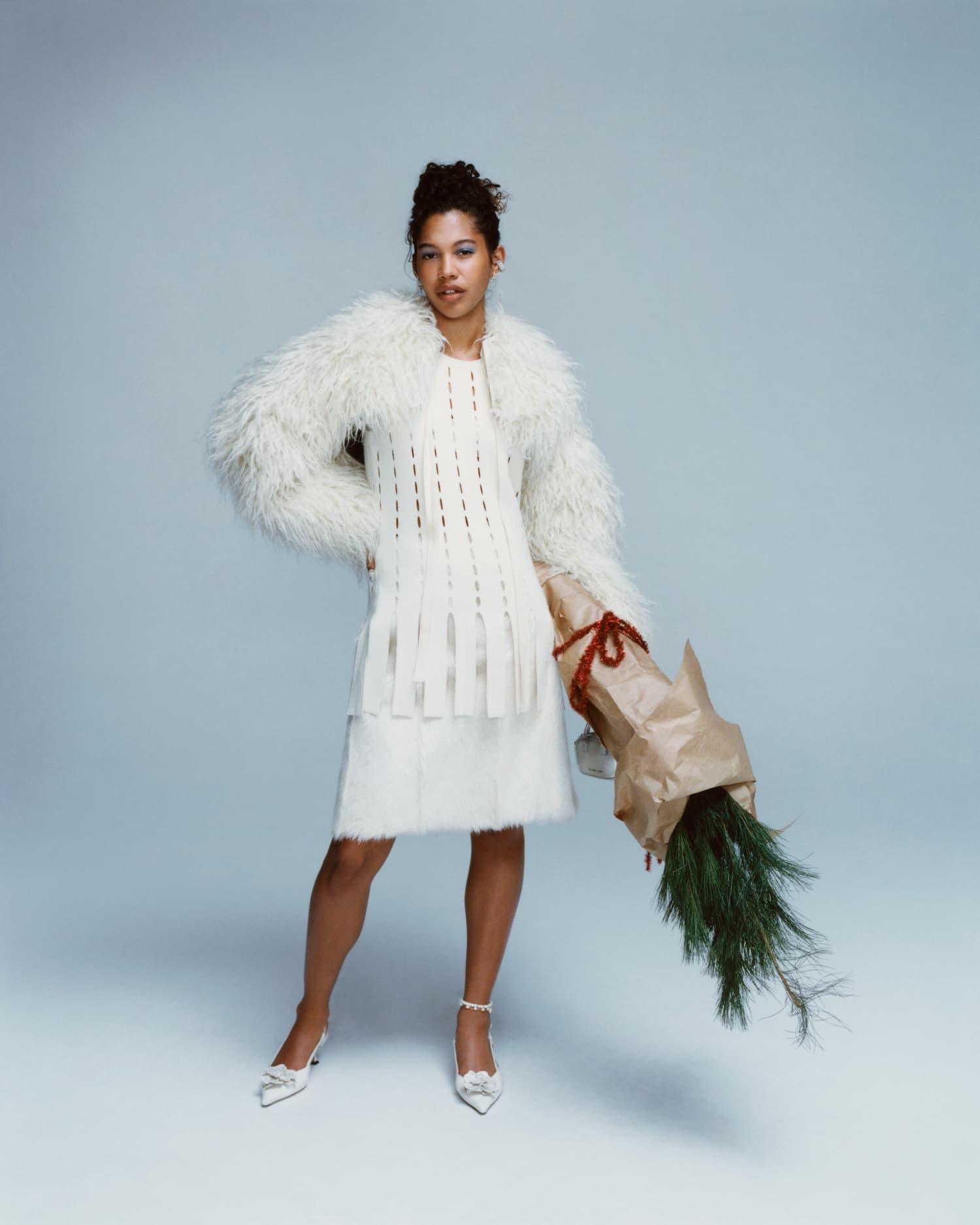
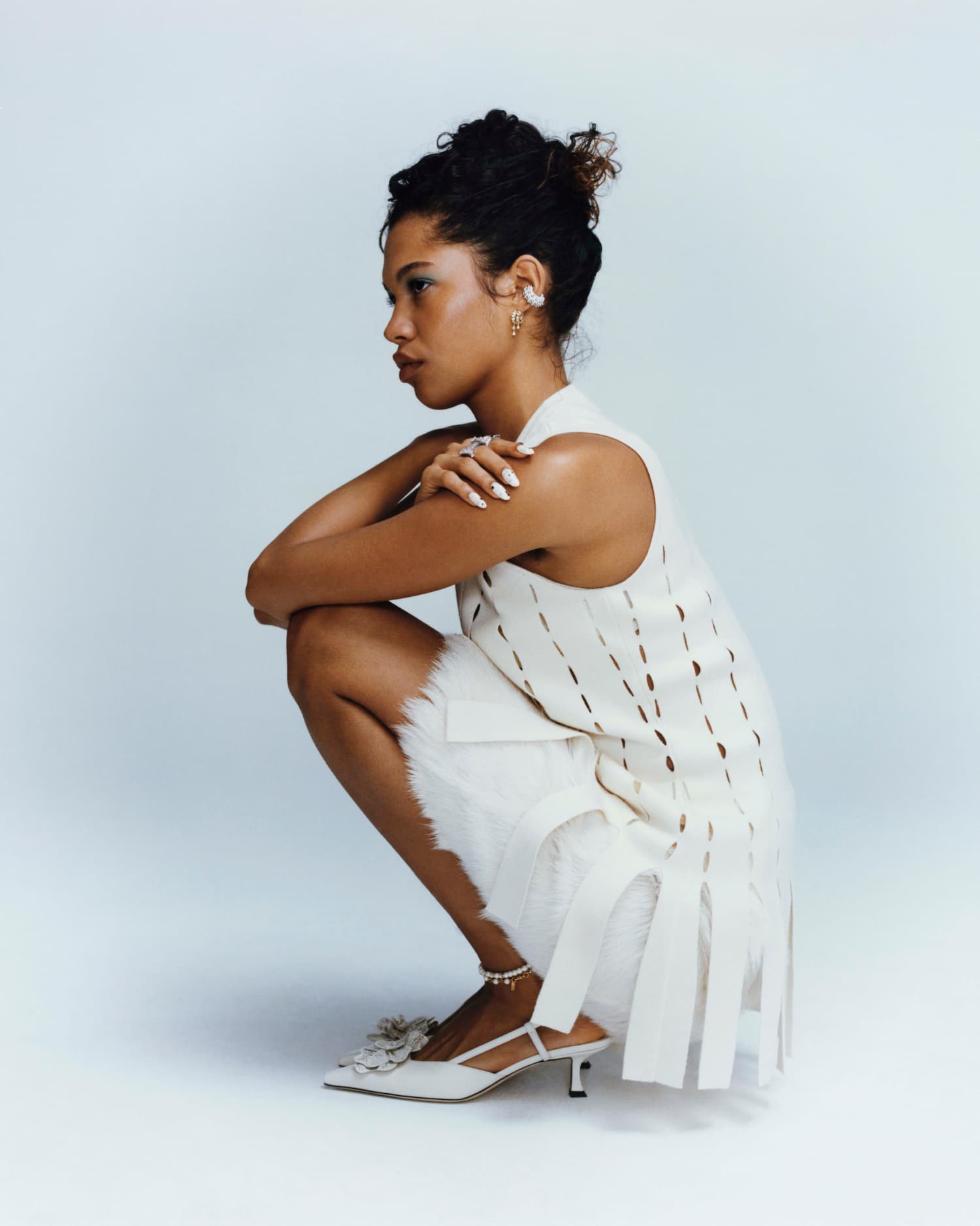
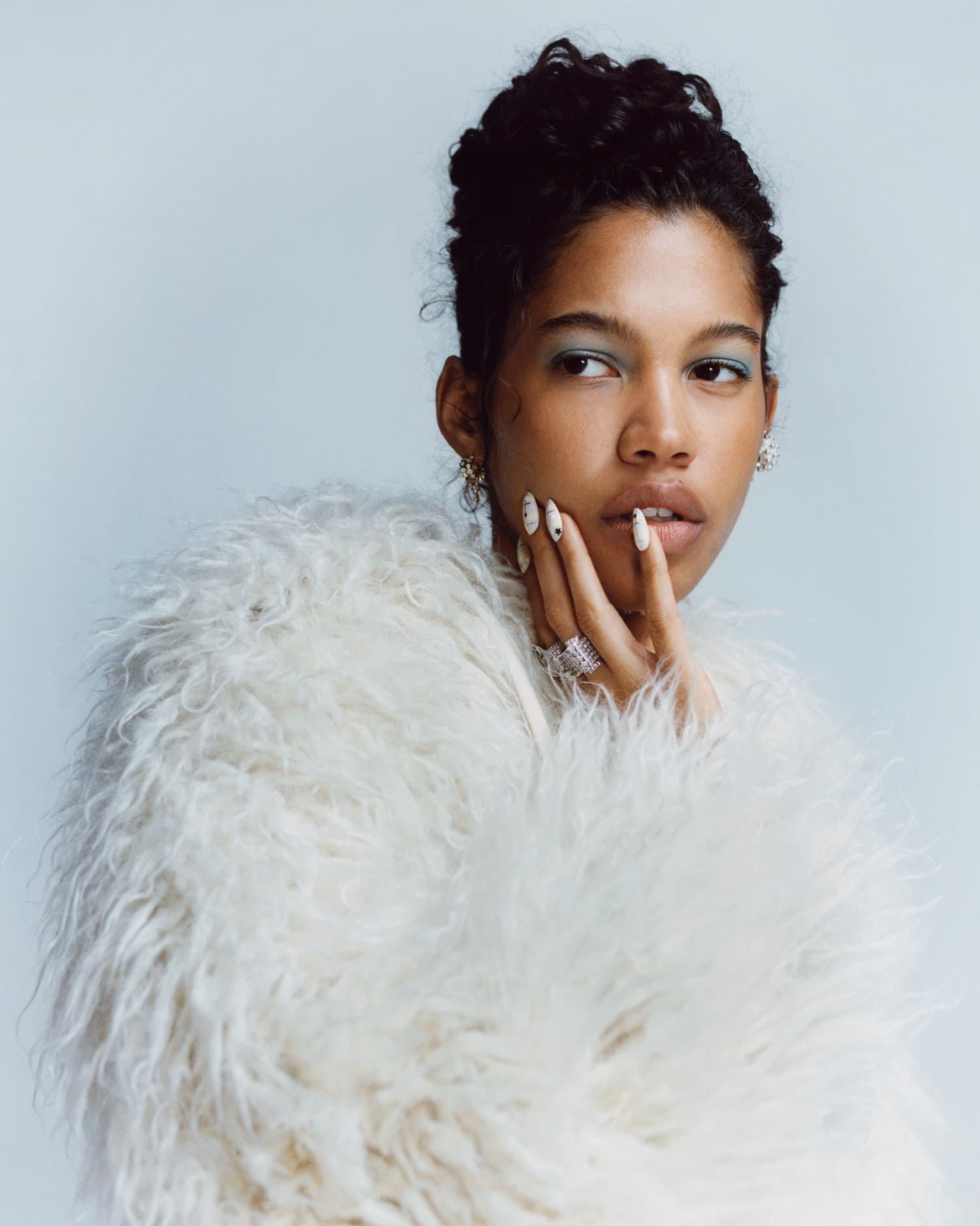
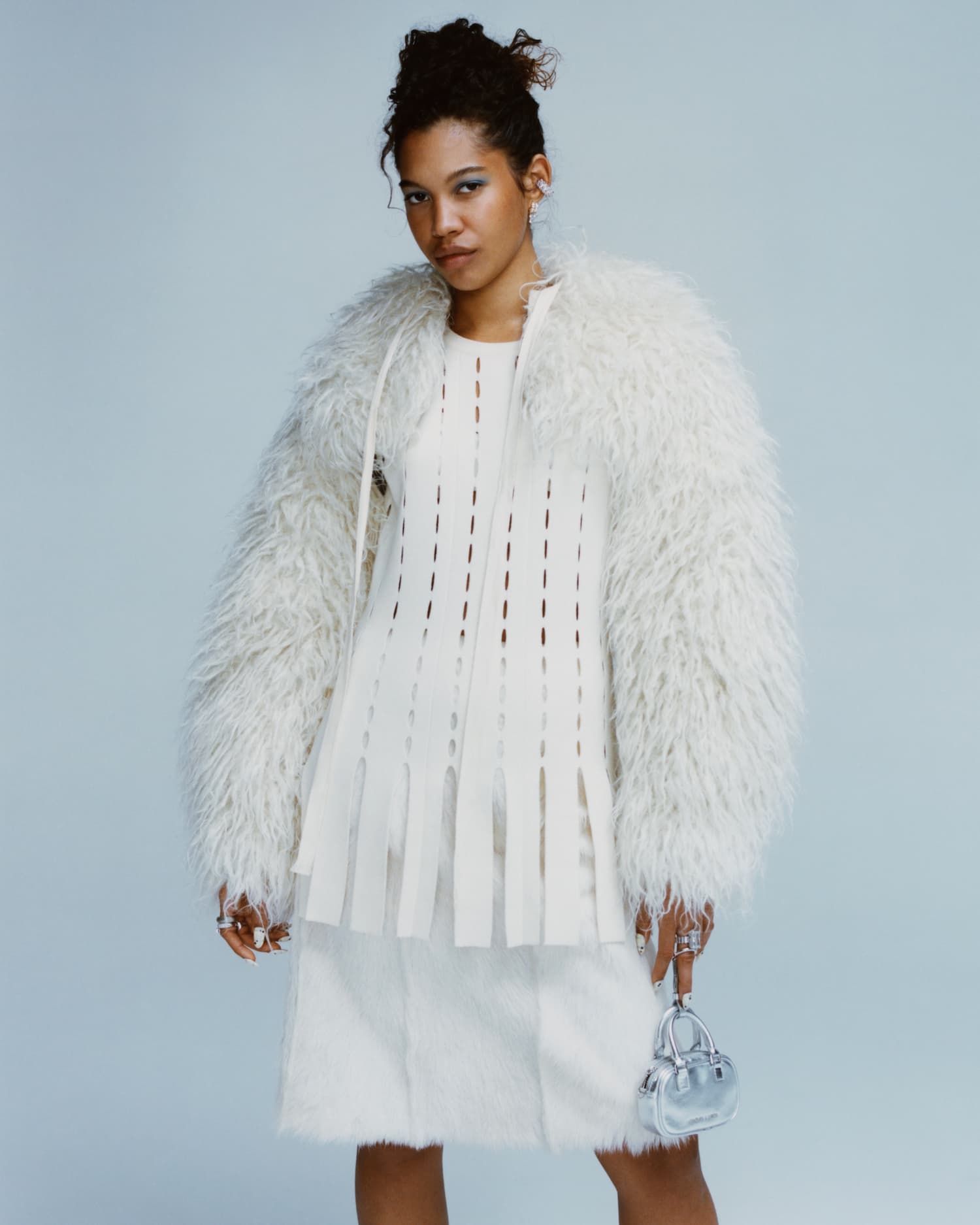
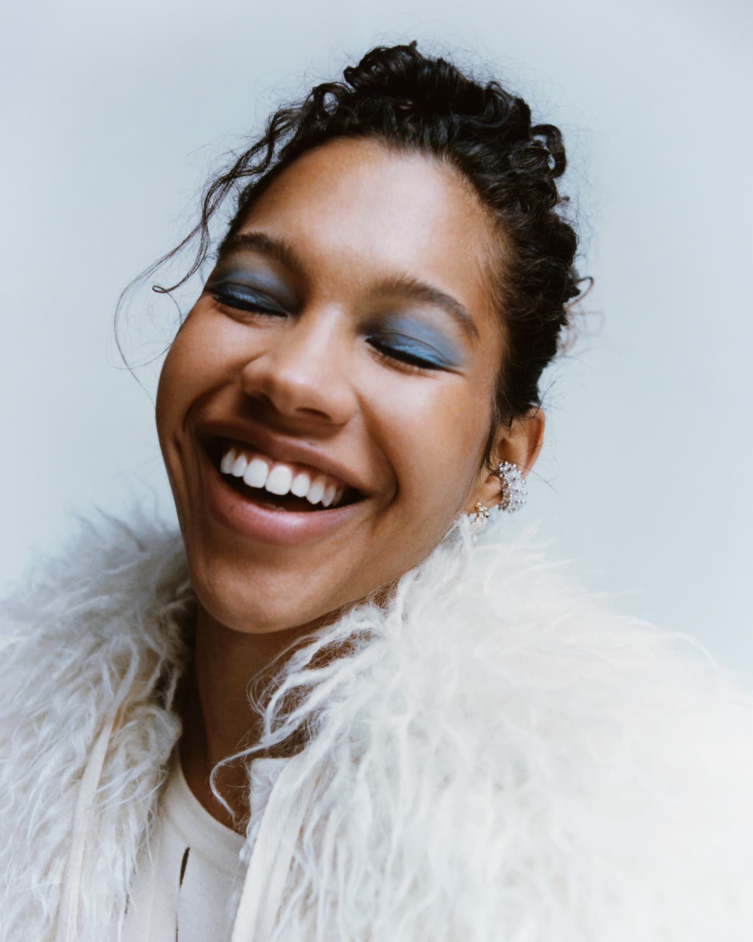
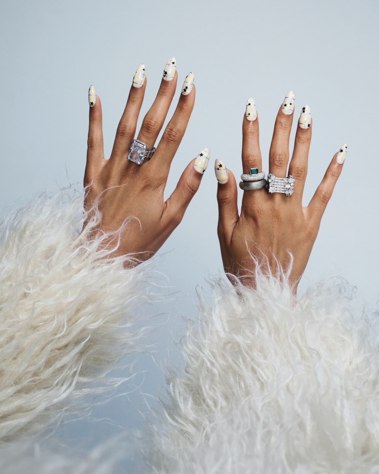
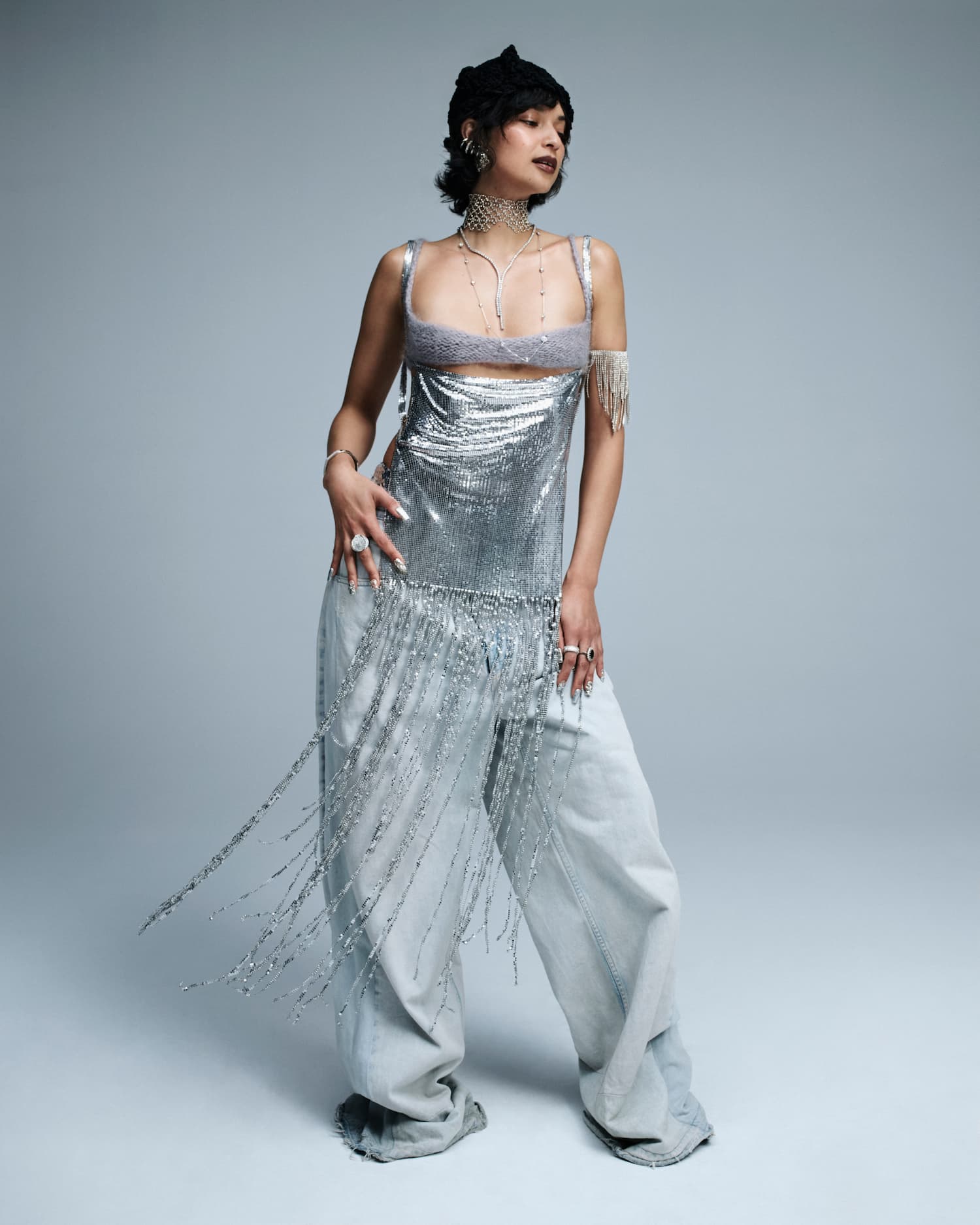
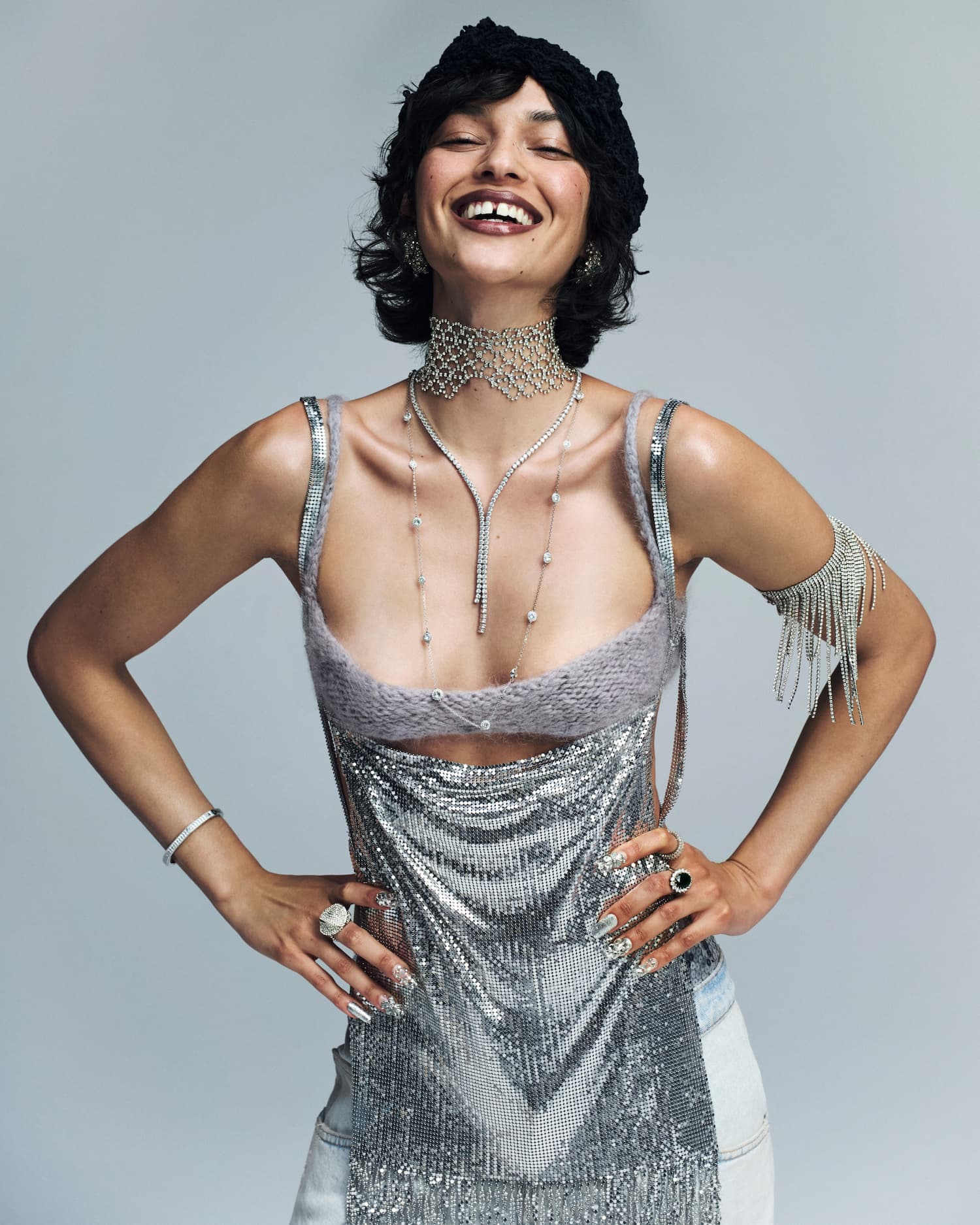
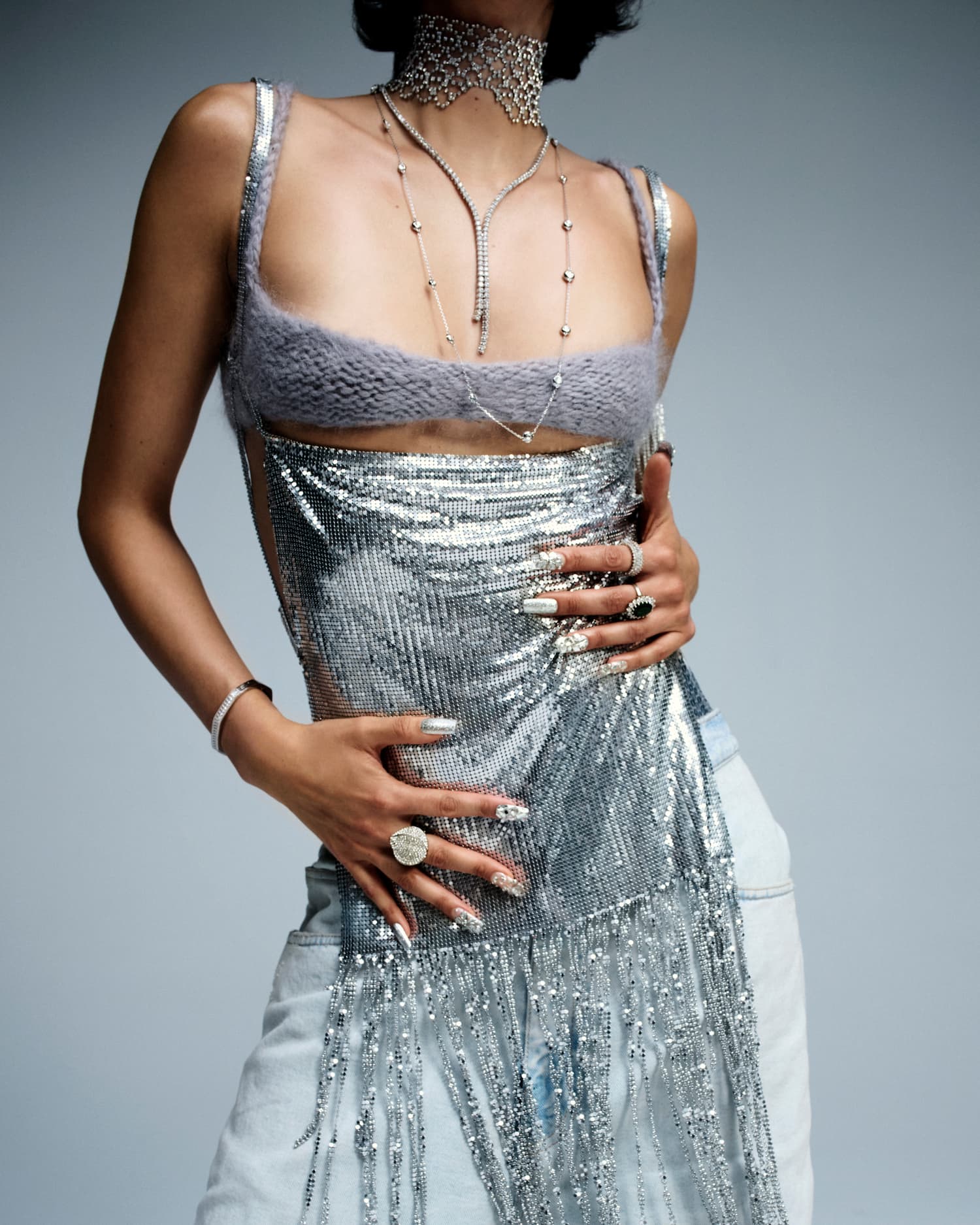
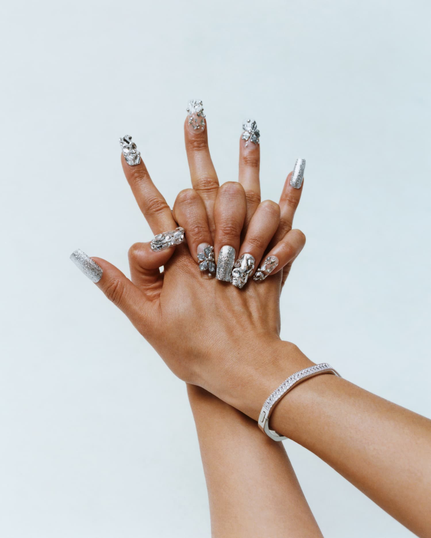
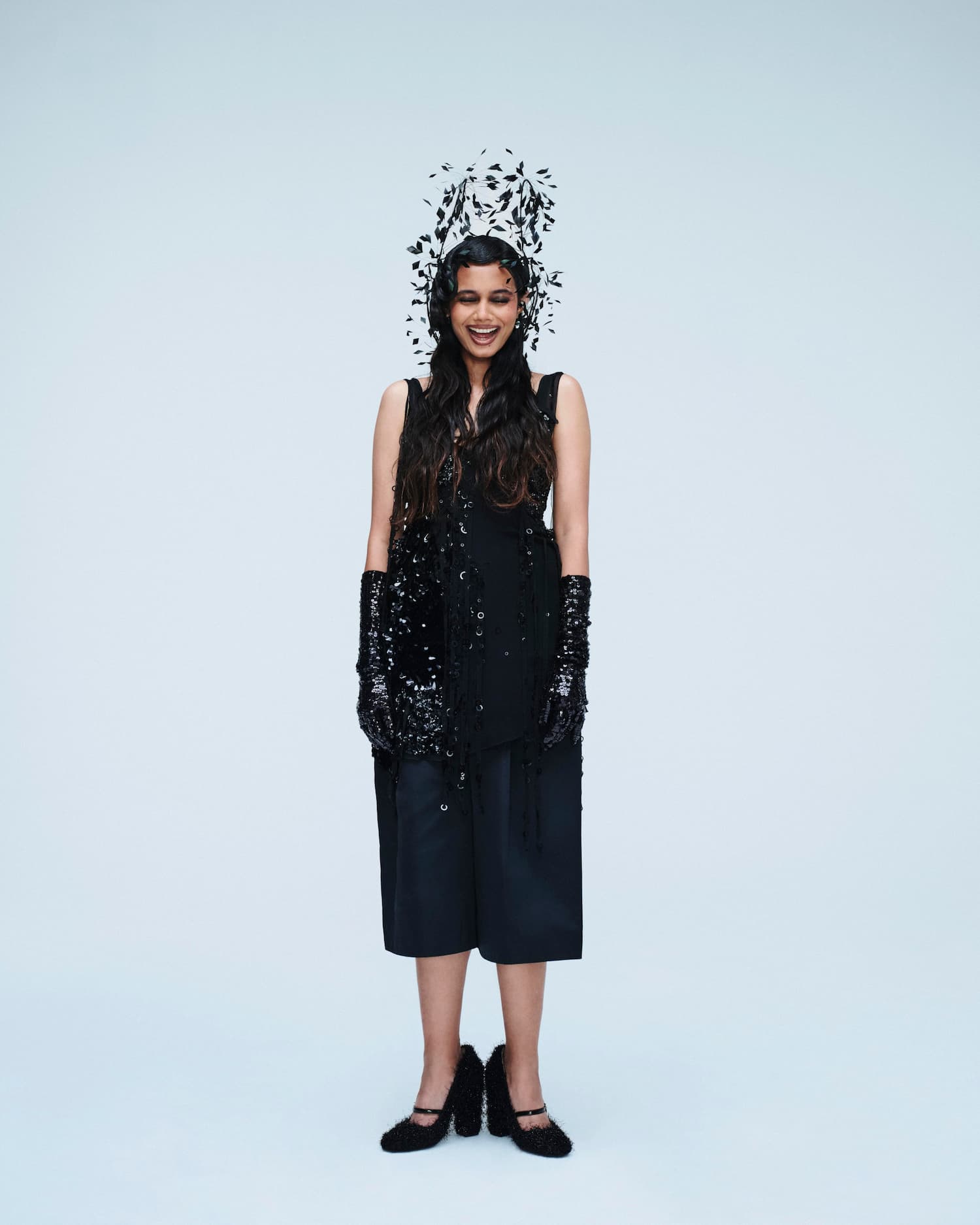
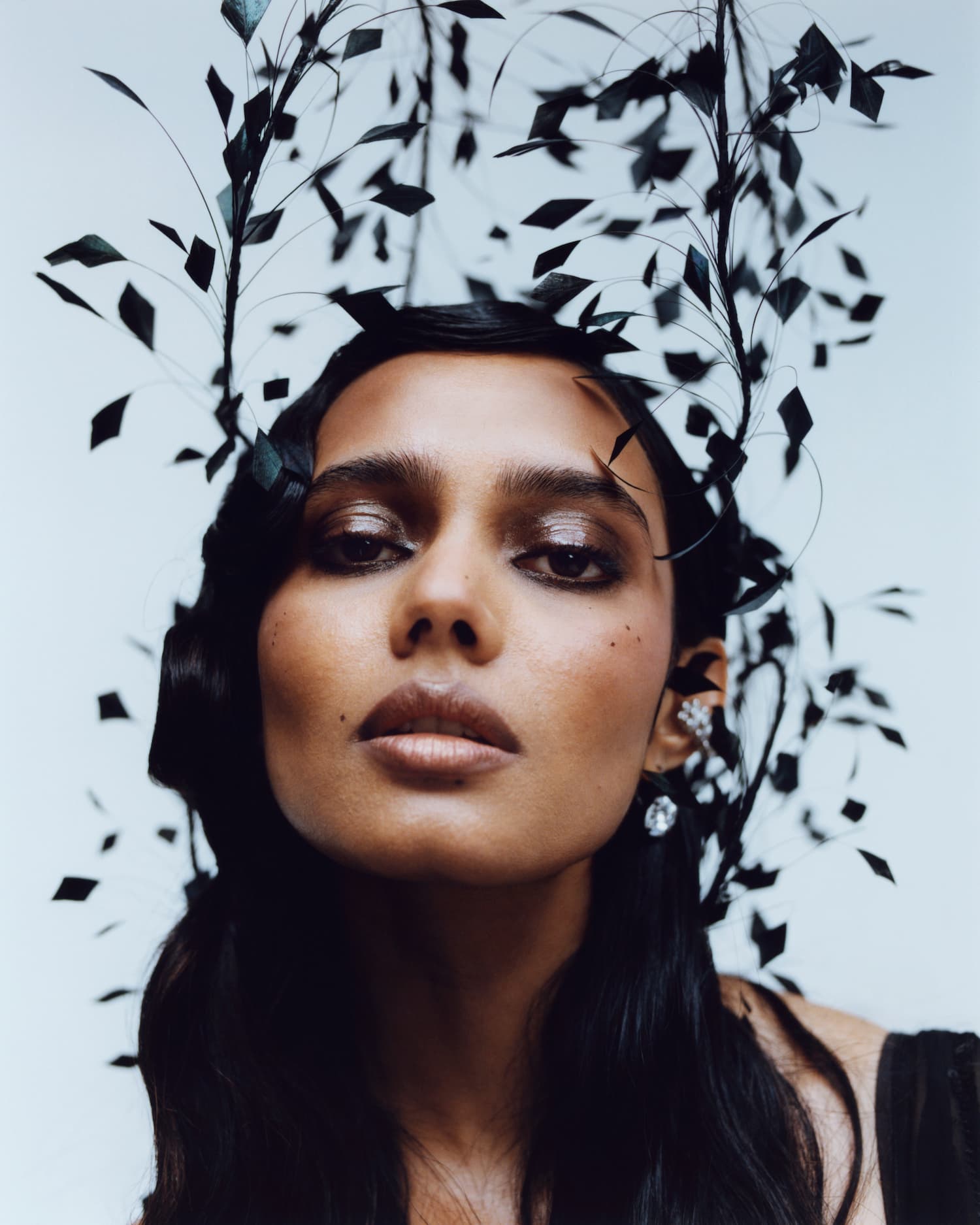
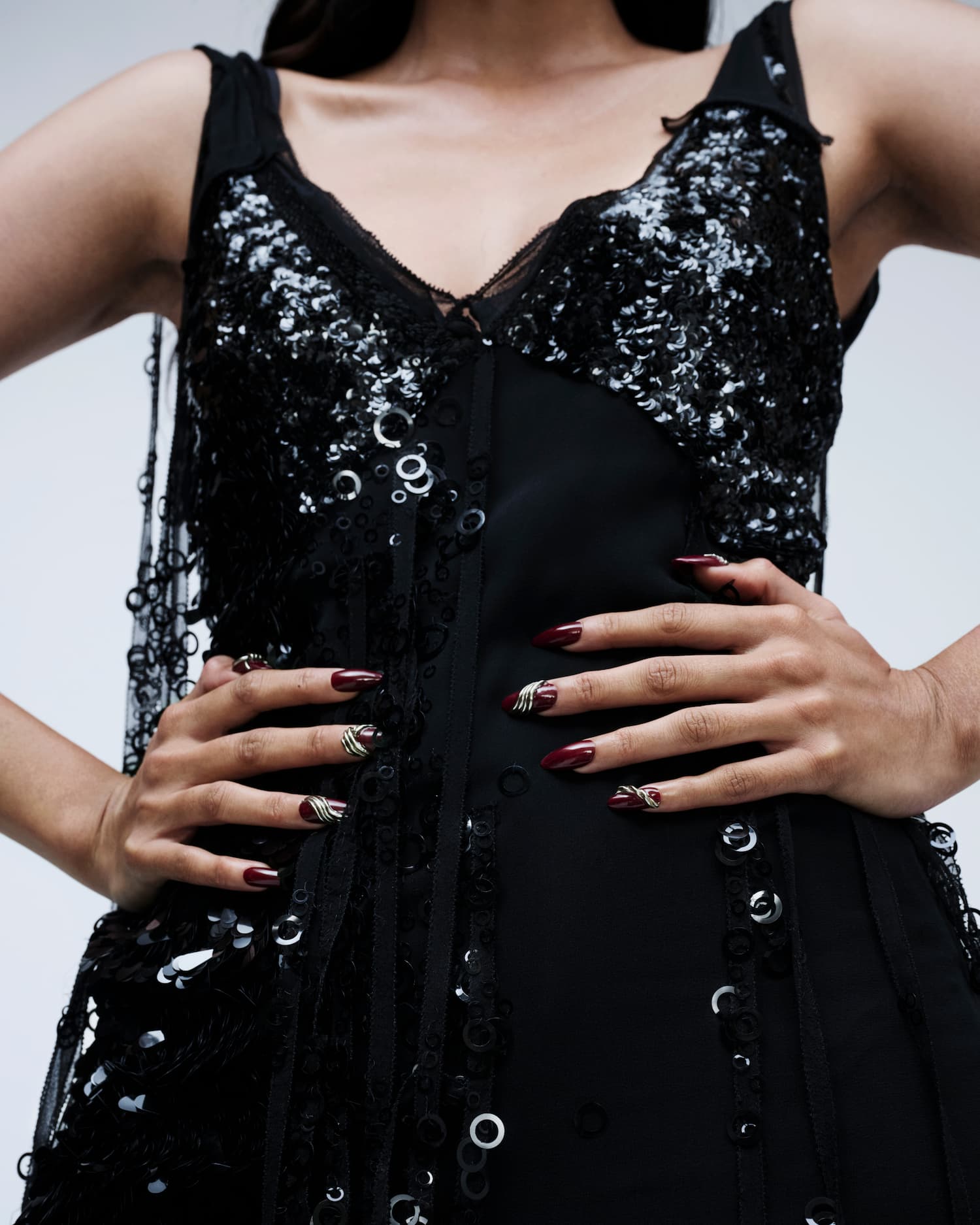
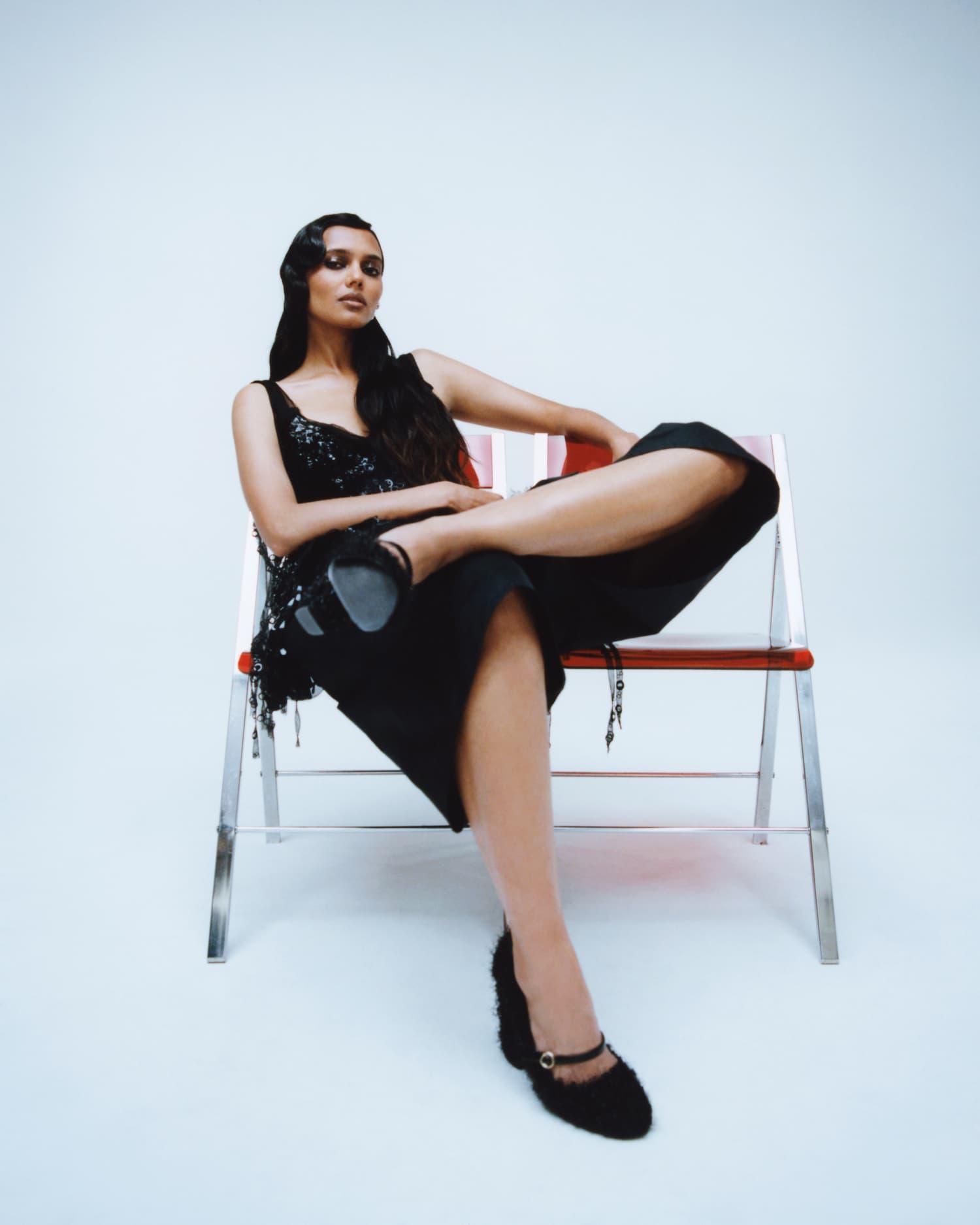
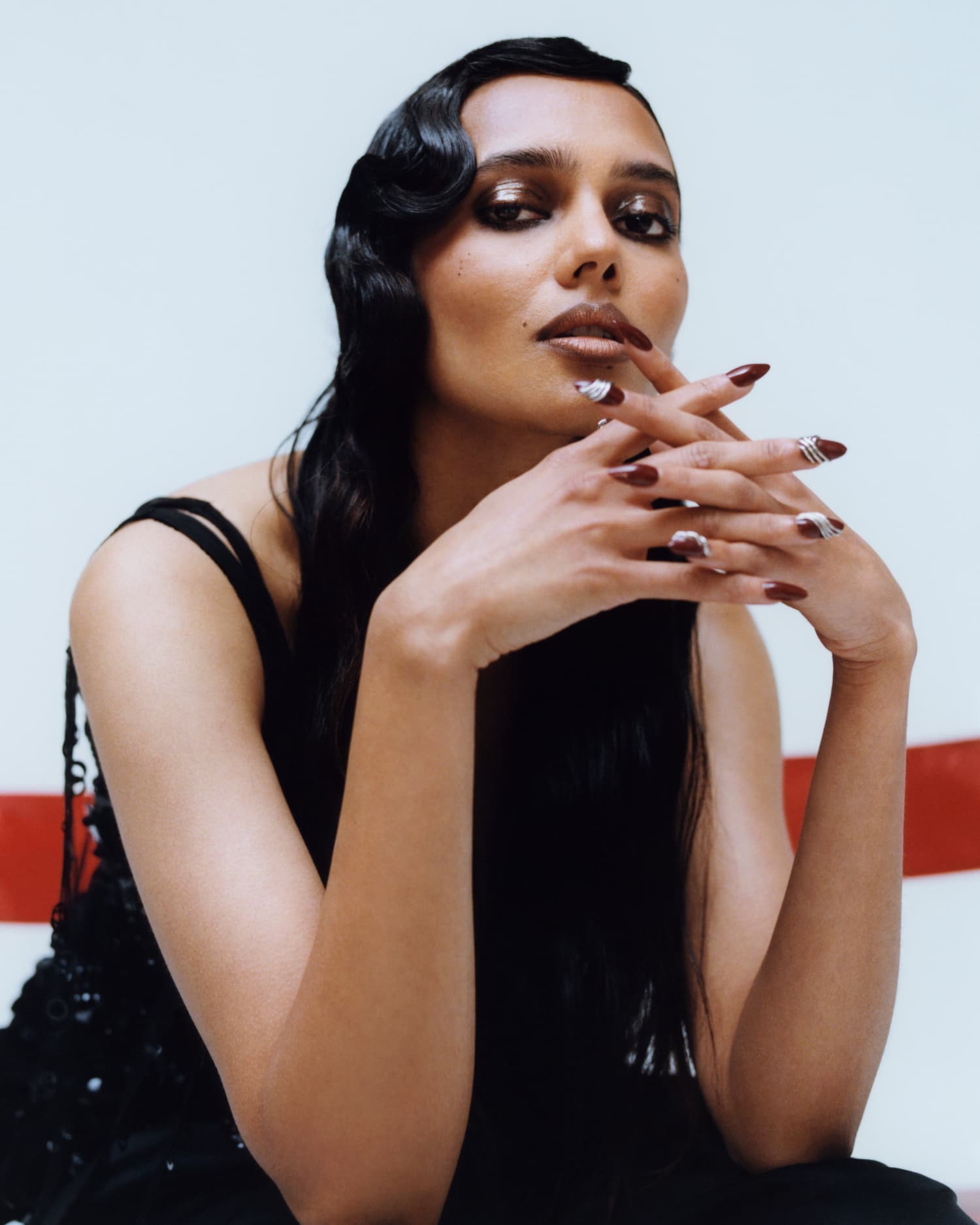
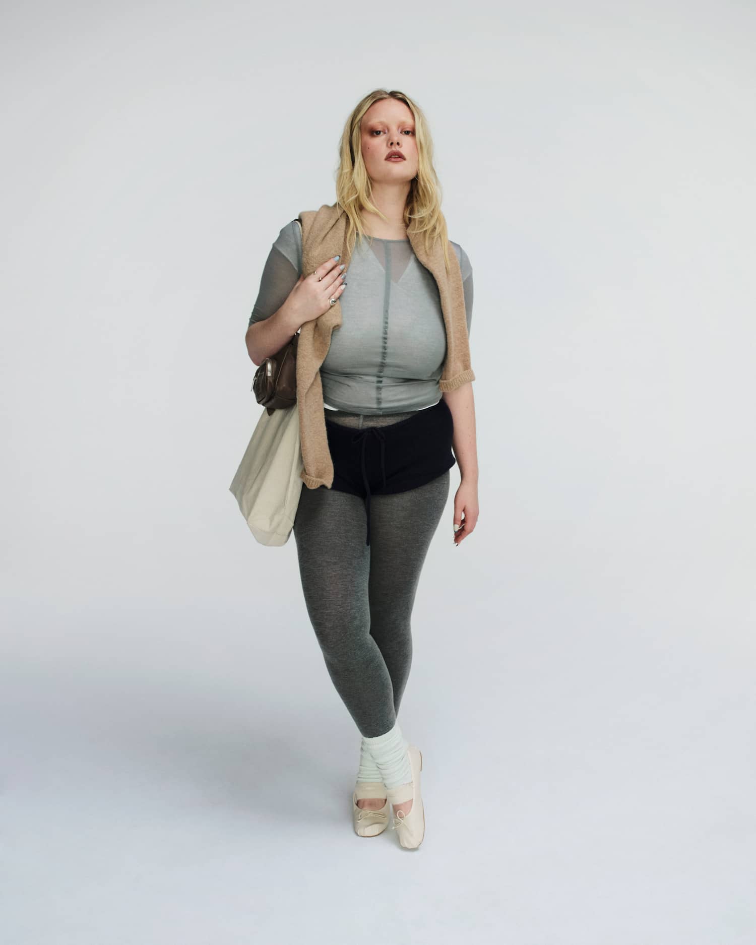
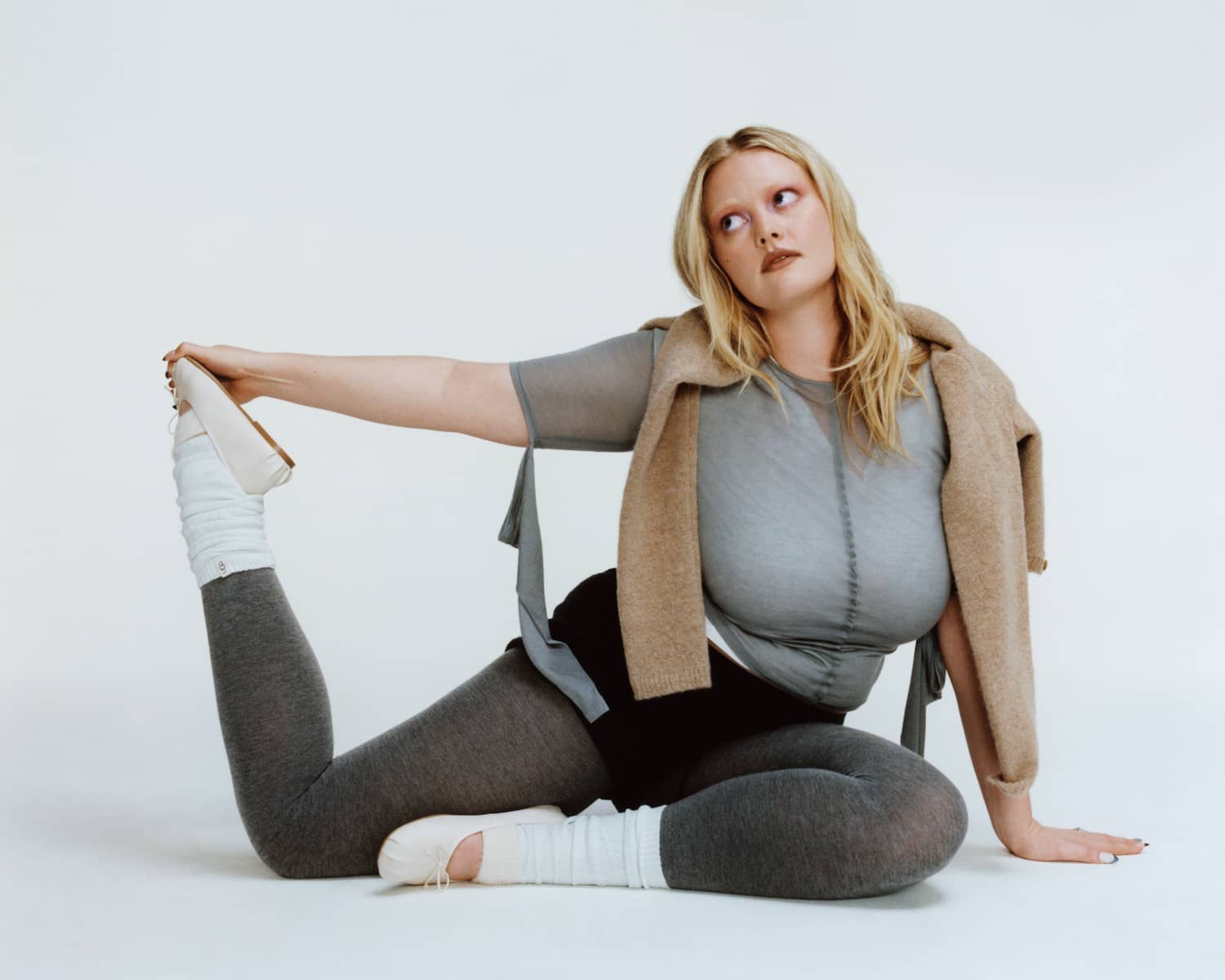
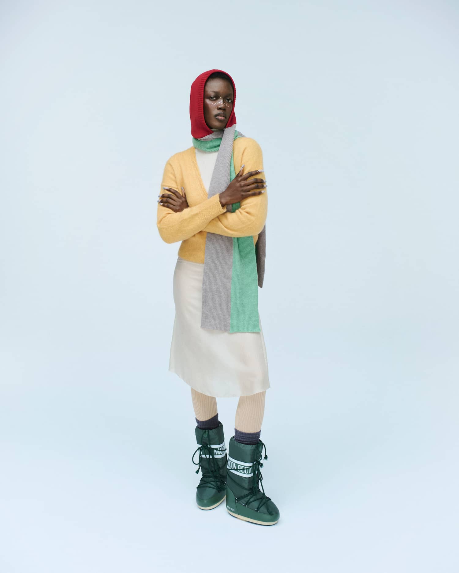
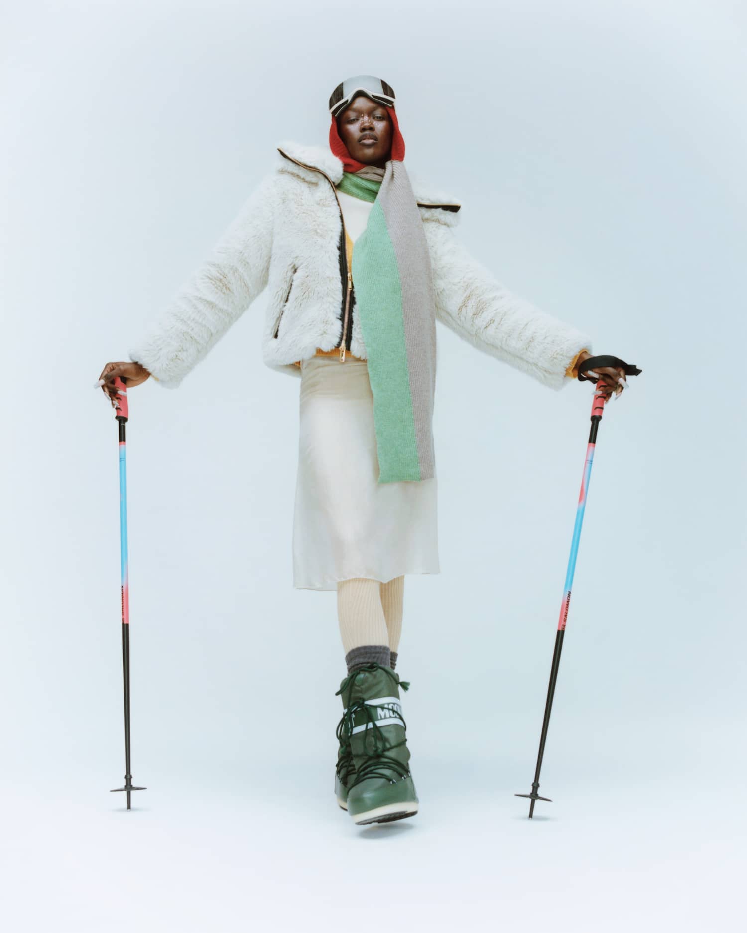
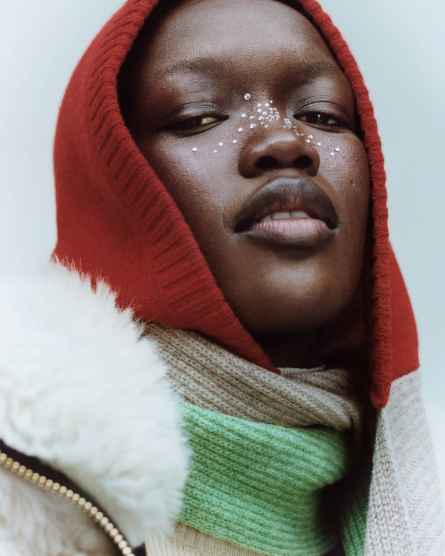
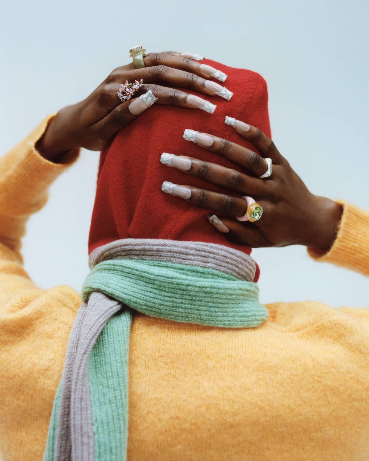
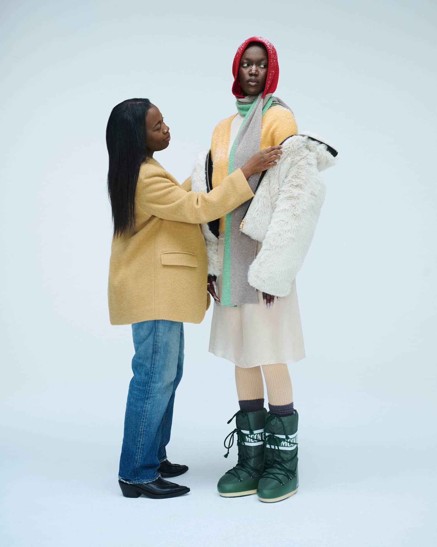
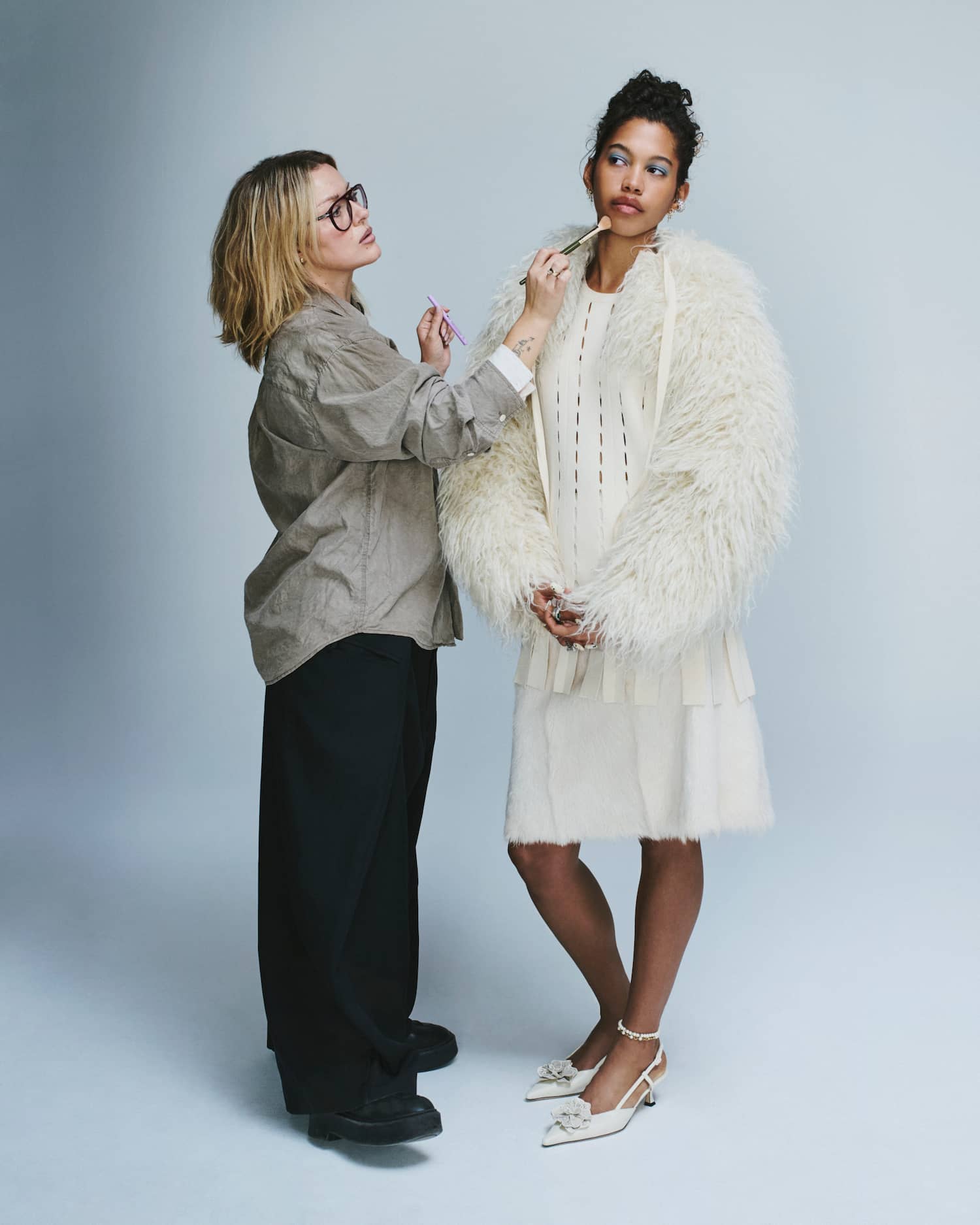
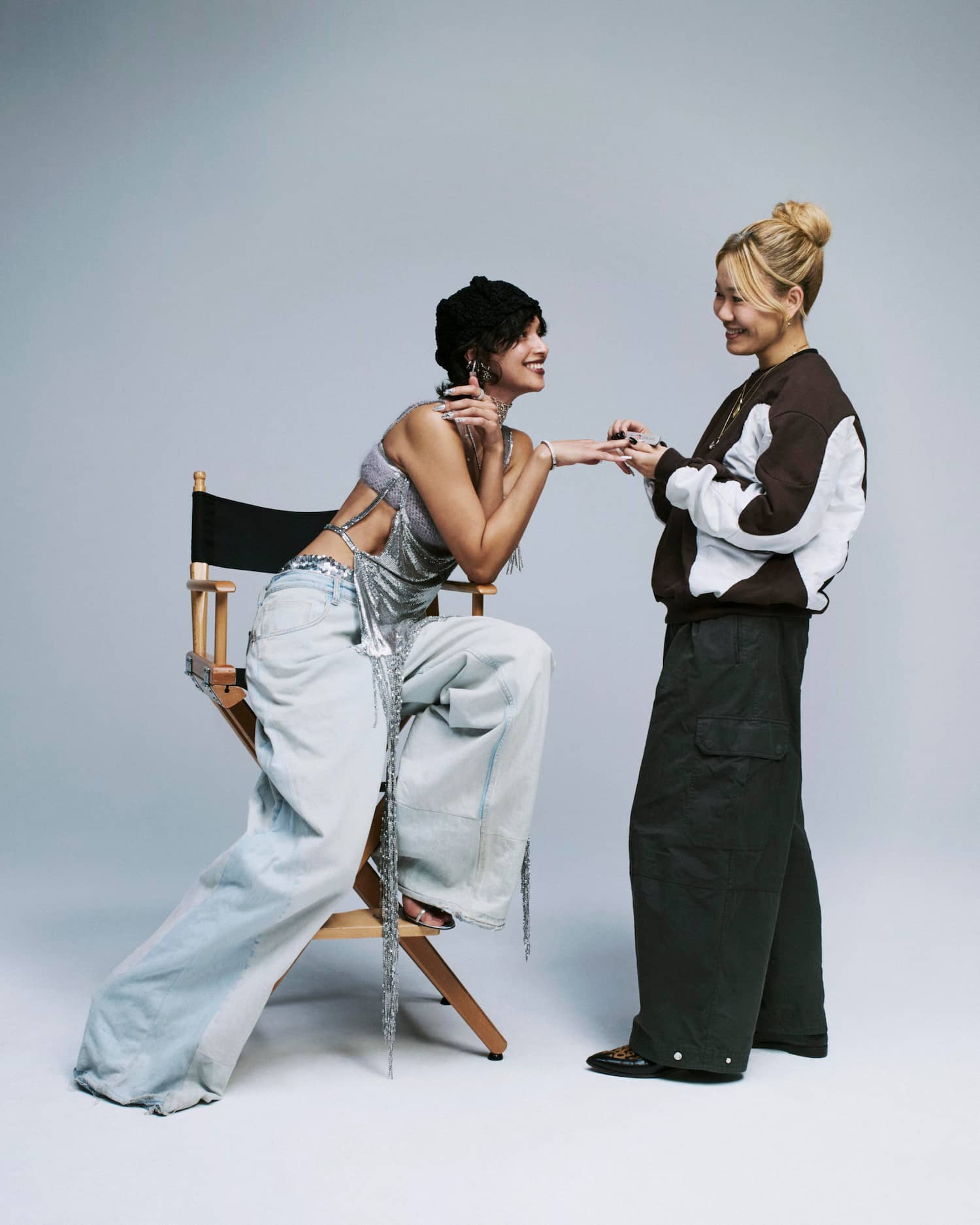
Winter loves to challenge us. It’s a season teeming with unexpected dress-codes, temperature drops, and parties, parties, parties. We tapped three of the industry’s most inspiring artists to create five looks to inspire your season, whether you’re hosting or guesting.
let CaroMobile = false;
if (navigator.userAgent.match(/Android|BlackBerry|iPhone|iPad|iPod|Opera Mini|IEMobile/i)) {
CaroMobile = true;
}
function CaroLeft(id,crd) {
let w = (window.innerWidth)/2;
let i = [“CARO__scroller” + id];
let o = document.getElementById(i);
o.scrollLeft += -(w);
}
function CaroRight(id,crd) {
let w = (window.innerWidth)/2;
let i = [“CARO__scroller” + id];
let o = document.getElementById(i);
o.scrollLeft += w;
}
function CaroArrows(id,crd) {
const ar_l = “>”;
const ar_r = “>”;
// Arrows code, add id to the fucntion calls
const a = “
“;
// Target the carousel
let b = document.querySelectorAll(“.caro__arrows”)[id];
// Add arrows to carousel
b.innerHTML = a;
}
function CaroMonitor(id,wd,crd) {
let i = [“CARO__scroller” + id];
let o = document.getElementById(i);
let pos = o.scrollLeft;
// Get number of cards in scroller
let num = o.childElementCount;
// Get window width
let w = window.innerWidth;
// Calc scrolling sapce
let max = -((w – wd));
let gla = [“CARO__left” + id];
let gra = [“CARO__right” + id];
let la = document.getElementById(gla);
let ra = document.getElementById(gra);
// Left Arrow
if (pos > -20 && pos max) {
ra.style.display = “none”;
ra.style.opacity = “0.0”;
} else {
ra.style.display = “block”;
ra.style.opacity = “1.0”;
}
}
function CaroDevice(id) {
let i = [“CARO__scroller” + id];
let o = document.getElementById(i);
let pos = o.scrollLeft;
if (pos > 100) {
let gra = [“CARO__right” + id];
let ra = document.getElementById(gra);
ra.style.opacity = “0.0”;
ra.style.transition = “all 0.7s”;
ra.style.WebkitTransition = “all 0.7s”;
let wait = setTimeout(function() {
ra.style.display = “none”;
clearTimeout(wait);
}, 200);
}
}
function CaroCount(id) {
let a = [“CARO__scroller” + id];
let b = document.getElementById(a).children;
return b.length;
}
function CaroWidthCheck(id,wd,count) {
let w = window.innerWidth;
let a = [“CARO__scroller” + id];
let b = document.getElementById(a);
let gla = [“CARO__left” + id];
let gra = [“CARO__right” + id];
let la = document.getElementById(gla);
let ra = document.getElementById(gra);
console.log(id + “browser ” + w);
console.log(id + “scroller ” + wd);
if (wd < w) {
b.style.justifyContent = “center”;
la.style.visibility = “hidden”;
ra.style.visibility = “hidden”;
} else {
b.style.justifyContent = “start”;
la.style.visibility = “visible”;
ra.style.visibility = “visible”;
}
}
function CaroSetup(id) {
// Assemble carousel id attribute
let a = [“CARO” + id];
let aa = [“CARO__scroller” + id];
// Target the carousel
let b = document.querySelectorAll(“.caro”)[id];
let bb = document.querySelectorAll(“.caro__scroller-list”)[id];
// Get width of cards
let crd = bb.querySelectorAll(“.caro__card”)[1].clientWidth; // Get width from the second card
// Set the attribute of the carousel
b.setAttribute(“id”,a);
bb.setAttribute(“id”,aa);
// Get width of the scroller element
let wd = bb.scrollWidth;
let count = CaroCount(id);
// Watch the carousel scolling
bb.addEventListener(“scroll”, function() {
if (CaroMobile == false) {
CaroMonitor(id,wd,crd);
} else {
CaroDevice(id);
}
}, false);
// Add the arrows
CaroArrows(id,crd);
// Check width of cards, if not wider than browser, center and turn off arrows
CaroWidthCheck(id,wd,count);
}
function CaroResize() {
let a = document.querySelectorAll(“.caro”);
let b,c,d,wd;
for (let i = 0; i < a.length; i++) {
b = [“CARO__scroller” + i];
c = document.getElementById(b);
d = b.childElementCount;
wd = c.scrollWidth;
CaroWidthCheck(i,wd,d);
}
}
function CaroInit() {
// Look for Carousels
let a = document.querySelectorAll(“.caro”);
// Run setup for each carousel found
for (let i = 0; i < a.length; i++) {
CaroSetup(i);
}
// If browser resize, recheck if carousels need centering and arrows
window.onresize = function() {
CaroResize();
};
}
const CaroWait = setTimeout(function() {
clearTimeout(CaroWait);
let a = document.querySelectorAll(“.caro”)[0].id;
if (a != “CARO0”) {
CaroInit();
}
}, 500);

<!–
–>

competing with it.
<!–
–>


<!–
–>

<!–
–>

without giving yeti.
<!–
–>
.gallery__item {
width: 30%;
}
.is-double {
width: 66%;
}
.gallery__detail-group {
display: flex;
flex-direction: row;
gap: 0;
height: 60vh;
background: #e8e0cc;
background: -webkit-linear-gradient(180deg, rgba(232, 224, 204, 1) 0%, rgba(230, 202, 225, 1) 100%);
background: -moz-linear-gradient(180deg, rgba(232, 224, 204, 1) 0%, rgba(230, 202, 225, 1) 100%);
background: linear-gradient(180deg, rgba(232, 224, 204, 1) 0%, rgba(230, 202, 225, 1) 100%);
filter: progid:DXImageTransform.Microsoft.gradient(startColorstr=”#E8E0CC”, endColorstr=”#E6CAE1″, GradientType=0);
}
.gallery__detail-card {
display: flex;
flex-direction: column;
gap: 0;
justify-content: center;
align-content: center;
white-space: normal;
padding: 40px;
}
.detail__header {
font-family: var(–Ivy-Presto);
font-weight: 400;
font-size: 1.85rem;
color: var(–color-black);
text-align: left;
}
.detail__title {
font-family: var(–Ivy-Presto);
font-weight: 400;
font-size: 1.2rem;
color: var(–color-black);
text-align: left;
padding-bottom: 12px;
}
.detail__blurb {
font-family: var(–Ivy-Presto);
font-weight: 400;
font-size: 1rem;
text-transform: none;
text-align: left;
line-height: 1.5;
margin-bottom: 25px;
color: var(–color-black);
padding-top: 10px;
}
.detail__label {
font-family: ‘Roboto Mono’, monospace;
font-weight: 400;
font-size: 0.75rem;
text-transform: uppercase;
text-align: left;
color: var(–color-black);
}
a.detail__link {
font-family: ‘Brown Regular’, sans-serif;
font-weight: 400;
font-size: 1.3rem;
text-transform: none;
text-align: left;
margin: 8px 0 15px;
color: var(–color-black);
text-decoration: none;
line-height: 1.32;
transition: all 0.3s ease-in-out;
-webkit-transition: all 0.3s ease-in-out;
}
@media only screen and (max-width: 1200px) {
a.detail__link {
font-size: 1.15rem;
}
}
a.detail__link span {
border-bottom: 1px solid var(–color-black);
transition: all 0.15s ease-in-out;
-webkit-transition: all 0.15s ease-in-out;
}
a.detail__link:hover {
color: #FFEEEE;
transition: all 0.15s ease-in-out;
-webkit-transition: all 0.15s ease-in-out;
}
a.detail__link:hover span {
border-bottom: 1px solid transparent;
background: #54374C;
transition: all 0.15s ease-in-out;
-webkit-transition: all 0.15s ease-in-out;
}
.is-smaller img {
height: 60vh;
}
.is-smaller.gallery__image-group {
display: flex;
flex-direction: column;
gap: 20px;
height: 60vh;
}
.is-smaller.gallery__image-group img {
height: 48%;
}
.gallery__container {
gap: 20px;
padding: 0 20px;
}
.special {
width: 100%;
margin: 0 auto;
display: flex;
flex-direction: column;
justify-content: center;
align-items: center;
gap: 40px;
margin: 0;
padding: 0;
}
.special__container {
width: 100%;
max-width: 500px;
display: flex;
flex-direction: column;
justify-content: center;
align-items: center;
gap: 0;
flex-wrap: wrap;
padding: 0;
margin: 0 auto;
}
.special__column {
width: 100%;
display: flex;
flex-direction: column;
justify-content: stretch;
align-items: start;
}
.special__column img {
width: 100%;
}
.is-details {
padding: 20px 30px 30px;
}
.special__grid {
width: 100%;
display: flex;
flex-direction: row;
flex-wrap: wrap;
gap: 0;
font-size: 0;
padding: 0;
margin: 0;
overflow: hidden;
}
.special__grid>img {
width: 50%;
}
.detail__instagram {
margin-bottom: 20px;
}
.detail__instagram a {
padding: 0 0 0 0;
}
.detail__instagram a svg {
width: 30px;
height: 30px;
padding: 0;
background-color: transparent;
transition: all 0.15s ease-in-out;
-webkit-transition: all 0.15s ease-in-out;
border-radius: 6px;
}
.detail__instagram a:hover svg {
background-color: #54374C;
transition: all 0.15s ease-in-out;
-webkit-transition: all 0.15s ease-in-out;
}
.detail__instagram a svg path {
fill: #54374C;
transition: all 0.15s ease-in-out;
-webkit-transition: all 0.15s ease-in-out;
}
.detail__instagram a:hover svg path {
fill: #FFEEEE;
transition: all 0.15s ease-in-out;
-webkit-transition: all 0.15s ease-in-out;
}
.artist__products {
width: 100%;
max-width: 1100px;
}
.artist__products .caro__card {
width: 23% !important;
}
/* Updates */
.special {
gap: 20px;
margin-bottom: 80px;
}
.special__grid {
gap: 20px;
flex-direction: column;
}
.special__grid-image {
width: 100%;
}
.is-taller {
width: 25%;
padding: 0 0 0 20px;
}
.is-taller:last-of-type {
width: 25%;
padding: 0 0 0 20px;
}
.special__grid {
column-gap: 20px;
flex-direction: column;
justify-content: start;
align-items: end;
}
.special__container {
align-items: start;
}
.is-bigger {
padding-right: 0;
overflow: hidden;
justify-content: start;
align-items: start;
}
.is-bigger img {
margin-top: -30px;
}
.is-break {
display: block;
}
.special a img {
transform: scale(1.0);
transition: all 0.5s ease-in;
-webkit-transition: all 0.5s ease-in;
}
.special a:hover img {
transform: scale(1.1);
transition: all 0.5s ease-in;
-webkit-transition: all 0.5s ease-in;
}
.special__column,
.special__grid-image {
overflow: hidden;
}
@media only screen and (max-width: 1100px) {
.is-details {
padding: 20px;
}
.detail__header {
font-size: 2.3rem;
}
.detail__title {
font-size: 1.65rem;
}
}
@media only screen and (max-width: 960px) {
.special__container {
width: 100%;
max-width: 600px;
display: flex;
flex-direction: column;
justify-content: center;
align-items: center;
gap: 0;
row-gap: 20px;
flex-wrap: wrap;
padding: 0;
margin: 0 auto;
}
.special__container.is-grids {
flex-direction: row;
}
.special__column {
width: 100%;
}
.is-details {
padding: 0 25px 40px;
}
.detail__header {
font-size: 2.3em;
}
.detail__title {
font-size: 1.4rem;
}
.is-taller {
width: 50%;
padding: 0 10px 0 0;
}
.is-taller:last-of-type {
width: 50%;
padding: 0 0 0 10px;
}
}
@media only screen and (max-width: 760px) {
.is-break {
display: none;
}
}
.is-footnote {
justify-content: center;
margin-top: -10px;
}
.detail__instagram {
display: none !important;
}
.artists {
display: flex;
flex-direction: row;
justify-content: center;
align-items: start;
gap: 20px;
width: 100%;
max-width: 1500px;
margin: 0 auto;
padding: 0 20px;
}
.QA {
position: relative;
}
.QA__set {
display: none;
opacity: 0.0;
width: 100vw;
height: 105vh;
position: fixed;
top: 0;
left: 0;
background-color: rgba(0,0,0,0.4);
z-index: 999999999999;
flex-direction: column;
justify-content: center;
align-items: center;
}
.QA__set-container {
display: flex;
flex-direction: column;
justify-content: start;
align-items: start;
gap: 0;
background-color: var(–color-yellow);
color: var(–color-black);
font-family: var(–Ivy-Presto);
font-weight: 400;
font-size: 1.1rem;
line-height: 1.45;
margin: 0 auto;
width: 80%;
max-width: 960px;
height: 80vh;
text-align: left;
padding: 40px 40px 60px;
}
.QA__set-container h3 {
font-size: 3rem;
margin: 0 0 30px;
}
.QA__set-container p {
padding: 0;
margin: 10px 0;
}
.QA__set-container p strong {
font-weight: 700;
}
.QA__set-container>button {
font-family: ‘Roboto Mono’, monospace;
font-weight: 400;
font-size: 0.75rem;
text-transform: uppercase;
background-color: var(–color-cream);
margin: 0 0 20px auto;
}
.detail__qa>button {
margin-top: 8px;
font-family: ‘Roboto Mono’, monospace;
font-weight: 400;
font-size: 0.75rem;
text-transform: uppercase;
background-color: var(–color-cream);
}
.QA__scroller {
width: 100%;
height: auto;
overflow-y: auto;
padding: 0 20px 0 0;
}
.QA__scroller::-webkit-scrollbar {
width: 6px;
pointer-events: auto;
cursor: pointer;
}
.QA__scroller::-webkit-scrollbar-thumb {
background: rgba(0,0,0,0.07);
border-radius: 6px;
border: 0;
}
.QA__scroller::-webkit-scrollbar-track {
background: rgba(0,0,0,0.05);
padding: 0;
}
.QA__scroller::-webkit-scrollbar-thumb:hover {
background: var(–color-black);
}
@media only screen and (max-width: 1200px) {
.artists {
margin-bottom: 50px;
flex-wrap: wrap;
}
.special {
min-width: 250px;
max-width: 400px;
margin-bottom: 0;
}
}
The Artists
<!–
–>
<!–
–>
<!–
–>
<!–
Q&A with Christine Nicholson
Where dolor sit amet, consectetur adipiscing elit?
Lorem ipsum dolor sit amet, consectetur adipiscing elit. Pellentesque sed diam turpis. Integer lobortis vitae eros in blandit. Cras vel convallis dolor. Etiam eget pharetra turpis, ac porttitor lectus. Nunc eleifend lorem orci, id ultrices mauris dictum quis. Nunc quis lobortis justo. Ut arcu eros, faucibus in faucibus sed, mollis in dolor. Aenean vel faucibus dolor. Interdum et malesuada fames ac ante ipsum primis in faucibus. Curabitur semper varius velit eu laoreet. Cras enim lectus, efficitur vitae mauris a, fermentum interdum elit. Donec in dui nisi.
Nunc eleifend lorem orci, id ultrices mauris dictum quis. Nunc quis lobortis justo. Ut arcu eros, faucibus in faucibus sed, mollis in dolor. Aenean vel faucibus dolor. Interdum et malesuada fames ac ante ipsum primis in faucibus. Curabitur semper varius velit eu laoreet. Cras enim lectus, efficitur vitae mauris a, fermentum interdum elit. Donec in dui nisi.
Q&A with Katie Jane Hughes
Where dolor sit amet, consectetur adipiscing elit?
Lorem ipsum dolor sit amet, consectetur adipiscing elit. Pellentesque sed diam turpis. Integer lobortis vitae eros in blandit. Cras vel convallis dolor. Etiam eget pharetra turpis, ac porttitor lectus. Nunc eleifend lorem orci, id ultrices mauris dictum quis. Nunc quis lobortis justo. Ut arcu eros, faucibus in faucibus sed, mollis in dolor. Aenean vel faucibus dolor. Interdum et malesuada fames ac ante ipsum primis in faucibus. Curabitur semper varius velit eu laoreet. Cras enim lectus, efficitur vitae mauris a, fermentum interdum elit. Donec in dui nisi.
Nunc eleifend lorem orci, id ultrices mauris dictum quis. Nunc quis lobortis justo. Ut arcu eros, faucibus in faucibus sed, mollis in dolor. Aenean vel faucibus dolor. Interdum et malesuada fames ac ante ipsum primis in faucibus. Curabitur semper varius velit eu laoreet. Cras enim lectus, efficitur vitae mauris a, fermentum interdum elit. Donec in dui nisi.
Q&A with Naomi Yasuda
Where dolor sit amet, consectetur adipiscing elit?
Lorem ipsum dolor sit amet, consectetur adipiscing elit. Pellentesque sed diam turpis. Integer lobortis vitae eros in blandit. Cras vel convallis dolor. Etiam eget pharetra turpis, ac porttitor lectus. Nunc eleifend lorem orci, id ultrices mauris dictum quis. Nunc quis lobortis justo. Ut arcu eros, faucibus in faucibus sed, mollis in dolor. Aenean vel faucibus dolor. Interdum et malesuada fames ac ante ipsum primis in faucibus. Curabitur semper varius velit eu laoreet. Cras enim lectus, efficitur vitae mauris a, fermentum interdum elit. Donec in dui nisi.
Nunc eleifend lorem orci, id ultrices mauris dictum quis. Nunc quis lobortis justo. Ut arcu eros, faucibus in faucibus sed, mollis in dolor. Aenean vel faucibus dolor. Interdum et malesuada fames ac ante ipsum primis in faucibus. Curabitur semper varius velit eu laoreet. Cras enim lectus, efficitur vitae mauris a, fermentum interdum elit. Donec in dui nisi.
–>
function showQA(e) {
let a = [“QA” + e];
let b = document.getElementById(a);
b.style.display = “flex”;
b.style.opacity = “1.0”;
}
function hideQA(e) {
let a = [“QA” + e];
let b = document.getElementById(a);
b.style.display = “none”;
b.style.opacity = “0.0”;
}
a.button__large {
font-family: ‘Brown Regular’, sans-serif;
font-weight: 400;
font-size: 0.9rem;
text-transform: uppercase;
color: var(–color-cream);
background-color: var(–color-black);
width: fit-content;
margin: 40px auto;
padding: 12px 25px;
border-radius: 100px;
text-decoration: none;
}
a.button__large:hover {
color: var(–color-black);
background-color: var(–color-white);
}
.credits {
width: 100%;
max-width: 960px;
padding: 80px 20px 80px;
color: var(–color-black);
margin: 0 auto;
text-align: center;
}
.credits>p {
font-family: ‘Roboto Mono’, monospace;
font-size: 0.65rem;
font-weight: 400;
line-height: 1.55;
text-transform: uppercase;
text-align: center;
margin: 0 auto 20px;
}
.credits a {
color: var(–color-black);
text-decoration: underline;
}
CREDITS:
Chief Content Officer: Brooke DeVard;
Featured Stylist: Christine Nicholson;
Featured Celebrity & Editorial Makeup Artist: Katie Jane Hughes;
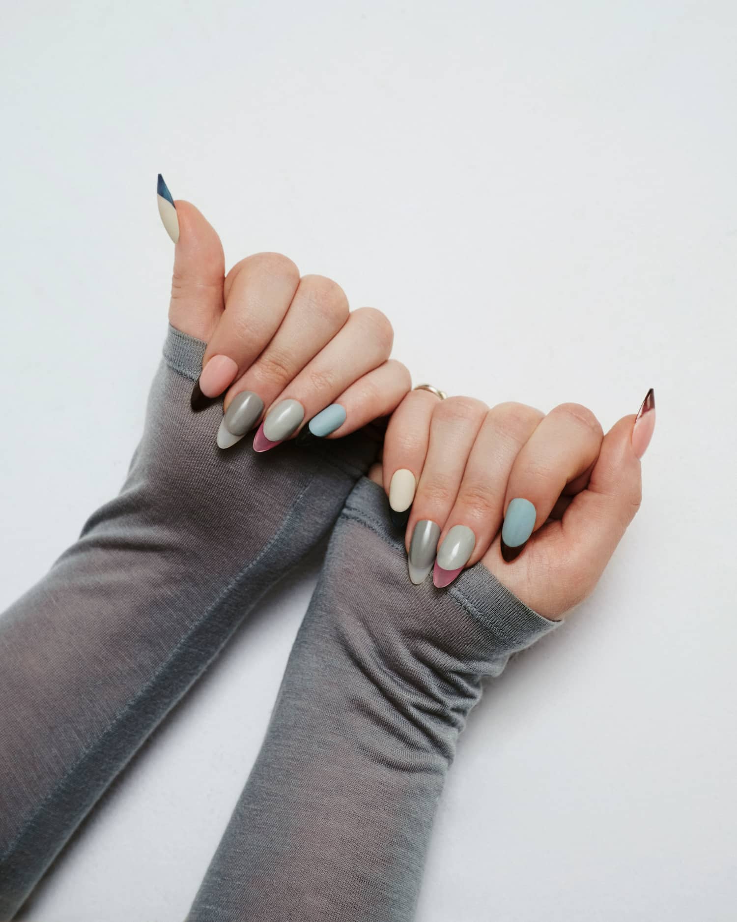
Featured Nail Artist: Naomi Yasuda;
Featured Hairstylist: David Lopez;
Photographer: Emma Anderson;
Model: Gracen Wilkins, Yared Chavez, Ravyanashi Mehta, Delphine Clowe,Adama Jobe;
1st Photo Assistant: Daniel Johnson;
2nd Photo Assistant: Rob Critchlow;
Digital Imaging Technician: Evan Browning;
Director of Photography: Winnie Cheung;
Social Shooter/Editor: Michelle Dufflocq;
B-Cam Operator: Isabel Padilla;
Audio Operator: Vera Quispe;
Production Assistant: Jordan Chavez- Darquea;
Make-up Assistant: Zane J. Chen;
Manicurist Assistant: Tracy Lok;
Wardrobe Assistant: Angie Hines;
Hairstylist Assistant: Natasha Kristine;
Make-up Artist – Brooke: Melissa Drouillard;
VP, Creative: Praise Paige;
Photography & Social Director: Lauren Stair;
Senior Creative Director: Elyza Parker;
Senior Creative Director: Hayley Champoux;
Producer, Production: Sharon Viera;
Supervising Social Producer: Jordan Bogigian;
Production Coordinator: Dawnie Jefferson;
Talent Manager: Anne Marie Andrews;
Social – Strategy: Taylor Loren;
Social: Lia Tabackman;
Fashion: Victoria Montalti;
.stories {
width: 100%;
padding-bottom: 80px;
}
.stories__container {
width: 100%;
display: flex;
flex-direction: row;
flex-wrap: wrap;
justify-content: center;
align-items: center;
gap: 20px;
padding: 0 40px;
margin: 0 auto;
}
.stories__card {
height: 600px;
position: relative;
width: 340px;
margin: 0;
display: inline-block;
background-color: #FFEEEE;
text-align: center;
color: var(–color-black);
min-width: 140px;
-webkit-transition: box-shadow .2s ease-in-out;
transition: box-shadow .2s ease-in-out;
vertical-align: top;
}
.stories__opener-image {
min-height: 405px;
z-index: 40;
position: relative;
}
.stories__opener-image img {
position: static;
width: 100%;
z-index: 60;
}
.stories__story-content {
text-align: left;
margin: 20px;
}
.stories__section {
font-family: Brown Regular, sans-serif;
font-size: 12px;
letter-spacing: .1em;
line-height: 1.2em;
word-spacing: normal;
font-weight: 400;
color: var(–color-black);
text-transform: uppercase;
margin-bottom: 15px;
}
.stories__title {
font-family: Brown Bold, sans-serif;
font-size: 25px;
font-weight: 400;
word-spacing: normal;
letter-spacing: 0em;
line-height: 1.3em;
text-transform: none;
font-size: 20px;
text-align: left;
}
.stories__card a
.stories__title>span {
-webkit-transition: border-bottom 0.1s ease-in;
transition: border-bottom 0.1s ease-in;
border-bottom: 1px solid transparent;
}
.stories__card a:hover
.stories__title>span {
-webkit-transition: border-bottom 0.1s ease-in;
transition: border-bottom 0.1s ease-in;
border-bottom: 1px solid var(–color-black);
}
.stories__story-meta {
font-family: Brown Regular, sans-serif;
font-size: 12px;
letter-spacing: .1em;
line-height: 1.2em;
word-spacing: normal;
font-weight: 400;
text-transform: uppercase;
color: var(–color-black);
}
.stories__author {
padding-top: 2.5em;
position: absolute;
bottom: 20px;
left: 20px;
}
.stories__author-name {
text-transform: uppercase;
}
.stories__publish-date {
position: absolute;
bottom: 20px;
right: 20px;
}
@media only screen and (max-width: 1550px) {
.stories__container {
max-width: 1000px;
}
}
MORE LOOKBOOKS

Like what you see? How about some more R29 goodness, right here?
R29 Winter Lookbook: “Glow In The Darkest Months”


