Terrible Maps That Are So Bad They’re Good (Part 2)

0
Terrible Maps That Are So Bad They’re Good (Part 2)

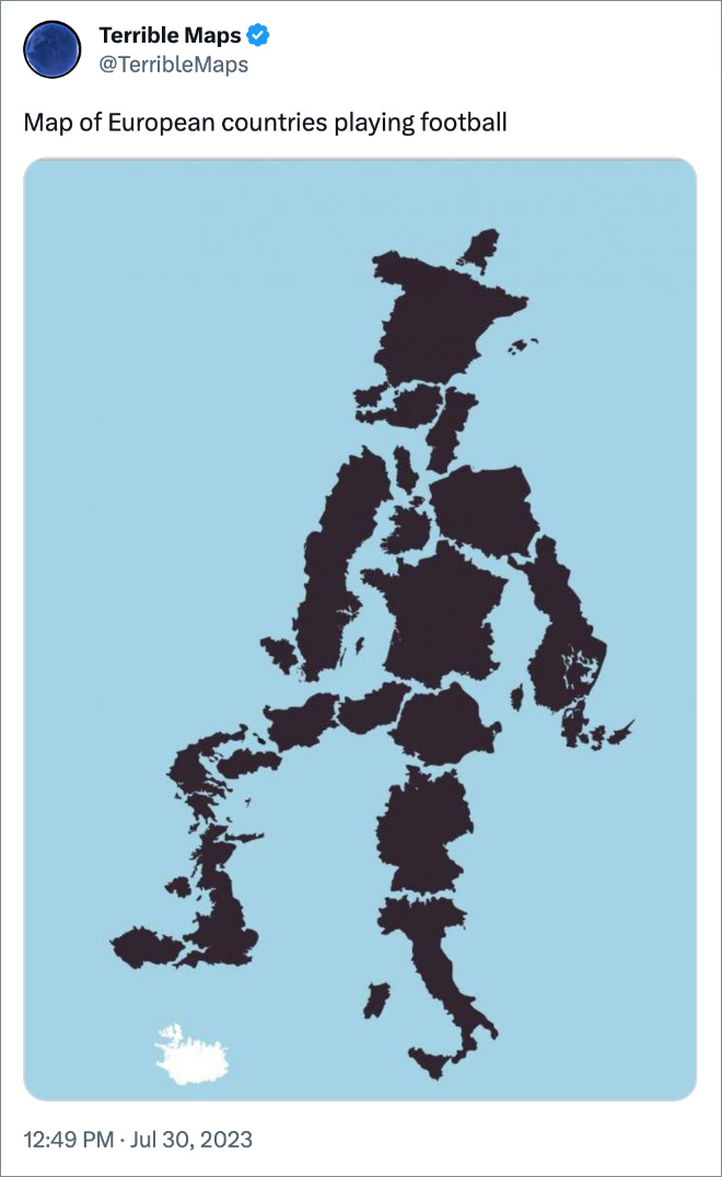
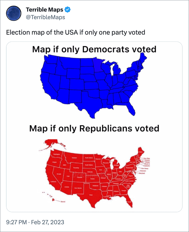
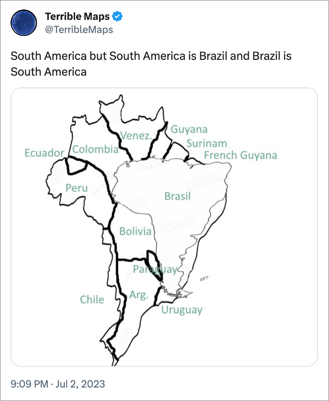
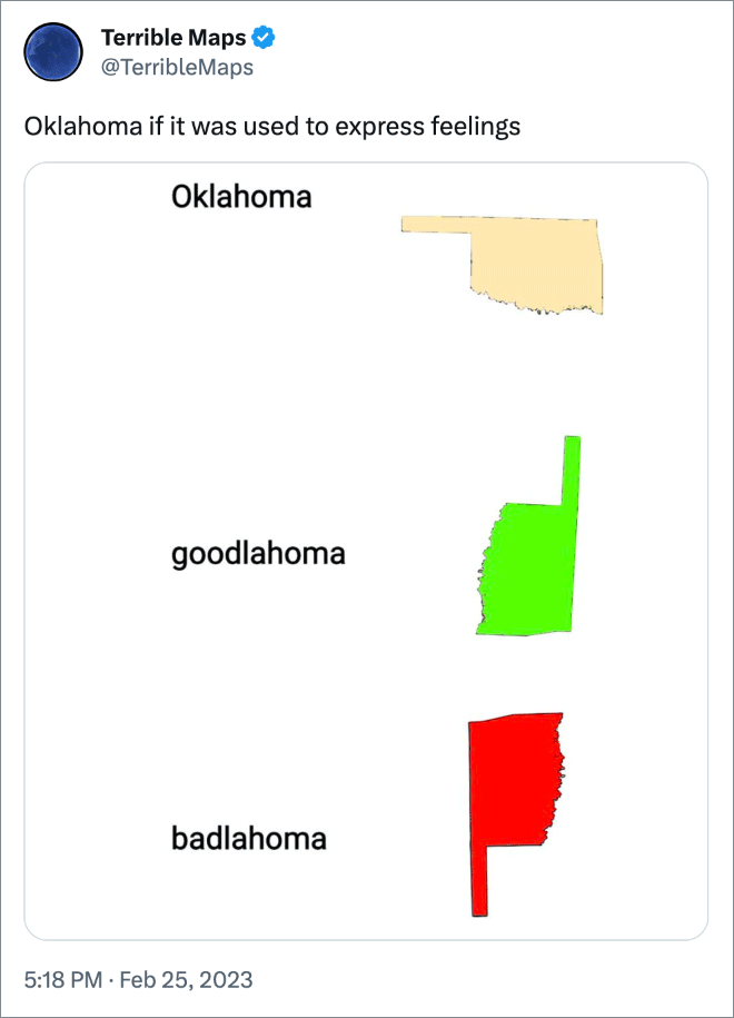
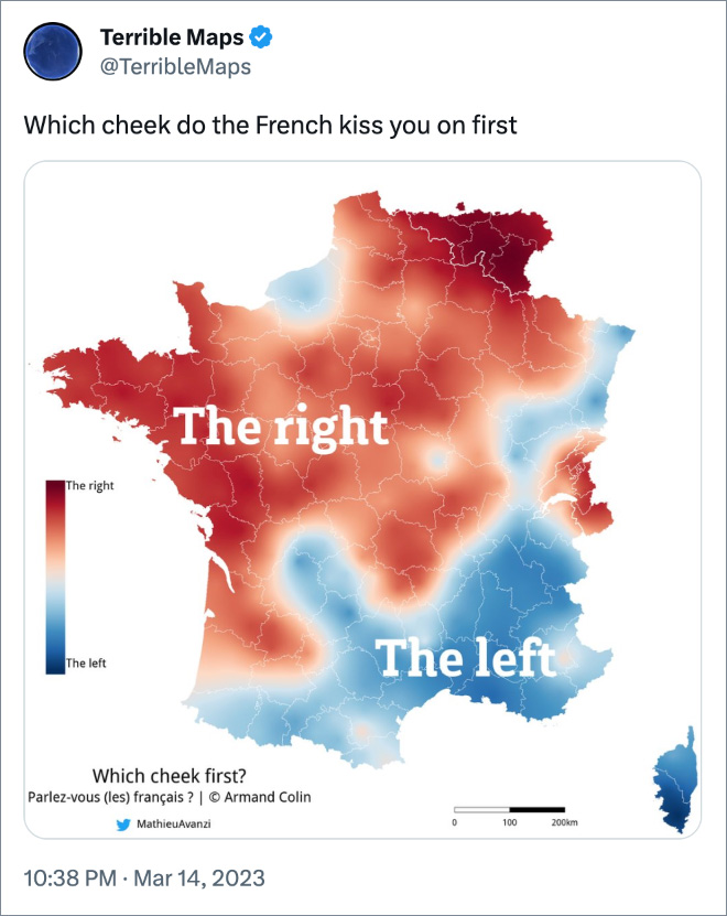
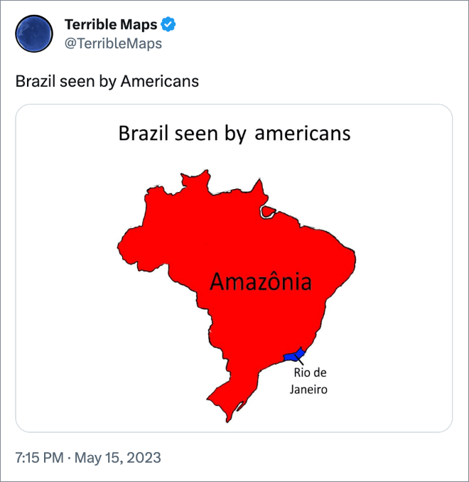
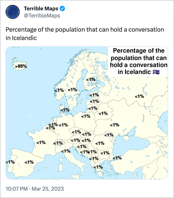
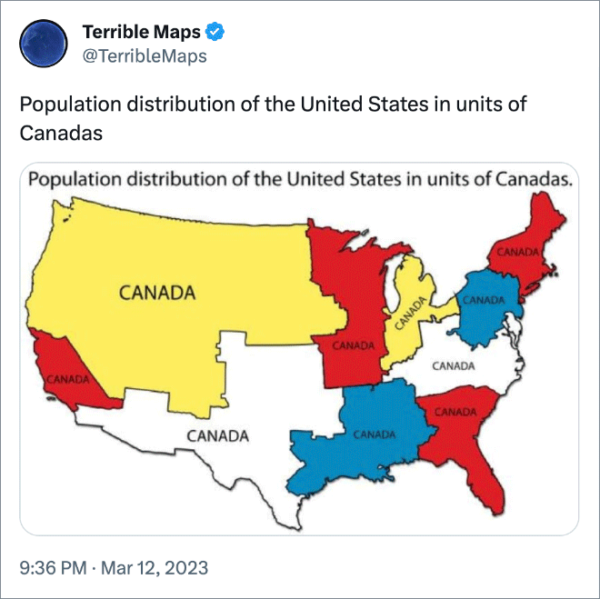
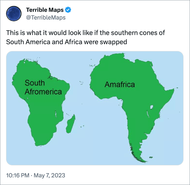
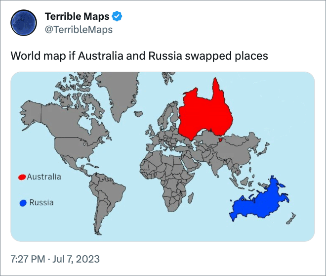
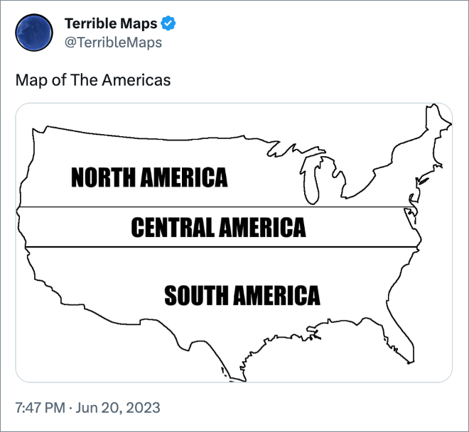
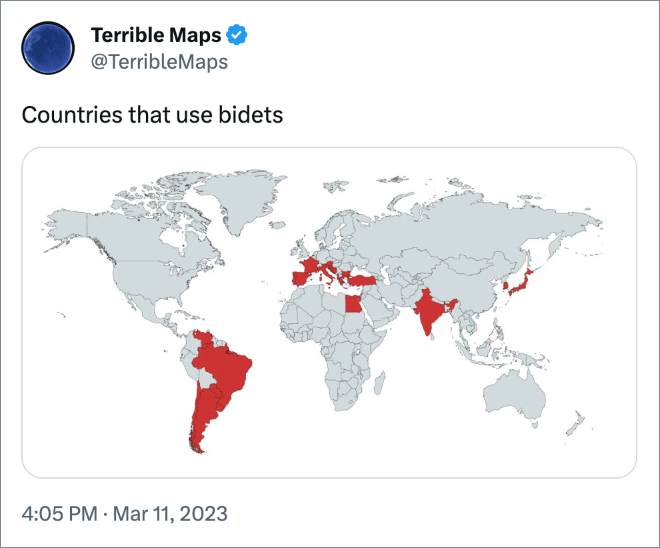
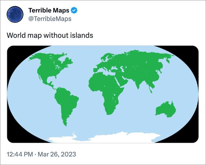
Maps are very useful… usually. However, @TerribleMaps Twitter account proves that not all maps are created equal. Some are downright terrible. Scroll down to see the best examples of hilariously pointless maps and don’t forget to also check out Part 1!

Map of European countries playing football

Very useful map.

Map of Europe but with the wrong font size

Did you know?

Election map of the USA if only one party voted

South America but South America is Brazil and Brazil is South America

Oklahoma if it was used to express feelings

Which cheek do the French kiss you on first

Brazil seen by Americans

Percentage of the population that can hold a conversation in Icelandic

Population distribution of the United States in units of Canadas

This is what it would look like if the southern cones of South America and Africa were swapped

Maximum size of a PDF, version 7: 381 km × 381 km.

Due to its unique shape, the centre of Croatia is actually located in Bosnia and Herzegovina

Seems legit..

How far away is Ohio?

World map if Australia and Russia swapped places

Map of The Americas

Countries that use bidets

World map without islands

Cyprus is just a more aerodynamic version of the USA

Countries starting with the letters D.I.C. and K.

Map of all the countries that start with O

If you enjoyed these terrible maps, don’t forget to also check out Part 1!

The post Terrible Maps That Are So Bad They’re Good (Part 2) first appeared on Sad and Useless Humor.

Comments are closed.