
.disclaimer{width:90%;margin-bottom:1rem}.disclaimer__lines{width:100%;margin:0 auto;border-bottom:1px solid #999;padding:0;max-width:150px}.disclaimer__copy{width:100%;max-width:355px;font-family:Brown Regular,sans-serif;font-size:.9rem;font-weight:300;line-height:1.3em;color:#333;padding:0 0 .4rem;margin:1rem auto;text-align:center}
I don’t know if this is universally true, but, in my experience, therapists love the color burgundy.
I’ve sat in many different therapists’ offices over the decades, and, as a design writer, I often find myself wondering about their decor. How did they choose that menacing Venetian mask? Why would they plop so many plastic plants on their carpet? Why do they seem to gravitate towards heavy furniture? Why do so many of them have maroon couches and rugs?
I blame Sigmund Freud, of course.
Freud began his practice in the late 19th century in the opulent city of Vienna. At the time, he was just a humble doctor — no one special. He would go on to become one of the most influential (and controversial) men of the century, his ideas about the human mind making him famous worldwide. But then, his fame rippled outwards, touching everything he touched, from his iconic round lenses to his equally iconic couch. (You can still visit this divan in London, which is the last place Freud lived.) While the latter is beige and rather plain, Freud turned it into something maximalist, piling it with rugs and cushions, all of them red, red, red.
But no red is just red. Maybe more so than any other color, red asks for specificity. Orange-red is very different from pinkish-red, which is, again, totally, tonally unlike brown-red. “The varied powers of red are very striking,” wrote painter Wassily Kandinsky in On The Spiritual in Art (1910). “By a skillful use of it in its different shades, its fundamental tone may be made warm or cold.”
Our current red, the one making the rounds on social media and hopping off runways and clothing racks, isn’t a hot color. It’s decidedly not a Matisse red, which has more yellow in it and better fits the tomato-girl vibes of summer. It’s not a sporty red, either, nor is it a sexy red. It’s much quieter than that. This burgundy — or bordeaux, to use the currently favored name for the hue — is cool. It speaks not of flame or flowers, but rather of blood and pomegranates. One does not choose bordeaux for a sports car or a sexy strapless dress; you do so for a sumptuous velvet drape or a pair of subtle statement boots.
There’s never any one reason for why a color begins to trend. It’s always a snowball effect: Someone cool wears it, some cool designer features it in their show, some cool marketing executive picks it for a cool new campaign, some cool product designer slaps it on a cool new product or an old (but, again, cool) standby. (A KitchenAid has, of course, never looked cooler.) Then, once the ball is rolling, it begins to grow.
Sometimes, the color is exciting, because we haven’t seen it in a while (see: Peach Fuzz). Sometimes, it’s appealing because we already have it in our closets (hello, Brat Green). Usually, it’s a combination. In oxblood, dark academia meets Freudcore meets standard fall dressing — throw in a dash of The Substance, and you’ve got a fully-fledged color moment.
I happen to love this color. I’m currently seated in a coffee shop in Santa Fe, typing on a laptop I pulled out of my beat-up Madewell leather tote. It’s burgundy — almost purple, but not quite — with a black stripe down the middle. I bought it years ago, seeking a work bag that would look more polished than my nylon backpack. After I splurged for this unremarkable thing, something funny happened: I began buying more pieces, from sweaters to boots to corduroys, in a similar hue. See, burgundy’s always available, because it’s almost (but again, not quite) a neutral tone, easy to match with the other colors that dominate my wardrobe: black, blue, brown, olive.
Lately, I find myself reaching for burgundy because it feels homey. It reminds me of the old brick buildings of New York and New England, and the emphasis placed on scholastic endeavors. It reminds me of being young and going off to college in the Hudson Valley, where maroon banners hung from European-style facades and kids went to class in red fleece sweatpants with the school’s logo emblazoned on the side. It reminds me of tradition and transitions — of both becoming and pretending.
In many cultures, dark reds are associated with pomp, circumstance, and displays of power. This has been true for hundreds of years, possibly even dating back to the ancients. If you’re a color fiend, you may have already heard of Tyrian purple, a famed dye harvested from carnivorous snails on the Mediterranean shores — what you might not realize that this hue skewed more red than blue in practice: Like many natural dyes, the results changed depending on the underlying color of the cloth and the conditions under which it was steeped, but, while many tend to fade with time, Tyrian purple only gets more vivid. (BBC historian Kelly Grovier notes that this is the “miraculous quality that commanded [its]exorbitant price, exceeding the pigment’s weight in precious metals.”)
In ancient Greece, only the richest and most elevated members of society were allowed to don Tyrian purple. Supposedly, Emperor Caligula once killed a visiting guest for daring to wear it, interpreting their outfit as a direct insult to his power.
Over the centuries, it became a little less dangerous to wear reddish-purple, though it was still a favored color for men at the top of the hierarchy. Cardinals wore red, kings loved it, and the pope still famously walks around in little red loafers. Some of these are true crimsons, but others feel more Tyrian in spirit.
Writer Jude Stewart argues that burgundy came to “epitomize officialdom,” showing up in Catholic school uniforms and on institutional carpets around the western hemisphere. For Stewart, there’s one often-overlooked reason for this choice: dirt-proofing. (Deep red carpets hide a little schmutz, while burgundy cloaks can undergo plenty of wear-and-tear.)

You no longer have to milk a snail to get a durable merlot hue. Today, it’s a perfect cross-over color, fitting equally well into the Mob Wife aesthetic, the Quiet Luxury trend, and even the pop-punk revival. It was big in both the ‘90s and the ‘60s, equally popular with mods and grunges and housewives. It can be ladylike and prim, or neurotic and messy. It looks equally good on a thrashed velvet slip dress as a wool suit.
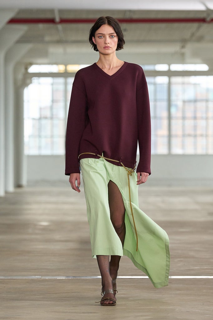
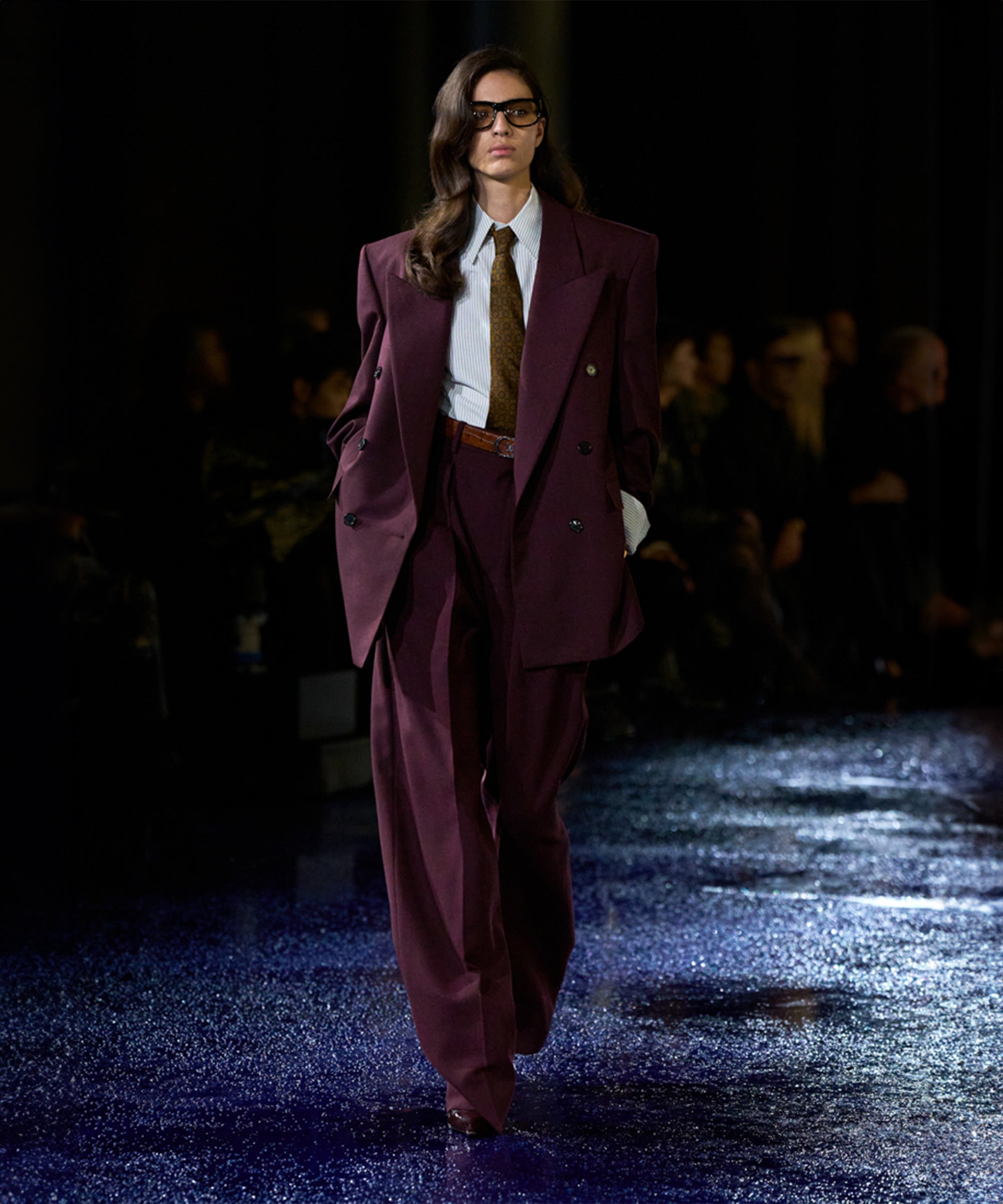
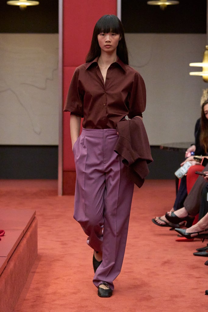
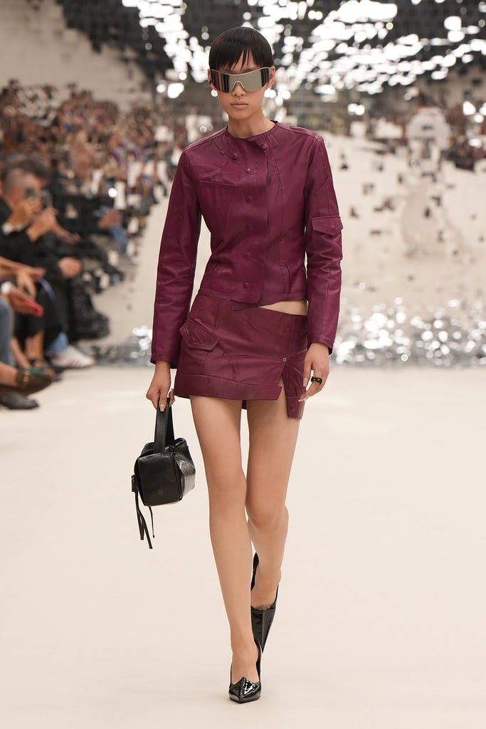
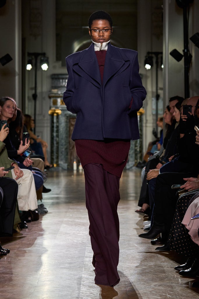
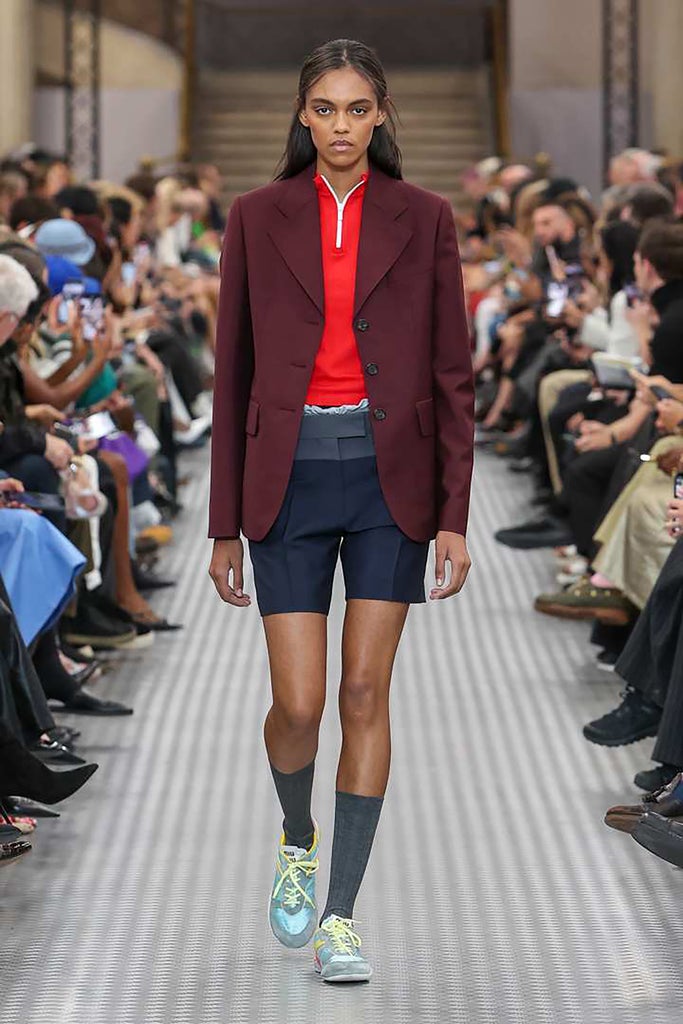
A more contemporary way of wearing burgundy can be found on the 2024 runways, where houses including Gucci, Hermès, Tom Ford, and Miu Miu used dark red leather (real and faux) to create tailored skirts, scoop-neck bra tops, and nostalgia-nodding suiting. While there’s nothing truly groundbreaking about wearing deep, cool reds during the colder months, there is something gratifying about dressing so seasonally, particularly when you can throw in a little spice. A formerly conservative color, burgundy feels newly wild when worn as a leather bustier or in frothy layers of tulle. Maybe Caligula would object, but your therapist (probably) will not.
Like what you see? How about some more R29 goodness, right here?
Pantone’s 2024 Color Of The Year Is…


