
let ProdMobile = false;
if (navigator.userAgent.match(/Android|BlackBerry|iPhone|iPad|iPod|Opera Mini|IEMobile/i)) {
ProdMobile = true;
}
function ProdLeft(id) {
let w = (window.innerWidth)/2;
let i = [“PROD__scroller” + id];
let o = document.getElementById(i);
o.scrollLeft += -(w);
}
function ProdRight(id) {
let w = (window.innerWidth)/2;
let i = [“PROD__scroller” + id];
let o = document.getElementById(i);
o.scrollLeft += w;
}
function ProdArrows(id) {
const container = document.querySelectorAll(“.multi-product-carousel-container”)[id];
const newArrows = document.createElement(‘div’);
newArrows.setAttribute(‘class’,”caro__arrows”);
container.appendChild(newArrows);
const ar_l = “>”;
const ar_r = “>”;
// Arrows code, add id to the fucntion calls
const a = “
“;
////// ??????????????????????? ////////
// Target the carousel
// let b = document.querySelectorAll(“.prod__arrows”)[id];
// Add arrows to carousel
newArrows.innerHTML = a;
}
function ProdMonitor(id,wd) {
let i = [“PROD__scroller” + id];
let o = document.getElementById(i);
let pos = o.scrollLeft;
// Get number of cards in scroller
let num = o.childElementCount;
// Get window width
let w = window.innerWidth;
// Calc scrolling sapce
let max = -((w – wd)+20);
let gla = [“PROD__left” + id];
let gra = [“PROD__right” + id];
let la = document.getElementById(gla);
let ra = document.getElementById(gra);
// Left Arrow
if (pos > -20 && pos max-20) {
ra.style.display = “none”;
ra.style.opacity = “0.0”;
} else {
ra.style.display = “block”;
ra.style.opacity = “1.0”;
}
}
function ProdDevice(id) {
let i = [“PROD__scroller” + id];
let o = document.getElementById(i);
let pos = o.scrollLeft;
if (pos > 100) {
let gra = [“PROD__right” + id];
let ra = document.getElementById(gra);
ra.style.opacity = “0.0”;
ra.style.transition = “all 0.7s”;
ra.style.WebkitTransition = “all 0.7s”;
let wait = setTimeout(function() {
ra.style.display = “none”;
clearTimeout(wait);
}, 200);
}
}
function ProdCount(id) {
let a = [“PROD__scroller” + id];
let b = document.getElementById(a).children;
return b.length;
}
function ProdWidthCheck(id,wd) {
console.log(“ProdWidthCheck”);
let w = window.innerWidth;
let a = [“PROD__scroller” + id];
let b = document.getElementById(a);
let gla = [“PROD__left” + id];
let gra = [“PROD__right” + id];
let la = document.getElementById(gla);
let ra = document.getElementById(gra);
console.log(id + “browser ” + w);
console.log(id + “scroller ” + wd);
if (wd <= w) {
console.log(“Center it”);
b.style.justifyContent = “center”;
la.style.visibility = “hidden”;
ra.style.visibility = “hidden”;
} else {
console.log(“Left it”);
b.style.justifyContent = “start”;
la.style.visibility = “visible”;
ra.style.visibility = “visible”;
}
}
function ProdSetup(id) {
// Assemble carousel id attribute
let a = [“PROD” + id];
let aa = [“PROD__scroller” + id];
// Target the carousel
let b = document.querySelectorAll(“.section-multi-product-container”)[id];
let bb = document.querySelectorAll(“.products-row”)[id];
// Get width of cards
// let crd = bb.querySelectorAll(“.product”)[1].clientWidth; // Get width from the second card
// Set the attribute of the carousel
b.setAttribute(“id”,a);
bb.setAttribute(“id”,aa);
// Get width of the scroller element
let wd = bb.scrollWidth;
// let count = ProdCount(id);
// Watch the carousel scolling
bb.addEventListener(“scroll”, function() {
if (ProdMobile == false) {
ProdMonitor(id,wd);
} else {
ProdDevice(id);
}
}, false);
// Add the arrows
ProdArrows(id);
// Check width of cards, if not wider than browser, center and turn off arrows
ProdWidthCheck(id,wd);
}
function ProdResize() {
let a = document.querySelectorAll(“.section-multi-product-container”);
let b,c,d,wd;
for (let i = 0; i < a.length; i++) {
b = [“PROD__scroller” + i];
c = document.getElementById(b);
d = b.childElementCount;
wd = c.scrollWidth;
console.log(b + ” = ” + wd);
ProdWidthCheck(i,wd,d);
}
}
function ProdInit() {
console.log(“ProdInit”);
// Look for Carousels
let a = document.querySelectorAll(“.section-multi-product-container”);
// Run setup for each carousel found
for (let i = 0; i < a.length; i++) {
ProdSetup(i);
}
// If browser resize, recheck if carousels need centering and arrows
window.onresize = function() {
ProdResize();
};
}
const ProdWait = setTimeout(function() {
console.log(“ProdWait”);
clearTimeout(ProdWait);
let a = document.querySelectorAll(“.section-multi-product-container”)[0].id;
if (a != “PROD0”) {
ProdInit();
}
}, 1500);
/* Roboto */
@import url(‘https://fonts.googleapis.com/css2?family=Roboto:ital,wght@0,100..900;1,100..900&display=swap’);
/* Roboto Mono */
@import url(‘https://fonts.googleapis.com/css2?family=Roboto+Mono:ital,wght@0,100..700;1,100..700&display=swap’);
:root {
/* //////////////////////////////////////////////////////////////////// */
/* System colors */
–color-cream: #E8F6F7;
–color-black: #000;
–color-white: #E8F6F7;
–color-light-gray: #EAE0D4;
–color-medium-gray: #555555; /* Hovers */
–color-dark-gray: #4B4D56;
/* Primary colors, use white or black text */
–color-pink: #F300CE;
–color-blue: #1F69FF;
/* Secondary colors, use black text only*/
–color-orange: #4B4D56;
–color-yellow: #FBF5E7;
–color-green: #4B4D56;
–color-teal: #4B4D56;
–color-purple: #4B4D56;
/* //////////////////////////////////////////////////////////////////// */
/* Fonts */
–Brown-Regular: Brown Regular, Gill Sans, Arial, Helvetica, Roboto, Segoe UI Light, Ubuntu Light, DroidSans, sans-serif;
–Brown-Bold: Brown Bold, Gill Sans, Arial, Helvetica, Roboto, Segoe UI Light, Ubuntu Light, DroidSans, sans-serif;
–Roboto: ‘Roboto’, Arial, Helvetica, Segoe UI Light, Ubuntu Light, DroidSans, sans-serif;
–Roboto-Mono: ‘Roboto Mono’, Monaco, monospace;
–Owners-Narrow: ‘owners-narrow-black’, sans-serif;
–Playfair: Playfair Display, Times New Roman Bold, TimesNewRomanPSMT-Bold, Times Bold, Noto Serif Bold, NotoSerif-Bold, Georgia, serif;
–Ivy-Presto: ‘owners’, Helvetica, Roboto, Segoe UI Light, Ubuntu Light, DroidSans, sans-serif;
–Owners: ‘owners’, Helvetica, Roboto, Segoe UI Light, Ubuntu Light, DroidSans, sans-serif;
–OwnersWide: ‘owners-wide’, Helvetica, Roboto, Segoe UI Light, Ubuntu Light, DroidSans, sans-serif;
–OwnersXwide: ‘owners-xwide’, Helvetica, Roboto, Segoe UI Light, Ubuntu Light, DroidSans, sans-serif;
–NeueHaus-Unica: neue-haas-unica, Helvetica, Roboto, Segoe UI Light, Ubuntu Light, DroidSans, sans-serif;
/* Font Letterspacing < DO NOT ALTER */
–Tight: -0.01em;
–Normal: 0em;
–Loose: 0.02em;
–Spread: 0.1em;
/* Intro column div{font-family:var(–Roboto-Mono);font-weight:var(–Weight-Roboto-Mono-Regular);font-size:.7rem;text-transform:uppercase;text-decoration:none;letter-spacing:.02em;color:var(–subnav-text-color);border-bottom:1px solid transparent}.subnav__container a:hover,.subnav__container-mobile button:hover,.subnav__container>div:hover{color:var(–subnav-text-hover-color);border-bottom:1px solid var(–subnav-text-hover-color)}.subnav__read-more{pointer-events: none;color:var(–subnav-read-more-color);border:0!important;text-decoration:none}.subnav__container-mobile{display:none}#subnav__marker{height:1px;margin-top:-1px}@media only screen and (max-width:1100px){.subnav__container{display:none}.subnav__container-mobile{display:flex}}@media only screen and (max-width:1024px){.subnav__container{width:100%;height:30px;display:flex!important;flex-direction:row;justify-content:start;align-items:center;gap:30px;overflow-x:auto;scroll-behavior:smooth;padding:0 20px 2px}.subnav__container a,.subnav__container-mobile button,.subnav__container>div{white-space:nowrap}.subnav__container::-webkit-scrollbar{height:1px;pointer-events:auto;cursor:pointer}.subnav__container::-webkit-scrollbar-thumb{background:rgba(255,255,255,0);border-radius:6px;border:0}.subnav__container::-webkit-scrollbar-track{background:rgba(0,0,0,0);padding:0}}@media only screen and (max-width:760.98px){.subnav__container a,.subnav__container-mobile button,.subnav__container>div{font-size:.65rem;border-bottom:1px solid var(–subnav-text-color-underline)}.subnav__container,.subnav__container-mobile{gap:20px}}
#subnav, .subnav {
transition: translateY 0.5s ease-in-out;
-webkit-transition: translateY 0.5s ease-in-out;
z-index: 99;
}
/* //////////////////////////////////////////////////////////////////// */
/* Anchors */
.caro__marker{position:relative}.caro__anchor{position:absolute;top:-40px;left:0;width:100%;height:1px}.caro__marker .caro__anchor{top:-140px}
.marker_set{position:relative}.marker{position:absolute;top:-40px;left:0;width:100%;height:1px}.marker_set .marker{top:-140px}
.section-html, .module {position: relative;}
/* //////////////////////////////////////////////////////////////////// */
/* Carousel Basics */
.caro,.caro__scroller{display:block;width:100%}.caro{clear:both;margin:0;padding:0;overflow:hidden}.caro__scroller{position:relative}.caro__scroller-wrapper{width:100%;display:flex;flex-direction:column;position:relative}.caro__count{display:none}.caro__arrows{position:absolute;top:0;left:0;right:0;width:100%;pointer-events:none;display:flex;flex-direction:row;justify-content:center;align-items:center;height:100%}.caro__arrow,.caro__arrow-left,.caro__arrow-right{padding:0;pointer-events:auto}.caro__arrow-left{top:auto;bottom:auto;left:40px;width:auto;margin:0;display:none;opacity:0}.caro__arrow-right{top:auto;right:40px;width:100px;margin:0;display:block;opacity:1;animation-name:moveArrow;animation-timing-function:ease-in-out;animation-duration:1.5s;animation-iteration-count:infinite}.caro__arrow{position:absolute;width:60px;height:60px;cursor:pointer;margin:-20px 0 0}.caro__arrow-file svg{width:100%;height:100%}.caro__arrow-file svg path{fill: var(–carousel-arrow-shape-color)}.caro__arrow-file:hover path{fill:var(–carousel-arrow-shape-color-hover)}.caro__arrow-file svg circle{fill:var(–carousel-arrow-bgcolor);stroke:var(–carousel-arrow-bordercolor)}.caro__arrow-file:hover svg circle{fill:var(–carousel-arrow-bgcolor-hover);stroke:var(–carousel-arrow-bordercolor-hover)}.caro__arrow-right:hover{animation-play-state:paused;-webkit-animation-play-state:paused}@keyframes moveArrow{0%,100%{transform:translateX(0)}50%{transform:translateX(30px)}}@-moz-keyframes moveArrow{0%,100%{transform:translateX(0)}50%{transform:translateX(30px)}}@-webkit-keyframes moveArrow{0%,100%{transform:translateX(0)}50%{transform:translateX(30px)}}@-o-keyframes moveArrow{0%,100%{transform:translateX(0)}50%{transform:translateX(30px)}}.caro__scroller-list{width:100%;height:fit-content;white-space:nowrap;overflow-x:auto;overflow-y:hidden;scroll-behavior:smooth;scroll-snap-type:x mandatory;scroll-padding:0 20px;padding:0 0 20px;-webkit-transform:translateZ(0);-moz-transform:translateZ(0);-ms-transform:translateZ(0);-o-transform:translateZ(0);transform:translateZ(0);-webkit-backface-visibility:hidden;-moz-backface-visibility:hidden;-ms-backface-visibility:hidden;backface-visibility:hidden;-webkit-perspective:1000;-moz-perspective:1000;-ms-perspective:1000;perspective:1000;-webkit-overflow-scrolling:touch;grid-template-columns:repeat(100,340px);font-size:0;display:flex;justify-content:start;align-items:start;gap:20px;flex-wrap:nowrap}.is-promos .caro__scroller-list,.is-wide .caro__scroller-list,.is-youtube .caro__scroller-list{grid-template-columns:repeat(100,500px)}.is-social .caro__scroller-list,.is-tall .caro__scroller-list{grid-template-columns:repeat(100,340px)}.caro__card{overflow:hidden;width:340px;min-width:340px;max-width:340px;background-color:transparent;height:fit-content;scroll-snap-align:start;position:relative;display:inline-block;float:none;box-sizing:content-box;padding:0;margin:0}.caro__card img{width:100%}.caro__card>div{box-sizing:border-box;width:inherit}.caro__card:first-of-type{padding-left:20px}.caro__card:last-of-type{margin-right:20px}.is-promos .caro__card,.is-wide .caro__card,.is-youtube .caro__card{width:500px;min-width:500px;max-width:500px}.is-youtube .caro__card iframe{width:500px!important;height:281px!important}.is-social .caro__card iframe.instagram-media{max-width:unset!important;width:100%!important;border-radius:0!important;margin:-54px 0 0!important;border:0!important}@media only screen and (max-width:760.98px){.caro__arrow-left{left:15px}.caro__arrow-right{right:15px;pointer-events:none}.caro__arrow-right .caro__arrow-file{transform:rotate(180deg)}.caro__arrow-file{width:85px;height:85px}.caro__arrow-file img,.caro__arrow-file svg{padding:11px}@keyframes moveArrow{0%,100%{transform:translateX(0)}50%{transform:translateX(20px)}}@-moz-keyframes moveArrow{0%,100%{transform:translateX(0)}50%{transform:translateX(20px)}}@-webkit-keyframes moveArrow{0%,100%{transform:translateX(0)}50%{transform:translateX(20px)}}@-o-keyframes moveArrow{0%,100%{transform:translateX(0)}50%{transform:translateX(20px)}}.caro__scroller-list,.is-people .caro__scroller-list,.is-promos .caro__scroller-list,.is-social .caro__scroller-list,.is-tall .caro__scroller-list,.is-wide .caro__scroller-list,.is-youtube .caro__scroller-list{grid-template-columns:repeat(100,335px)}.caro__card,.is-people .caro__card,.is-promos .caro__card,.is-social .caro__card,.is-tall .caro__card,.is-wide .caro__card,.is-youtube .caro__card{width:335px;min-width:335px;max-width:335px}.is-youtube .caro__card iframe{width:335px!important;height:188px!important}.caro__arrows{display:none!important}}.caro__scroller-list::-webkit-scrollbar{height:4px;pointer-events:auto;cursor:pointer;background:0 0!important}.caro__scroller-list::-webkit-scrollbar-track{background:0 0!important;padding:2px 0}.caro__scroller-list::-webkit-scrollbar-thumb{background:0 0!important;border-radius:6px;border:0}.caro__scroller-list::-webkit-scrollbar-thumb:hover{background:0 0!important}
/* /////////////////////////////////////////////////////////////////////////////// */
/* Editors */
.editors {
margin: 40px auto 0;
padding: 0;
}
.editors__wrapper {
}
.editors__list {
display: flex;
flex-direction: row;
justify-content: center;
align-items: flex-start;
flex-wrap: wrap;
width: 100%;
gap: 15px;
}
.editors__card {
width: 100%;
max-width: 250px;
display: block;
margin: 0;
padding: 0 20px;
}
.editors__card-image {
width: 100%;
max-width: 250px;
margin: 0 auto 10px;
}
.editors__card-image img {
width: 100%;
border-radius: 500px;
border: var(–editor-border-size) solid var(–editor-border-color);
}
.editors__card-details {
width: 100%;
display: flex;
flex-direction: column;
font-family: var(–editor-details-font);
font-weight: var(–editor-details-weight);
color: var(–editor-details-color);
font-size: 0.7rem;
line-height: 1.45;
text-align: center;
}
.editors__card-details a:hover {
color: var(–editor-name-hover-color);
}
.editors__card-name {
font-size: 1.2rem;
color: var(–editor-name-color);
font-family: var(–editor-name-font);
font-weight: var(–editor-name-weight);
}
.editors__card-role {
color: var(–editor-role-color);
text-transform: uppercase;
letter-spacing: 0.05em;
}
.editors__card-social {
display: flex;
flex-direction: row;
justify-content: center;
align-items: center;
gap: 0;
}
.editors__card-social-icon svg {
width: 50px;
height: 50px;
}
.editors__card-social-icon svg path {
fill: var(–editor-social-color);
}
.editors__card-social-icon:hover svg path {
fill: var(–editor-social-hover-color);
}
@media only screen and (max-width: 760px) {
.editors {
padding: 0 0 40px;
}
.editors__list {
gap: 20px;
}
.editors__card {
margin-bottom: 20px;
}
}
/* //////////////////////////////////////////////////////////////////// */
/* Products */
.product__card {
width: 100%;
height: 100%;
display: flex;
flex-direction: column;
gap: 0;
align-items: stretch;
justify-content: center;
}
.product__image {
width: 100%;
overflow: hidden;
display: flex;
flex-direction: column;
justify-content: start;
align-items: center;
position: static;
padding-bottom: 0;
height: fit-content;
top: 0;
max-height: 440px;
}
/* new */
.product__image {
width: 100%;
overflow: hidden;
display: flex;
flex-direction: column;
justify-content: center;
align-items: center;
position: relative;
padding-bottom: 0;
height: 440px; /* 420px; */
}
.product_image-container {
width: 100%;
overflow: hidden;
position: relative;
padding-bottom: 0;
height: auto;
border: 0; /* var(–product-img-border-size) solid var(–product-img-border-color); */
border-radius: 0; /* var(–product-img-border-radius); */
display: flex;
flex-direction: column;
justify-content: center;
align-items: center;
}
.product__image img {
width: 100%;
position: static;
top: unset;
-ms-transform: unset;
transform: unset;
top: 0;
left: 0;
}
.product__eyebrow {
width: 100%;
font-family: var(–product-brand-font);
font-weight: var(–product-brand-weight);
font-size: 0.7rem;
text-transform: uppercase;
letter-spacing: 0.05em;
color: var(–product-brand-color);
text-decoration: none;
padding: 15px 10px 5px;
overflow: hidden;
height: 35px;
}
.product__name {
width: 100%;
font-family: var(–product-name-font);
font-weight: var(–product-name-weight);
font-size: 1.1rem;
text-transform: none;
letter-spacing: 0em;
color: var(–product-name-color);
text-decoration: none;
padding: 0 10px 15px;
white-space: normal;
overflow: hidden;
height: 60px;
}
.product__name span {
border-bottom: 1px solid transparent;
}
.product__name:hover span {
border-bottom: 1px solid var(–product-name-color);
}
.product__buy {
width: 100%;
display: flex;
flex-direction: row;
justify-content: center;
align-items: stretch;
padding: 0 10px 10px;
gap: 20px;
}
.product__buy-button {
width: fit-content;
padding: 8px 20px;
font-family: Brown Bold, sans-serif;
font-weight: 400;
font-size: 0.7rem;
text-transform: uppercase;
letter-spacing: 0.05em;
color: var(–product-buy-text-color);
background-color: var(–product-buy-bg-color);
border: var(–product-buy-border-size) solid var(–product-buy-border-color);
border-radius: 100px;
text-align: center;
text-decoration: none;
}
.product__buy-button:hover {
background-color: var(–product-buy-bg-hover-color);
color: var(–product-buy-text-hover-color);
}
.product__buy-details {
display: flex;
flex-direction: column;
gap: 5px;
width: 100%;
}
.product__prices {
font-family: Brown Bold, sans-serif;
font-weight: 400;
font-size: 0.7rem;
color: var(–product-brand-color);
text-decoration: none;
}
.product__retailer {
font-family: Brown Regular, sans-serif;
font-weight: 400;
font-size: 0.7rem;
text-transform: uppercase;
letter-spacing: 0.05em;
color: var(–product-brand-color);
text-decoration: none;
}
.product__card {
text-align: left;
}
.caro.is-products .caro__card {
width: 220px !important;
min-width: 220px !important;
max-width: 220px !important;
}
.product__name {
font-size: 1.1rem !important;
}
.product__image {
height: 320px !important;
}
.product__buy {
padding: 0 0 10px !important;
gap: 15px !important;
}
.product__name,
.product__eyebrow {
padding-left: 0 !important;
padding-right: 0 !important;
}
.caro__card:first-of-type {
padding-left: 0 !important;
}
.caro__card:last-of-type {
margin-right: 0 !important;
}
.caro__scroller-list {
scroll-padding: 0 20px;
padding: 0 20px 20px !important;
}
h2.caro__header {
font-family: var(–OwnersXwide);
font-weight: 300;
font-size: 3.75rem;
margin: 0 auto 40px;
text-transform: uppercase;
line-height: 1.0;
padding: 0 20px;
}
h2.caro__header strong {
font-weight: 700;
}
h2.caro__header.is-minor {
font-size: 2rem;
}
h3.caro__subheader {
font-family: var(–NeueHaus-Unica);
font-weight: 300;
font-size: 1.45rem;
margin: 0 auto 20px;
text-transform: none;
font-style: italic;
padding: 0 20px;
}
h2.caro__header img {
height: 120px;
}
@media only screen and (max-width: 768px) {
h2.caro__header {
font-size: 3.0rem;
}
h3.caro__subheader {
font-size: 1.15rem;
}
h2.caro__header img {
height: auto;
width: 100%;
max-width: 400px;
padding: 0 20px;
}
h2.caro__header.is-minor {
font-size: 1.5rem;
}
}
@media only screen and (max-width: 500px) {
h2.caro__header img {
max-width: 375px;
}
}
@media only screen and (max-width: 420px) {
h2.caro__header img {
max-width: 335px;
}
}
.caro__eyebrow {
margin-bottom: 10px;
padding-top: 20px;
font-family: var(–NeueHaus-Unica);
font-weight: 300;
}
.subnav {
/* background-color: #FFEEEE; */
}
.header__container {
width: 100%;
display: flex;
flex-direction: row;
justify-content: start;
align-items: center;
gap: 0;
}
.header__column {
width: 33.333%;
}
.header__column.is-two-column {
width: 66.6666%;
}
.header__column img {
width: 100%;
}
.intro__break {
display: block;
}
.tmp-hero-overlay {
position: absolute;
top: 0;
left: 0;
width: 100%;
right: 0;
margin: 0 auto;
}
.tmp-hero-overlay img {
width: 100%;
}
@media only screen and (max-width: 968px) {
.header__container {
flex-direction: column;
}
.header__column {
width: 100%;
}
.header__column.is-two-column {
width: 100%;
}
.intro__break {
display: none;
}
}
.overlay__deaktop {
display: block;
}
.overlay__mobile {
display: none;
}
@media only screen and (max-width: 768px) {
.overlay__deaktop {
display: none;
}
.overlay__mobile {
display: block;
}
.tmp-hero-overlay {
top: 0;
left: 0;
width: 100%;
}
h2.caro__header {
font-size: 2.0rem;
}
}
/* Hide broken ad */
.goku,
.bxc {
display: none !important;
}
/* LOOKBOOK */
.gallery {
width: 100%;
margin-top: -20px;
font-size: 0;
}
.gallery__container {
width: 100%;
display: flex;
flex-direction: row;
flex-wrap: wrap;
gap: 0;
}
.gallery__item {
width: 25%;
}
.gallery__image {
width: 100%;
height: 100%;
z-index: 98;
position: relative;
}
.gallery__image img {
width: auto;
position: relative;
height: 80vh;
}
.gallery__details {
padding: 15px 0 0;
z-index: 99;
position: relative;
}
.gallery__item-title {
font-family: ‘Brown Regular’, sans-serif;
font-size: 1.2rem;
color: var(–color-black);
text-align: left;
margin: 5px auto;
display: flex;
flex-direction: row;
justify-content: start;
align-items: center;
gap: 12px;
max-width: 720px;
padding: 0 20px 40px;
}
.gallery__item-credit {
font-family: var(–Roboto-Mono);
font-size: 0.7rem;
text-transform: uppercase;
text-align: left;
display: flex;
flex-direction: row;
justify-content: start;
align-items: center;
gap: 12px;
padding-top: 0;
}
.caro__subheader .gallery__item-credit {
font-size: 0.9rem;
font-family: ‘Brown Regular’, sans-serif;
padding-top: 7px;
}
.gallery__item-credit a:hover {
background-color: var(–color-black);
color: var(–color-cream);
}
.footnote {
font-family: ‘Brown Regular’, sans-serif;
font-size: 0.65rem;
color: var(–color-black);
}
.person__overlay-set {
font-family: ‘Brown Regular’, sans-serif;
font-size: 1rem;
line-height: 1.65;
}
.person__image-container {
font-size: 0;
}
.is-double {
width: 50%;
}
.caro.is-gallery
.caro__card {
width: fit-content;
min-width: fit-content;
max-width: fit-content;
height: fit-content;
height: fit-content;
}
.gallery__credit-notes {
font-family: var(–Roboto-Mono);
font-size: 0.6rem;
text-transform: uppercase;
text-align: center;
width: 100%;
max-width: 1100px;
margin: 0 auto;
padding: 0 20px 50px;
white-space: normal;
}
/* Images */
.gallery__image.gallery__image-group {
display: flex;
flex-direction: column;
gap: 20px;
height: 80vh;
}
.gallery__image.gallery__image-group img {
height: 50%;
}
.gallery__image {
overflow: hidden;
}
.gallery__image a img {
transform: scale(1.0);
transition: all 0.5s ease-in;
-webkit-transition: all 0.5s ease-in;
}
.gallery__image a:hover img {
transform: scale(1.1);
transition: all 0.5s ease-in;
-webkit-transition: all 0.5s ease-in;
}
@media only screen and (max-width: 1400px) {
.gallery__image img,
.gallery__image.gallery__image-group {
height: 70vh;
}
}
@media only screen and (max-width: 1200px) {
.gallery__image img,
.gallery__image.gallery__image-group {
height: 60vh;
}
}
.is-quote-bg {
background: #f7e5ba;
background: -webkit-linear-gradient(180deg, rgba(247, 229, 186, 1) 0%, rgba(247, 231, 244, 0.85) 100%);
background: -moz-linear-gradient(180deg, rgba(247, 229, 186, 1) 0%, rgba(247, 231, 244, 0.85) 100%);
background: linear-gradient(180deg, rgba(247, 229, 186, 1) 0%, rgba(247, 231, 244, 0.85) 100%);
filter: progid:DXImageTransform.Microsoft.gradient(startColorstr=”#F7E5BA”, endColorstr=”#F7E7F4″, GradientType=0);
}
.caro__subheader {
font-family: var(–Owners);
font-size: 1.35rem;
color: var(–color-black);
text-align: center;
display: block;
flex-direction: column;
align-items: center;
gap: 12px;
max-width: 750px;
margin: 0 auto 20px;
padding: 0 20px 20px;
}
@media only screen and (max-width: 600px) {
.gallery__image img, .gallery__image.gallery__image-group {
height: auto;
width: 100%;
max-width: 87vw;
}
}
.caro__overlay {
pointer-events: none;
position: absolute;
top: 0;
left: 0;
display: flex;
flex-direction: column;
justify-content: center;
align-items: center;
background-color: #C0D6FA;
width: 100%;
height: 100%;
opacity: 0.0;
z-index: 99;
transition: all 0.3s ease-in-out;
-webkit-transition: all 0.3s ease-in-out;
}
.caro__overlay-set {
padding: 40px;
}
.gallery__image a:hover .caro__overlay {
opacity: 1.0;
transition: all 0.3s ease-in-out;
-webkit-transition: all 0.3s ease-in-out;
}
.caro__overlay-close {
position: absolute;
top: 10px;
right: 10px;
font-family: ‘Brown Regular’, sans-serif;
font-size: 0.8rem;
line-height: 1.5;
color: #000;
pointer-events: auto;
cursor: pointer;
}
.caro__overlay-info {
position: absolute;
top: 5px;
right: 5px;
padding: 0;
width: 44px;
height: 44px;
display: none;
flex-direction: column;
justify-content: center;
align-items: center;
pointer-events: auto;
cursor: pointer;
}
.caro__overlay-info-set {
display: flex;
flex-direction: column;
justify-content: center;
align-items: center;
background-color: rgba(0,0,0,0.25);
border-radius: 3px;
width: 26px;
height: 26px;
padding: 4px;
font-family: ‘Brown Regular’, sans-serif;
font-style: italic;
font-size: 0.8rem;
line-height: 1;
color: #fff;
border: 0 solid #fff;
}
.icon__info {
display: flex;
flex-direction: column;
justify-content: center;
align-items: start;
gap: 2px;
}
.icon__info-bar {
width: 15px;
height: 1px;
background-color: #fff;
}
.icon__info-bar-md {
width: 13px;
height: 1px;
background-color: #fff;
}
.icon__info-bar-sm {
width: 10px;
height: 1px;
background-color: #fff;
}
.caro__overlay.is-mobile-overlay {
display: none;
opacity: 1.0;
position: fixed;
top: 0;
left: 0;
width: 100%;
height: 100vh;
z-index: 9999999999;
}
.caro__overlay.is-mobile-overlay {
justify-content: start;
}
.caro__overlay.is-mobile-overlay
.caro__overlay-set {
overflow-y: auto;
justify-content: start;
max-width: 720px;
}
.caro__overlay-set>p {
font-family: ‘Brown Regular’, sans-serif;
font-size: 1.4rem;
line-height: 1.5;
color: #000;
white-space: normal;
width: 100%;
}
@media only screen and (max-width: 1400px) {
.caro__overlay-set>p {
font-size: 1.25rem;
}
}
@media only screen and (max-width: 1200px) {
.caro__overlay-set>p {
font-size: 1.0rem;
}
}
.mobile__overlays {
display: none;
}
@media only screen and (max-width: 1024px) {
.mobile__overlays {
display: block;
}
.caro__overlay-info {
display: flex;
}
.caro__overlay.is-desktop {
display: none;
}
}
.gallery__item.is-quote {
width: 100%;
}
.is-quote
.gallery__image {
margin: 0 auto;
text-align: center;
}
.is-quote
.gallery__image img {
height: auto;
width: 100%;
max-width: 1100px;
margin: 0 auto;
}
.quote__credit {
width: fit-content;
margin: 40px auto 20px;
}
.quote__credit .gallery__image img {
width: 100%;
max-width: 150px;
max-height: 150px;
border-radius: 400px;
margin: 0 auto;
}
.quote__name {
/* font-family: Brown Bold, sans-serif; */
font-family: var(–OwnersWide);
font-size: 1.45rem;
letter-spacing: 0;
line-height: 1.2;
word-spacing: normal;
font-weight: 500;
color: var(–color-black);
text-align: center;
padding: 8px 20px 3px;
}
.quote__role {
font-family: var(–OwnersWide);
font-size: 1.45rem;
letter-spacing: 0;
line-height: 1.2;
word-spacing: normal;
font-weight: 300;
color: var(–color-black);
text-align: center;
}
.quote__desktop {
display: block;
}
.quote__mobile {
display: none;
}
@media only screen and (max-width: 760px) {
.quote__credit .gallery__image img {
max-width: 100px;
max-height: 100px;
}
.quote__name,
.quote__role {
font-size: 1.25rem;
}
.quote__desktop {
display: none;
}
.quote__mobile {
display: block;
}
}
.quote__credit a .gallery__image {
transform: scale(1.0);
transition: all 0.5s ease-in;
-webkit-transition: all 0.3s ease-in;
}
.quote__credit a:hover .gallery__image {
transform: scale(1.1);
transition: all 0.5s ease-in;
-webkit-transition: all 0.3s ease-in;
}
.quote__credit a .quote__name span {
border-bottom: 1px solid transparent;
transition: all 0.5s ease-in;
-webkit-transition: all 0.3s ease-in;
}
.quote__credit a:hover .quote__name span {
border-bottom: 1px solid var(–color-black);
transition: all 0.5s ease-in;
-webkit-transition: all 0.3s ease-in;
}
.intro__sm {
font-size: 17px !important;
text-align: left;
}
.tmp-intro p {
max-width: 750px !important;
text-align: left;
font-size: 17px;
}
@media only screen and (max-width: 760px) {
.intro__sm {
font-size: 17px !important;
text-align: left;
}
}
.subheader-break {
display: block;
}
@media only screen and (max-width: 960px) {
.subheader-break {
display: none;
}
}
.related-entries-header {
font-family: var(–Owners);
font-size: 2rem;
font-weight: 700;
letter-spacing: 0;
line-height: 1.3;
}
.related-entry-title {
font-family: var(–NeueHaus-Unica);
font-size: 1.0rem;
font-weight: 400;
word-spacing: normal;
letter-spacing: 0;
line-height: 1.4;
text-transform: none;
text-decoration: none;
border-bottom: 1px solid var(–color-black);
text-overflow: ellipsis;
}
.related-entries-container .related-entries .related-entry.has-border {
border-left: 1px solid transparent;
}
.related-entry-title:hover {
border-bottom: 1px solid var(–color-black);
}
.section-text {
font-family: var(–body-font);
font-weight: 300;
max-width: 750px;
margin-left: auto;
margin-right: auto;
text-align: left;
padding-left: 20px;
padding-right: 20px;
color: #000;
}
.r29-article {
overflow-x: hidden !important;
overflow-y: hidden !important;
margin-top: 0; /* -17px; */
}
@media only screen and (max-width: 760.98px) {
.r29-article {
margin-top: 0;
}
}
.section-text h3 {
text-align: center;
}
.section-text a,
.section-text a:link,
.section-text a:visited {
border-bottom: 1px solid #000;
}
.section-text a:hover {
border-bottom: 1px solid #000;
}
/* Product Carousel */
.section-multi-product-container
.multi-product-carousel-container
.products-row {
width: 100%;
overflow-x: auto;
scroll-behavior: smooth;
padding: 0 20px;
}
.section-multi-product-container
.left-arrow,
.section-multi-product-container
.left-arrow.disabled,
.section-multi-product-container
.right-arrow {
display: none !important;
}
.section-multi-product-container .product-count {
display: none !important;
}
.multi-product-carousel-container .product {
font-family: var(–NeueHaus-Unica);
font-weight: 300;
}
.multi-product-carousel-container .product .short-title {
text-align: center;
font-family: var(–NeueHaus-Unica);
font-weight: 400;
letter-spacing: 0;
}
.multi-product-carousel-container .product .brand-name {
color: #000;
text-align: center;
font-weight: 400;
}
.multi-product-carousel-container .product .retailer-credit,
.product-carousel .product .retailer-credit,
.product-grid .product .retailer-credit {
display: none;
}
.multi-product-carousel-container .product .buy-details,
.product-carousel .product .buy-details,
.product-grid .product .buy-details {
margin: 0 auto 10px 0;
justify-content: start;
align-items: center;
flex-flow: column;
flex-direction: column-reverse;
}
.multi-product-carousel-container .product .buy-button,
.multi-product-carousel-container .product .more-info,
.product-carousel .product .buy-button,
.product-carousel .product .more-info,
.product-grid .product .buy-button,
.product-grid .product .more-info {
width: fit-content !important;
padding: 12px 20px;
border-radius: 100px;
background-color: #fff;
margin-top: 7px !important;
filter: drop-shadow(0 2px 1px rgba(0, 0, 0, 0.15))
}
.multi-product-carousel-container .product .price-details,
.product-carousel .product .price-details,
.product-grid .product .price-details {
align-items: center;
}
.buy-button.full-width {
margin: 0 0 10px 0 !important;
}
.custom__images {
display: flex;
flex-flow: column;
justify-content: center;
align-items: center;
gap: 40px;
width: 100%;
margin: 0 auto;
padding: 50px 20px;
}
.custom__images-row {
display: flex;
flex-flow: row;
justify-content: center;
align-items: center;
gap: 40px;
width: 100%;
max-width: 1200px;
margin: 0 auto;
padding: 0;
}
.custom__image {
width: 30%;
}
.custom__image img {
width: 100%;
}
@media only screen and (max-width: 760.98px) {
.custom__images-row {
flex-flow: column;
gap: 20px;
}
.custom__image {
width: 100%;
}
}
h4 {
font-family: var(–NeueHaus-Unica);
font-weight: 300;
font-size: 1.75rem;
margin: 0 auto 20px;
text-transform: none;
font-style: normal;
line-height: 1.4;
padding: 50px 20px;
text-align: center;
}
h4 strong {
font-weight: 600;
}
.section-multi-product-container .multi-product-carousel-container .products-row::-webkit-scrollbar {
background: rgba(0,0,0,0.0);
height: 10px;
pointer-events: auto;
cursor: pointer;
}
.caro__scroller-list::-webkit-scrollbar-track {
background: rgba(0,0,0,0);
padding: 2px 0;
}
.section-multi-product-container .multi-product-carousel-container .products-row::-webkit-scrollbar-thumb {
background: rgba(0,0,0,0.0);
border-radius: 3px;
border: 4px solid #E8F6F7;
pointer-events: auto;
cursor: pointer;
}
.section-multi-product-container .multi-product-carousel-container .products-row::-webkit-scrollbar-track {
background: rgba(0,0,0,0);
padding: 0;
}
.section-multi-product-container .multi-product-carousel-container:hover .products-row::-webkit-scrollbar-thumb {
background: rgba(0,0,0,0.1);
}
@media only screen and (min-width: 760.98px) {
.full-reveal .reveal-image .reveal-fixed-wrap .reveal-fixed {
top: 50px;
}
}
.openIntro {
font-family: ‘Brown Regular’, sans-serif;
font-style: normal;
font-size: 0.7rem;
line-height: 1;
color: #000;
border-bottom: 1px solid #000;
text-align: center;
width: fit-content;
margin: -10px 0 0 5px;
pointer-events: auto;
cursor: pointer;
display: inline-block;
}
.moreIntro {
display: none;
}
const hasSubnav = true;
/* //////////////////////////////////////////////////////////////////// */
/* DO NOT ALTER */
function showIntro() {
const a = document.getElementById(“moreIntro”);
const b = document.getElementById(“button__show”);
a.style.display = “block”;
b.style.display = “none”;
}
function hideIntro() {
const a = document.getElementById(“moreIntro”);
const b = document.getElementById(“button__show”);
a.style.display = “none”;
b.style.display = “inline-block”;
}
function fixImageSizes() {
const w = setTimeout(function() {
clearTimeout(w);
let a = document.querySelectorAll(“.product_image-container img”);
let h;
for (let i = 0; i < a.length; i++) {
// Get image height
h = a[i].clientHeight;
// If height is less than 440px
if (h 760) {
// c = document.getElementById(“video_desktop”);
// c.pause();
}
a.style.position = “fixed”;
b.style.height = “30px”;
a.style.transform = “translateY(-50px)”;
const w = setTimeout(function() {
a.style.transform = “translateY(58px)”;
a.style.transition = “all 0.75s ease-in-out”;
a.style.webkitTransition = “all 0.75s ease-in-out”;
}, 500);
}
function subnavOff() {
const a = document.getElementById(“subnav”);
const b = document.getElementById(“subnav__marker”);
let c;
if (window.innerWidth > 760) {
// c = document.getElementById(“video_desktop”);
// c.play();
}
a.style.transform = “translateY(0)”;
a.style.transition = “all 0.75s ease-in-out”;
a.style.webkitTransition = “all 0.75s ease-in-out”;
const w = setTimeout(function() {
clearTimeout(w);
a.style.position = “relative”;
b.style.height = “1px”;
}, 10);
}
function setupSubnav() {
if (Waypoint) {
var waySticky = new Waypoint({
element: document.getElementById(‘subnav__marker’),
handler: function(direction) {
if (direction == ‘down’) {
subnavOn();
}
if (direction == ‘up’) {
subnavOff();
}
},
offset: 110
});
}
}
function initSubnav() {
const w = setTimeout(function() {
clearTimeout(w);
setupSubnav();
}, 1000);
}
function initAnchors() {
let a = document.querySelectorAll(“#below-the-fold-modules>div”);
let b,c,d,e,dv;
for (let i = 0; i {
const script = document.createElement(‘script’);
script.src = url;
script.onload = resolve;
script.onerror = reject;
document.head.appendChild(script);
});
}
function initLoad() {
loadScript(‘https://studio-assets.rf29.net/Assets/Site/JS/waypoints.min.js’)
.then(() => {
// Loaded
if (hasSubnav) {
initSubnav();
// initAnchors();
}
// fixImageSizes();
})
.catch(error => {
// Not loaded
console.error(‘Error loading script:’, error);
});
}
const checkInit = setTimeout(function() {
clearTimeout(checkInit);
const a = document.getElementById(“tmp-hero”);
// Make sure to do this just once in case of page re-render
if (a == undefined) {
let b = document.querySelectorAll(“.tmp-hero”)[0];
b.setAttribute(“id”,”tmp-hero”);
initLoad();
}
}, 50);
function showOverlay(e) {
let a = [e];
let b = document.getElementById(a);
b.style.opacity = “0.0”;
b.style.display = “flex”;
const w = setTimeout(function() {
b.style.opacity = “1.0”;
b.style.transition = “all 0.5s ease-in-out”;
b.style.webkitTransition = “all 0.5s ease-in-out”;
}, 50);
}
function closeOverlay(e) {
let a = [e];
let b = document.getElementById(a);
b.style.opacity = “0.0”;
b.style.transition = “all 0.5s ease-in-out”;
b.style.webkitTransition = “all 0.5s ease-in-out”;
const w = setTimeout(function() {
b.style.display = “none”;
}, 550);
}
<!–
–>
<!–
–>


–>

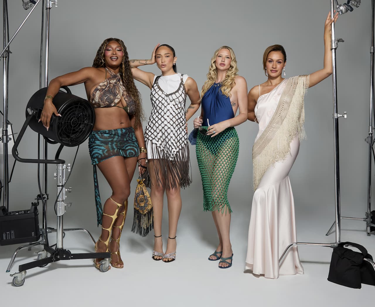


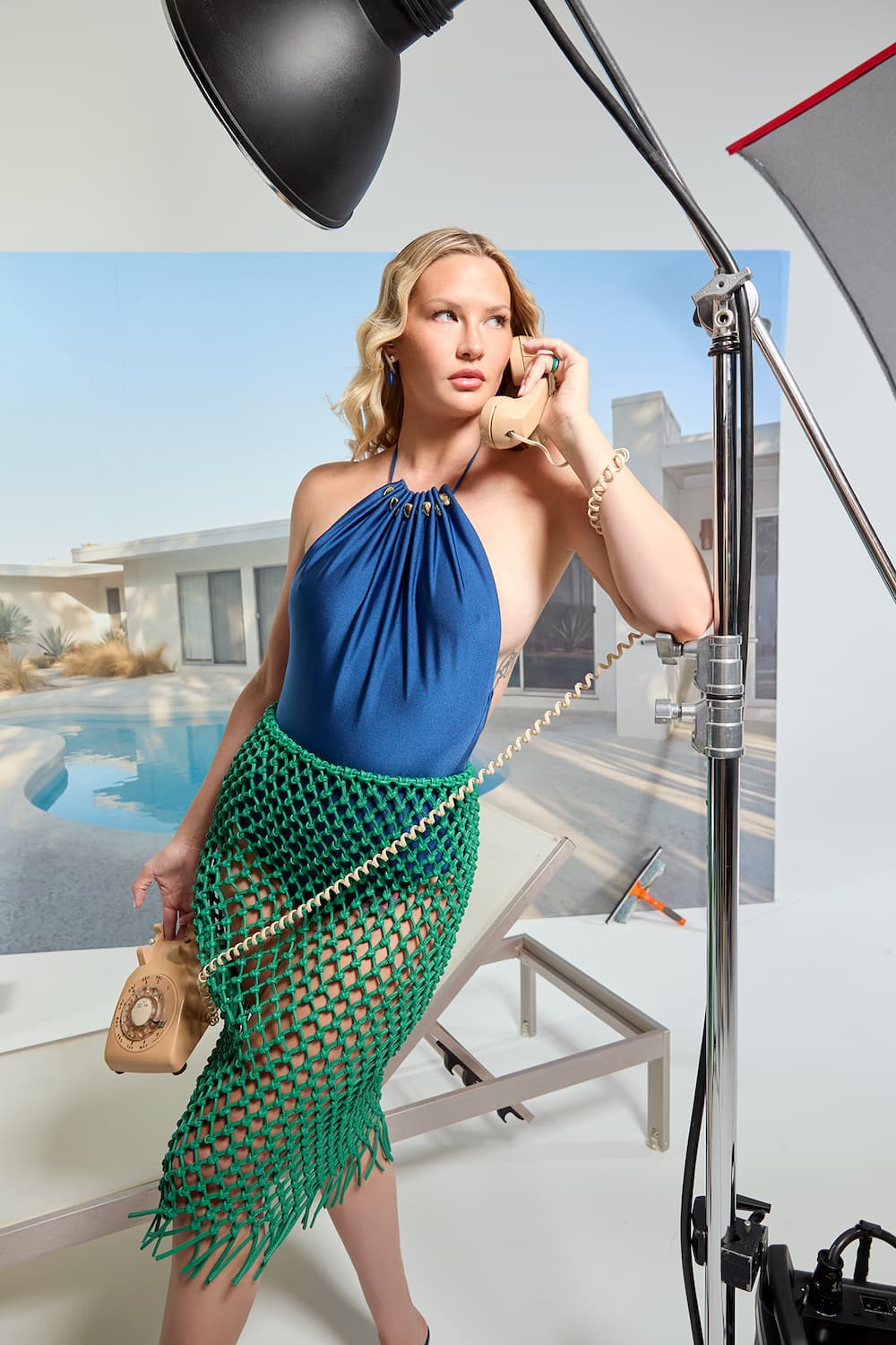
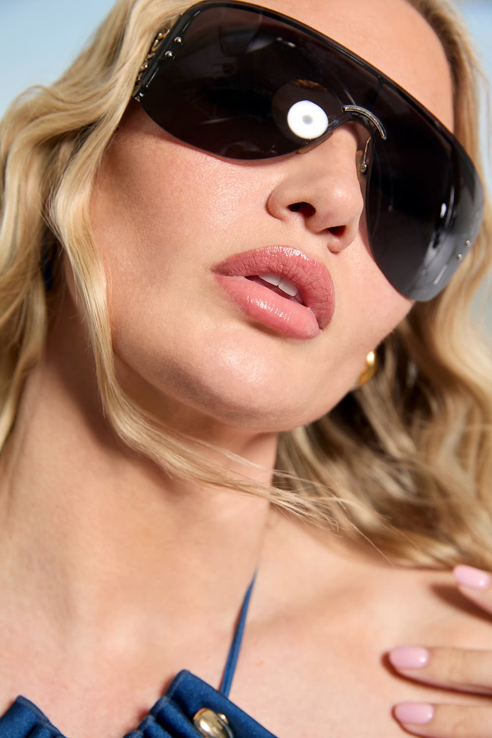
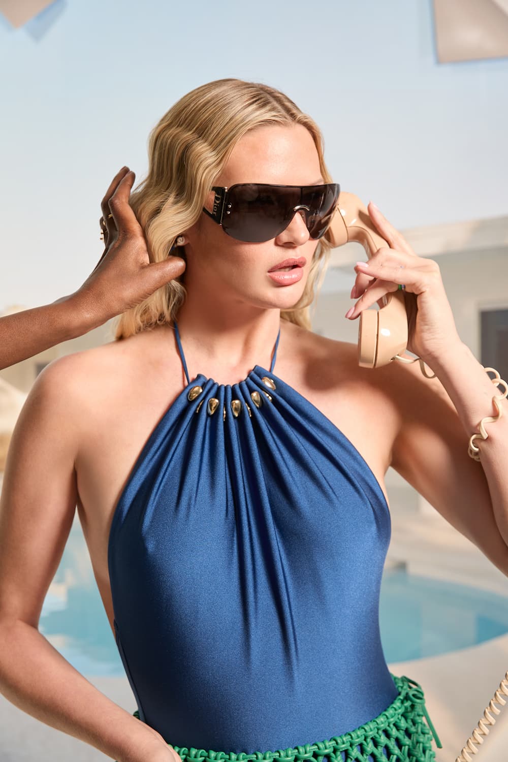
There’s something in the air this summer: a collective desire to stop shrinking, stop waiting, and step fully into the spotlight of our own lives. The Refinery29 Lookbook has always been about more than just trends — it’s about celebrating the creative visionaries who shape culture and collaborating with them to bring the season’s most inspiring fashion and beauty ideas to life. For Refinery29’s Summer 2026 Lookbook, we kept returning to one idea: the making of a star. Not perfection, not polish, but the transformation that happens when someone decides to be seen.
To bring that vision to life, we reunited some of the most iconic figures from America’s Next Top Model: Nigel Barker behind the camera, Miss J Alexander on set, and beloved stars Naima, Toccara, Mercedes, and Molly — women many of us grew up watching, admiring, and learning from. They taught an entire generation about fashion, beauty, confidence, presence, and what it means to command a room unapologetically. Having them together again felt electric, emotional, and honestly a little surreal.
<!–
–>
I grew up watching ANTM, and in many ways, I learned what it meant to be on set — what it meant to create fantasy, collaborate creatively, and build an image — from faithfully tuning in every Wednesday night. Sitting in the TV room of the New York City apartment I grew up in, I’d be on three-way calls with my two best friends during commercial breaks, doing immediate deep dives on everything we were watching unfold. Waiting until the next day at school to discuss it simply wasn’t enough.
Now, 20 years later, as the Chief Content Officer of Refinery29, I feel deeply affirmed knowing creative work can still give me that same buzz, that same electricity. And we hope you feel it too.
The result is a celebration of self-expression, glamour, and stepping into your power. Whether this summer finds you headed to the office, a wedding, a beach club, or simply becoming a new version of yourself, consider this your reminder: you are the star of the story. Take up space accordingly.
<!–
–>
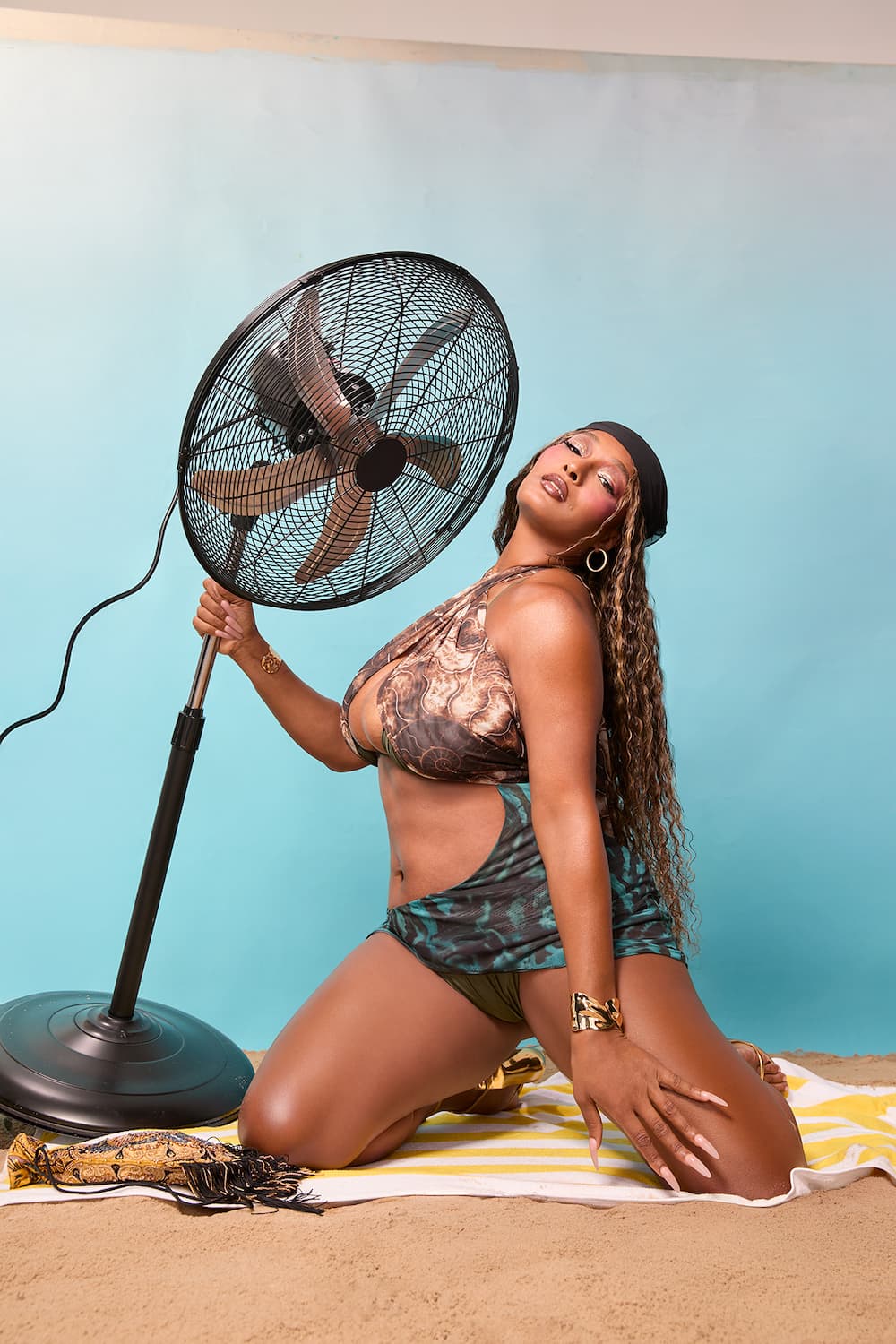
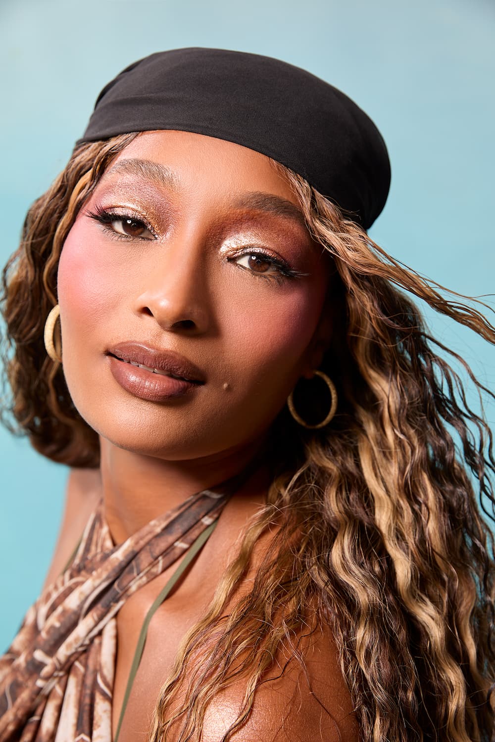
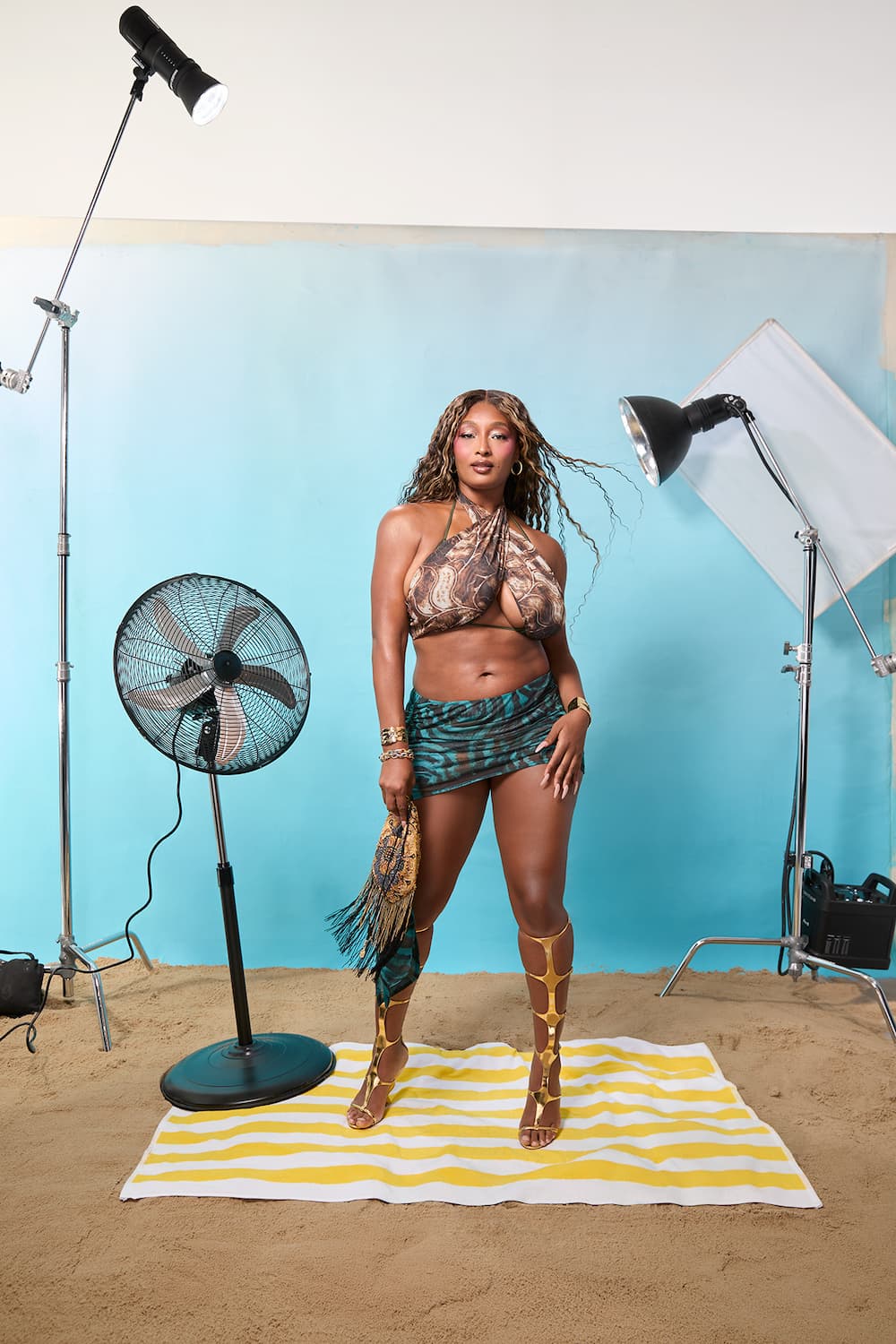
The Summer
Maximalist
How Molly is maximizing her summer, going from daytime pool parties to late-night dancing.
This summer, we’re making the most of every moment out — and dressing accordingly. Think looks that move as easily as you do, transitioning seamlessly from sun-soaked pool parties to late-night dance floors like Molly, all with that effortless, “cool Phoebe Philo” energy, as stylist Ana Tess puts it.
Key makeup artist Alexis De La Isla channels the heat and glow of peak summer: “There’s beauty in imperfection — that’s how I imagine a true day-to-night look. Smudged liner, a sunburnt rosy flush, that just-left-the-beach sheen.” The key is keeping things simple, but never boring, like fresh, radiant skin and defined lashes that feels instinctively cool. “I often use Colorfix on the lashes because it’s waterproof,” says beauty entrepreneur Danessa Myricks. “And I’m a ride-or-die Maybelline fan — they can do no wrong when it comes to mascara.”
Meanwhile, for hair, embrace undone, beachy texture in the warmer months. “If you can just enhance your natural texture and your natural beauty, then you’re not fighting against the natural elements,” says hairstylist Anike Rabiu.
The Resort Queen
How Toccara is beach club-maxxing all summer long.
Whether you’re a card-carrying member of a posh beach club or just channeling that energy, summer dressing is going full throttle on color and print. For this Y2K-leaning, maximalist moment, Tess’s directive is simple: “It’s either mini, layers of sheer fabric, or a dress with a really interesting print — think Pucci or Missoni.”
For makeup, De La Isla looks to other celebrity artists like Ngozi Edeme (who often works with Tyla) and Sophia Sinot (Zara Larsson’s go-to for glam) for their signature “high-exposure shine.” Expect glow dialed all the way up: “I see dimensional blush getting even bolder this summer,” adds Myricks, who recommends glazing cheekbones with a touch of holographic highlighter for a hyper-radiant finish.
Hair follows suit with an intentionally undone feel. “It’s effortless because you’re at the beach,” says Anike, suggesting you brush out your style, like she did on Toccara, so the texture feels loose, airy, and fully free-flowing.
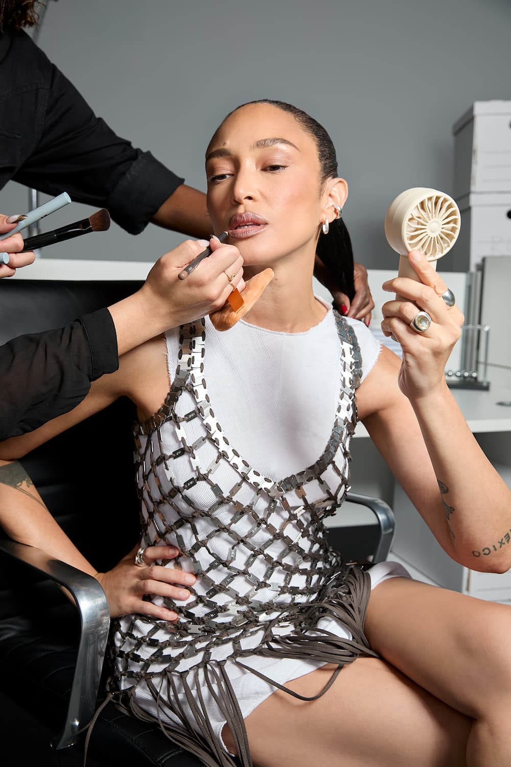
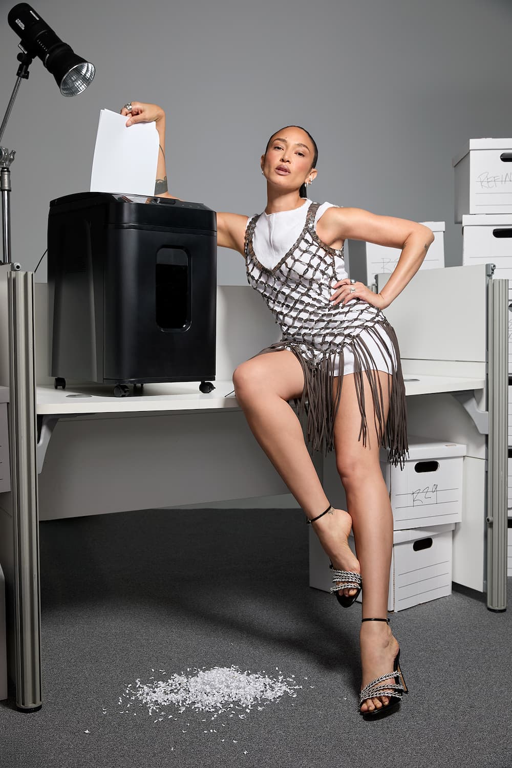
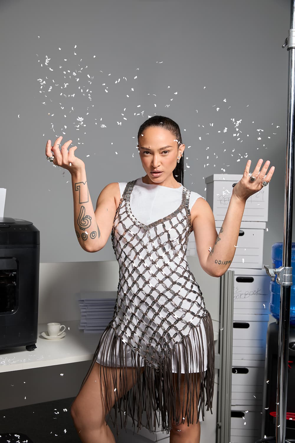
The Office Siren
How Naima is serving office mermaid personality hire to make working in July more bearable.
The office siren is getting a sea-soaked update this season, reemerging as the office mermaid. The key, says Tess, is all in the mix: layering playful textures — sequins, feathers, flashes of metal — over the everyday staples already in your closet, like a classic white tee.
Bringing vacation energy to the 9-to-5 means leaning into unexpected texture: a crochet sarong tied over white capris, crystal-embellished Alexandre Birman heels, a structured blazer, and a DeMellier bag that says you mean business even when you’d rather be at the pool.
For De La Isla, it’s about bringing a hint of vacation energy to your 9-to-5. “I’d always rather be at the pool in the summer, so why not bring that light into the office?” she asks, pointing to a metallic lip as a modern twist on the classic red: “It’s a little nostalgic, a little forward.”
As for hair, Rabiu keeps it refreshingly low effort. “It’s probably the last thing you want to think about at work,” she notes. “Just push it back out of your face so you can focus on your fierceness.” A strong-hold gel — like TRESemmé’s Instant Fix Styling Stick — delivers an instant slick-back in a few swipes, and is ideal for on-the-go touch-ups, whether you’re wearing a cropped cut à la Naima or long, waist-grazing lengths.
The Best-Dressed
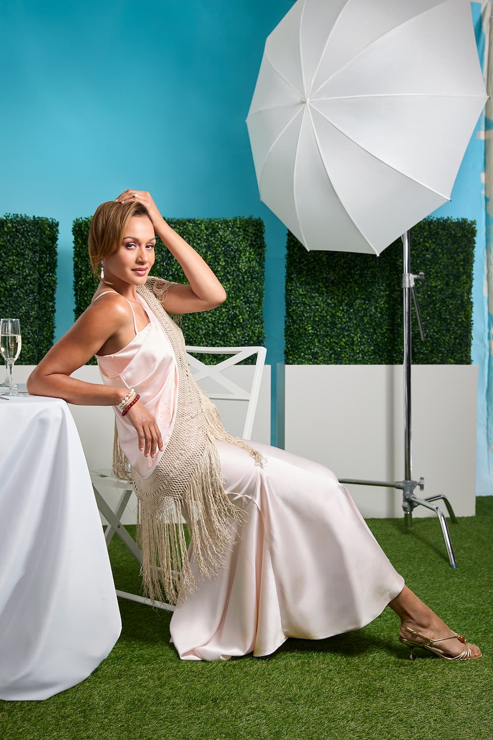
Plus One
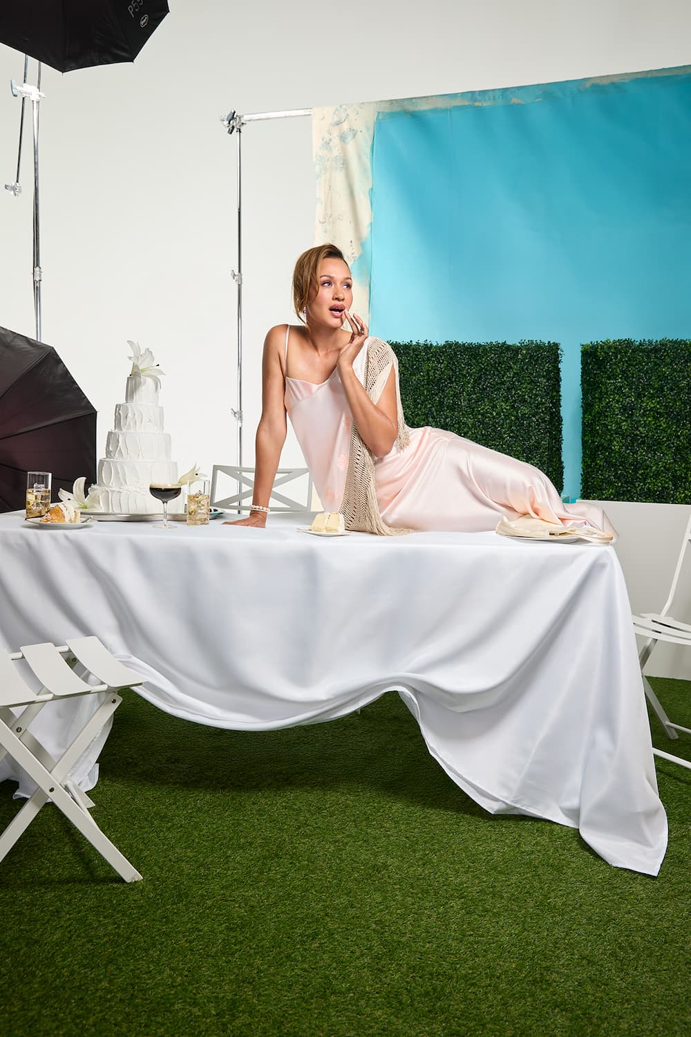
How Mercedes is mastering every dress code for each summer wedding and soirée on the calendar.
It’s the bride’s special day, but you can still bring your best look forward — even as a plus one. For summer weddings, garden parties, and everything in between, take cues from ’90s It girls with monochromatic makeup and polished updos that feel equal parts timeless and cool.
While a slinky silk slip dress will always hold its own, Tess suggests dialing up the interest with thoughtful details — think embroidery, prints, or a textural layer like the crocheted fringe shawl seen here on Mercedes.
“The makeup inspiration I drew from was a ’90s beauty campaign,” says De La Isla of the tonal look. “It felt like such a fun way to be sleek and classic — without veering bridal.” For hair, it’s all about reworking the classics. “For weddings, I was thinking an updo, right?” asks Anike. “But Mercedes is so fierce, we went with a ’90s French roll with a side part and a little oomph.”

.teaser {
display: block !important;
position: relative !important;
width: 100% !important;
height: auto !important;
padding-top: 50px !important;
padding-bottom: 50px !important;
background: unset !important;
background-size: unset !important;
}
.teaser__video {
position: relative !important;
left: 0 !important;
top: 0 !important;
width: 1100px !important;
height: auto !important;
}
@media only screen and (max-width: 1220px) {
.teaser__video {
position: relative !important;
left: 0 !important;
top: 0 !important;
width: 720px !important;
}
}
@media only screen and (max-width: 760px) {
.teaser__video {
position: relative !important;
left: 0 !important;
top: 0 !important;
width: 500px !important;
}
}
@media only screen and (max-width: 540px) {
.teaser__video {
position: relative !important;
left: 0 !important;
top: 0 !important;
width: 100% !important;
}
}
Hot girl summer may come and go, but summer star energy is forever. So this season, whether you’re heading to the office, the afterparty, or somewhere in between, lean into shimmer, texture, and glow — and don’t be afraid to let your star shine.

.credits {
width: 100%;
max-width: 960px;
padding: 0 20px 0;
color: var(–color-black);
margin: 0 auto;
text-align: center;
}
.credits>p {
font-family: ‘Roboto Mono’, monospace;
font-size: 0.65rem;
font-weight: 400;
line-height: 1.55;
text-transform: uppercase;
text-align: center;
margin: 0 auto 20px;
}
.credits a {
color: var(–color-black);
text-decoration: underline;
}
CREDITS:
Chief Content Officer: Brooke DeVard;
Featured PHOTOGRAPHER: NIGEL BARKER;
Featured creative: miss j alexander;
Stylist: Ana Tess;
Stylist assistant: Vanni Rubio;
Model: Mercedes Yvette Scelba-Shorte, Toccara Jones, Naima Mora, and Molly O’Connell.
MAKE-up provided by danessa myricks;
MAKE-UP ARTIST: Alexis de la Isla;
MAKEUP ASSISTANTS: Bri Swing, Grant Karpin;
HAIR STYLIST: Anike;
hair stylist assistant: Keila Rivera;
LIGHTING DIRECTOR & DIGITAL technician:
TOBY SPRAGUE;
Photo Assistants: Christian Ern, Tommy Kearns;
DIRECtor: Kathy Fusco; 1st assistant director: Jim Muscarella; 2nd ASSISTANT DIRECTOR: Kenny Williams; Director of Photography: Joe Victorine; CAMERA OPERATOR: Omar Guinier; 1st Assistant Camera: Jason Knoblock; 2nd Assistant Camera & Media Manager: Giacomo Novelli; KEY GAFFER: JOHN BUSCH; KEY GRIP: BROOKS TOMB; SOUND ENGINEER: Tara Sommer; PRODUCTION ASSISTANTs: Jordan Chavez Darquea, Eddie Claudon;
Production designer: Rae Godin; art assistants: Natalie Geldres, Goksu Kocakcigil, Madelyn Minicozzi;
VP, Creative: Praise Paige;
DIRECTOR, CONTENT PRODUCTION: LAUREN STAIR;
CREATIVE DIRECTORs: Madeleine Mogul, Heather Rosenthanl, Hayley Champoux;
VISUALS DIRECTOR: Breanna Hall;
Producer: Sharon Viera;
Talent Manager: Anne Marie Andrews;
Social LEAD: Taylor Loren;
Fashion: Victoria Montalti;
beauty: KARINA HOSHIKAWA;
.stories {
width: 100%;
padding-bottom: 80px;
}
.stories__container {
width: 100%;
display: flex;
flex-direction: row;
flex-wrap: wrap;
justify-content: center;
align-items: center;
gap: 20px;
padding: 0 40px;
margin: 0 auto;
}
.stories__card {
height: 600px;
position: relative;
width: 340px;
margin: 0;
display: inline-block;
background-color: #FFEEEE;
text-align: center;
color: var(–color-black);
min-width: 140px;
-webkit-transition: box-shadow .2s ease-in-out;
transition: box-shadow .2s ease-in-out;
vertical-align: top;
}
.stories__opener-image {
min-height: 405px;
z-index: 40;
position: relative;
}
.stories__opener-image img {
position: static;
width: 100%;
z-index: 60;
}
.stories__story-content {
text-align: left;
margin: 20px;
}
.stories__section {
font-family: Brown Regular, sans-serif;
font-size: 12px;
letter-spacing: .1em;
line-height: 1.2em;
word-spacing: normal;
font-weight: 400;
color: var(–color-black);
text-transform: uppercase;
margin-bottom: 15px;
}
.stories__title {
font-family: Brown Bold, sans-serif;
font-size: 25px;
font-weight: 400;
word-spacing: normal;
letter-spacing: 0em;
line-height: 1.3em;
text-transform: none;
font-size: 20px;
text-align: left;
}
.stories__card a
.stories__title>span {
-webkit-transition: border-bottom 0.1s ease-in;
transition: border-bottom 0.1s ease-in;
border-bottom: 1px solid transparent;
}
.stories__card a:hover
.stories__title>span {
-webkit-transition: border-bottom 0.1s ease-in;
transition: border-bottom 0.1s ease-in;
border-bottom: 1px solid var(–color-black);
}
.stories__story-meta {
font-family: Brown Regular, sans-serif;
font-size: 12px;
letter-spacing: .1em;
line-height: 1.2em;
word-spacing: normal;
font-weight: 400;
text-transform: uppercase;
color: var(–color-black);
}
.stories__author {
padding-top: 2.5em;
position: absolute;
bottom: 20px;
left: 20px;
}
.stories__author-name {
text-transform: uppercase;
}
.stories__publish-date {
position: absolute;
bottom: 20px;
right: 20px;
}
@media only screen and (max-width: 1550px) {
.stories__container {
max-width: 1000px;
}
}
PAST LOOKBOOKS


Like what you see? How about some more R29 goodness, right here?


